
When it comes to controversial UI, the hamburger navigation pattern has had its fair share of criticism, dismissed as everything from ‘mystery meat’ to ‘the devil’. In this article, we’ll take a closer look at the hamburger icon and alternative navigation patterns.
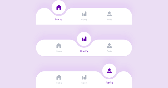
1. Bottom navigation for mobile
This has become the go-to alternative for teams who wanted to ditch the hamburger menu. It’s been adopted by big boys in the industry — Facebook, Flipagram, Buffer, and many others for good reason. The navigations at the bottom allows the user to see the core features and functionality immediately on the home screen, as well as tells users what page they are on at a glance. Direct access is key here, as users can rapidly switch to different features using a single click and without the need to return to the home screen.

2. Tabs
Similar to tabbed menus on the bottom of the screen, tabs at the top of the screen are a decent alternative. They allow users to have direct access to different features, as well as receive visual cues as to where they are within an app. They may also be more intuitive, as they work similarly to tabs on a browser. However, since they’re located on the upper ⅓ of the screen, they’re not quite as accessible as tabs on the bottom screen are. I have yet to see them used alone, as most apps opt to add them as additional navigation in conjunction with another system.

3. Navigation with vertical lettering
Vertical lettering is a brand-new trend these days. It looks increasingly fresh, and naturally stands out from the usual horizontally-oriented content. What’s more, it takes less space: just a narrow line. Nonetheless, it is visually weighty since it is stretched almost to the height of the screen. Compact, informative and zingy — an ideal solution for contemporary designs.
Checkout this website with the trendy vertical lettering navigation bar!

4. Progressively collapsing menu
A more sophisticated modification to a hamburger is to design a menu that adapts to the screen width, shows as much of the navigation as possible, and puts everything else under a “More” item. One might then argue that the ‘more’ item isn’t better than the hamburger menu (it’s kind of hidden and its label does not refer to its content at all), however, if you have made the prioritisation right, most users will be looking for one of the four visible items anyway so the navigation experience for the majority will still be improved.

5. Menu scattered around the perimeter of the fold
This one is unique and catches the eye. It is not a widely-used solution, and usually, it requires a proper environment, like a centered layout with perceptible gutters around the structure; nevertheless, it is a good way to give some zest to your navigation.
It’s tricky but when done well, looks really different and amazing! Each corner is reserved for its piece of information: logotype, socials, menu icon and quick access to the ‘about’ section.

6. Labeled Menu Button
James Foster of Exisweb ran a few very interesting A/B tests to see if simply tweaking the hamburger menu icon would significantly increase usability and reduce confusion. He found that icons labeled with the word “Menu” significantly increased the amount of clicks as compared to a normal hamburger menu, by as much as 20%.
If you’re not looking to make a big change to your app, but want to increase usability, this would be a good alternative. The Nielsen Norman group also recommend labelling the hamburger menu for increased conversions.

[IMP] Keep in mind — test whatever you create
Every design is amazing until tested with real users!
Honestly, how much ever we talk about the best practices, fads and trends in the field of UX, you can never be sure how your users might respond to an interface. The response might vary based on a lot of parameters — you users’ exposure to UI trends, the kind of apps they use, the age group they belong to and so much more… It’s best to design versions of form and test them with your users to know which works best for your brand.
We use CanvasFlip to check heatmaps and user videos on any variation in interface. I believe you would benefit from the same. An A/B testing of the same would be quite helpful in taking any decision.

Conclusion
As the saying goes, small details make a big difference; and such a common element of the website design as the menu is capable of enriching the general aesthetic, adding some nice twists to the structure, and enhancing the user experience when it stands out from the crowd. These four types of navigation might not impress your visitors with their incredible dynamic behaviour, nor intricate realisation.


