A Case Study in Ed-Tech: A New ThinkCERCA
Over the past eight months, my design team at ThinkCERCA has been heads down re-designing the teacher experience of our online curriculum product. ThinkCERCA’s platform teaches critical thinking and literacy skills across subjects for grades 3-12. It is used by hundreds of schools in the U.S. and is increasingly being adopted by school districts as their core English language arts curriculum.
After our release this July, I wanted to spend some time to reflect on the re-design process, showcase our learnings and share the work we were able to launch on a super tight schedule while maintaining our design intent.
When I joined ThinkCERCA (October 2017) and had the task of building out a product and marketing design team, I was excited by the challenge and opportunity to bring design innovation to the education arena. ThinkCERCA’s product hadn’t really been touched by a design team or process for more than four years! I quickly learned how low the bar has been for user experience in educational software compared to many other consumer experiences. Teachers have become accustomed to bad experiences and have invented workarounds for them. Many teachers are moving among several online software products and then further supplementing digital tools with offline resources.
Over the course of this project, our design team (myself, Elisabeth Klann, Rose Tarullo, Arielle Saporta and Sophie Lin) spoke with more than 100 teachers (existing users and new users) to inform our strategy and design changes.
We developed this problem statement for our re-design work:
“The current experience is not effective at clearly communicating the product purpose and value, and quickly acclimating users to the experience.
We must understand how to surface the content and features that users eventually love in a way that connects the product immediately to the user’s world and context.”
Some of our key learnings from our discovery research were that:
- New users were interested most in exploring content first in contrast to setting up their classes and learning basics of the platform.
- Communicating differentiation (how to assign texts according to a student’s reading level) had to be done in a simple and visual way.
- Most users expressed interest in using topics or themes as their driver for selecting content and expected content to be customized based on any questions they answered during sign up.
Some highlights of our design work are below with specific learnings that led to the design solutions shown.
Sign Up & Onboarding

Prior to this redesign, teachers had to confront a lengthy manual sign-up form despite many schools adopting Google or Clever as their platform for accessing curriculum tools. In re-designing the Sign Up flow, we gave the most emphasis on one-click sign up/sign on to give more focus to the sign up methods that make account creation and integration easier.
We added a few key questions into the sign up process to make our lesson library (curriculum area) of the site more relevant — making finding and planning lessons easier. All sign up information is now stored in a teaching profile where a teacher can edit or change their preferences at any time post-sign up.
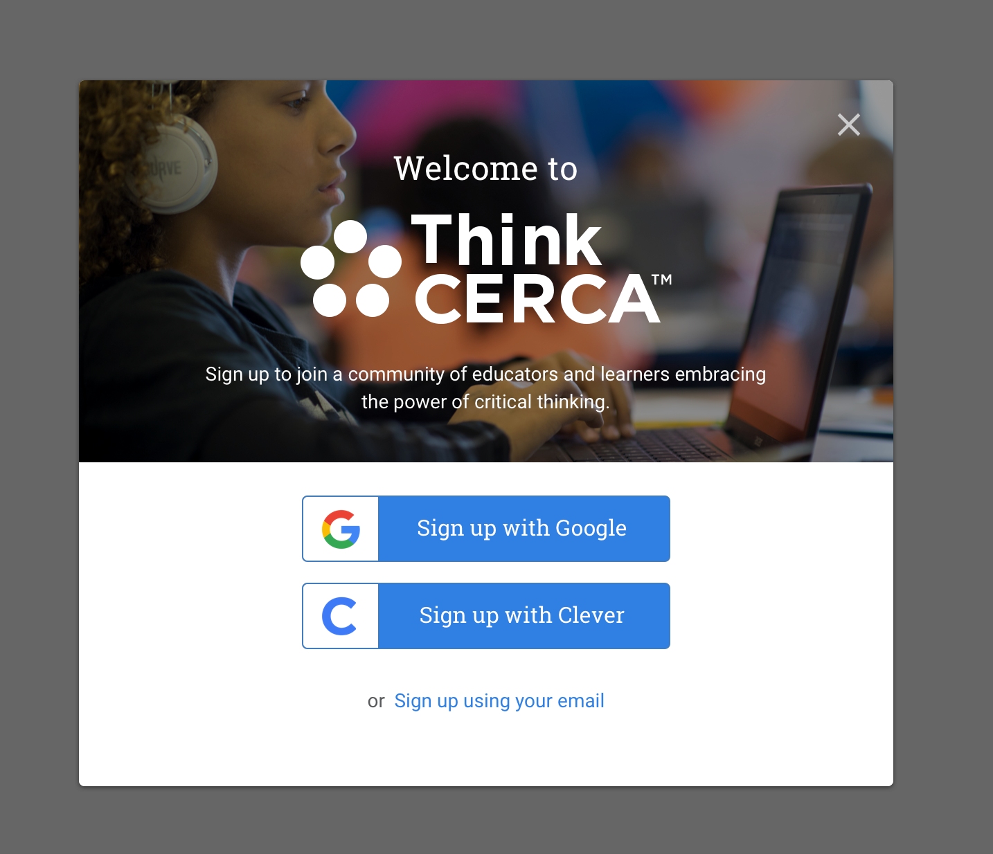
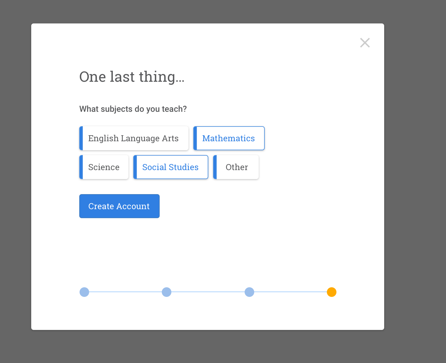
In terms of onboarding, we explored a very guided experience with a checklist, sense of progress and tooltips to highlight what to do next to get set up. We quickly realized, however, that while some teachers loved the hand-holding of a walkthrough, most people dismissed the tooltips and wanted to jump in and explore. We therefore streamlined the flow to drop teachers right into the curriculum area, where they could explore lessons and understand our product while making sure basic setup actions were clear enough in terms of how get setup when they were ready for it.

Classes and Planning
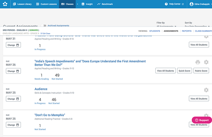
The Classes page is one of the most used areas of our teacher experience. It is the place where teachers manage assignments, grade writing pieces, set up classes, enroll students and view progress from assignment to assignment. When pulling analytics data on this page, it was clear there were only a small subset of actions that teachers actually engage with. The most used action was getting to the list of assignments for a given class.
In our redesign, we flattened the information architecture to allow teachers to see current assignments from the Classes tab. They can then jump right into an assignment detail page from Classes or they can click into their class Planner to see all assignments and their Class Roster to manage students.

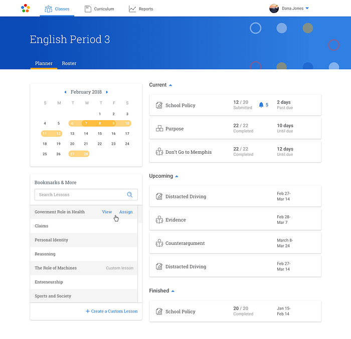
The class Planner came about from a desire for teachers to get ahead of the start of school or next semester of classes by planning ahead. We added a visual indication of assignments on a calendar view and also grouped bookmarked lessons in the same space as their assignments. We created a clearer distinction of assignment state (current, upcoming and complete) so that teachers could easily scan among groups of assignments to find what they were looking for.
Discovering Content
When initially looking at the data for how existing users were finding content on our Lesson Library page, we saw most use concentrated around search. Although we provided a lot of filtering options and had some navigation to see curated sets of lessons, most users were not engaging with them. Behind search, the most used page elements were the subject and grade level filters.
Using data and research, we developed the concept of a teaching profile so that we could better personalize the Lesson Library to reflect content that is relevant to what someone teaches versus showing all possible content and forcing users to rely on search to find content.
The new library was renamed to Curriculum to better connect to how the content was being used in schools. The Curriculum view now adapts which grade levels it shows based on the grades a teacher selects during sign up. We allow teachers to browse across subject areas in order to 1) communicate that we are a cross-curricular product and 2) support teachers that teach more than one subject.
One of the joys of being a teacher is designing a lesson plan and unit. To better support a teacher’s need to align content to a unit they have planned, we made lesson themes more prominent and accessible on the page. We also surfaced lessons by standard (ex. Writing Arguments) for teachers that have to cover specific skill-based standards throughout the year in order to prepare students for assessments.


Themes and Modules
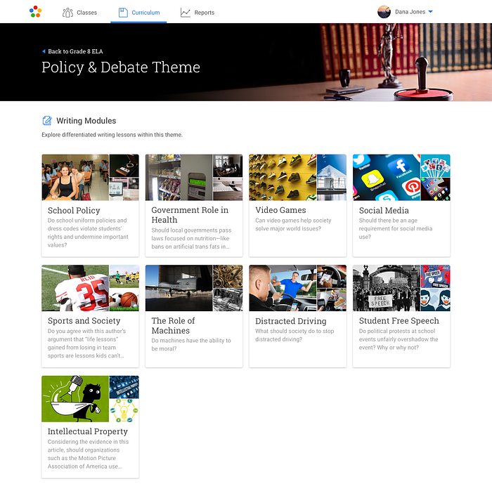
To emphasize our core lesson type more clearly we designed our Theme pages to showcase Writing lessons only (organized into Modules). Previously, our lesson library showcased all four lesson types we offer (Direct Instruction, Reading, Skills and Writing lessons) despite our Writing lessons being our core offering and the lesson type where there is the most impact demonstrated in reading and writing growth (2 years of growth in one year) when students complete 10 lessons in a year.
Our Theme page visualizes Writing Modules with a collage-style thumbnail to communicate that a module contains a range of lessons on the shown topic, (ex. “School Policy”). The collage provides a smooth transition into the image carousel that is shown on a Writing module page.
Writing Lessons and Differentiation
One of our main challenges with this redesign was making it clearer for teachers what our value proposition is. We offer a unique type of differentiation compared to other digital writing and literacy products. We provide a module of writing lessons that have different texts at different reading levels anchored around the same topic. This method of differentiation was a hard requirement as it is based on findings from the World Economic Forum as the most effective type of differentiation. Other offerings simply change the vocabulary in a text instead of thinking about the comprehension and skills required by each text a student confronts. ThinkCERCA’s approach to differentiation is new to most teachers learning about our product and therefore as a design team, we had the challenge of making it clear for teachers how our product works to users without having a lot of background knowledge.
We came up with a carousel approach as the method to visually show a spectrum of texts along on topic (ex. “School Policy”) and overarching discussion question for the class. We provided labels to emphasize the end points of the spectrum using the concept of “more” or “less challenging”. We tested several alternatives to these labels to try to find ones that teachers would feel comfortable with and that did not describe students abilities in a negative way.
What led to the success of this UI pattern in this context was a lot of small details around language, using different visual thumbnails for each text excerpt and updating the card content underneath each thumbnail to convey each text was different. After many small tweaks we finally got to the point where new users finally ‘got it’ and were able to consistently understand our concept of leveled readings within one umbrella topic.
In redesigning the core Writing Module page, we also improved how teachers assigns lessons. We simplified the interaction by using a modal overlay instead of a persistent area on the page which confused the task at hand.


We’re excited for teachers to start the upcoming school year with a more focused and elegant experience with our new ThinkCERCA. We will use this refresh as a starting point to build and evolve the teacher experience to be more useful, intuitive and where possible, delightful. We are continuing to track post-release how our changes are performing in the wild to see what areas we should dig into more or to see what surprising new ways teachers want to leverage our content and tools to be more effective. We are excited to embark upon the same iterative and rapid prototyping process we employed in this project as we shift onto a redesign of the student side of the experience this summer and fall. Stay tuned!
Interested in learning more? Drop us a note.


