
Animation in Mobile UX Design
by Nick Babich
Well-designed animations are an essential part of product design because they make the experience feel crafted. Good animations help to create an experience that feels human and help users accomplish tasks with ease.
In this article we will review the benefits of using animations in mobile design and share practical examples of when and how to use animated effects.
Benefits of animation
Animation in mobile apps has a clear, logical purpose—it reduces user cognitive load by preventing change blindness and establishing better recall in spatial relationships. But there is one more thing. Animation brings delight.
When to use animation
Ideally, in-app animation should:
- Provide clear feedback in response to user’s actions.
- Provide system status to the user.
- Guide and teach the user how to interact with the interface.
Visual Feedback
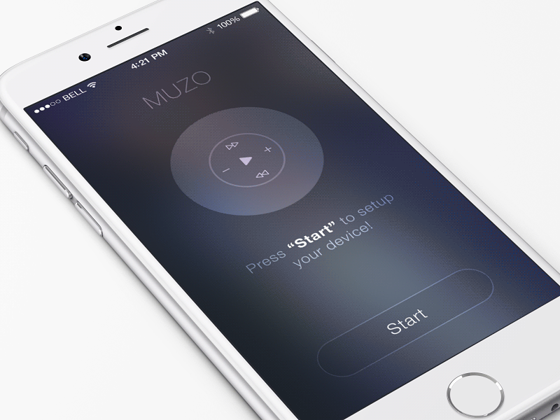
Visual feedback is extremely important in user interface design. In real life, buttons and controls respond to our interaction, this is how we expect things to work. The same level of responsiveness we expect from digital products. That’s why users feel good when the system provide instant visual confirmation upon user input.
Buttons and Controls
User interface elements like buttons and controls should feel tangible. Visual and motion cues should offer visual feedback in ways that users feel like they have a direct manipulation with controls.

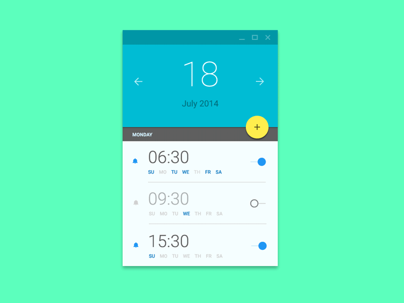
System Status
Users don’t like surprises—they want to be in control when they interact with a digital product, and trust that the app behaves as they expect it to behave. Animation can aid trust by providing real-time notification of the app’s process status, enabling the user to quickly understand what is going on.

A well-known animation for this group is “pull down to refresh,” which initiates a process of content updates on mobile devices.

Also animation is very helpful during onboarding. Smooth transitions and good animations during onboarding can have a tremendous impact on the level of engagement of the first-time users.
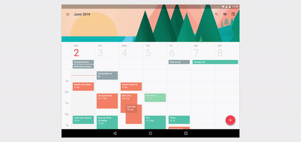
Meaningful Transitions
Motion language can be used to guide the user’s attention in ways that both inform and delight. Animation should smoothly transfer users between different states, explain changes in the arrangement of elements on a screen, and reinforce the visual hierarchy of elements on the screen.
Connect States Visually
Transitioning between two visual states should be clear, smooth, and effortless. The user should see how two states are connected.
Consistent Animation
Transitioning objects should behave in a coordinated manner. Direct user attention. All moving elements should create a clear picture of where to look for the user.
Avoid haphazard motion like in the example below, because it’s very distracting and hard to follow.

Delightful Details
The most basic use of animation is creating animated transitions between states, but animation can also be used to delight a user. Animation can exist within all components of an app, including small icons.

Fun
Animations can create positive mood that will help users interact with a product.
Animation for Animation’s Sake
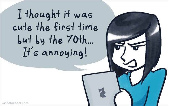
But it’s vital to be careful with animation. Animation for animation’s sake is (almost always) poor design. When an animation doesn’t fit a functional purpose, it usually also feels awkward or annoying. Also keep longevity in mind — will the animation get annoying on the 100th use, or is it universally clear and unobtrusive?
Design with care. Attention to each and every detail is key to your success making human-computer interaction easy to use.
Thank you!

