Apple Vision Pro Spatial Design 101 — (Part 3)
This is part 3 of an ongoing series, catch up on part 1, part 2, part 4, part 5 here.
This article focuses on designing great UI to create groundbreaking spatial computing apps.
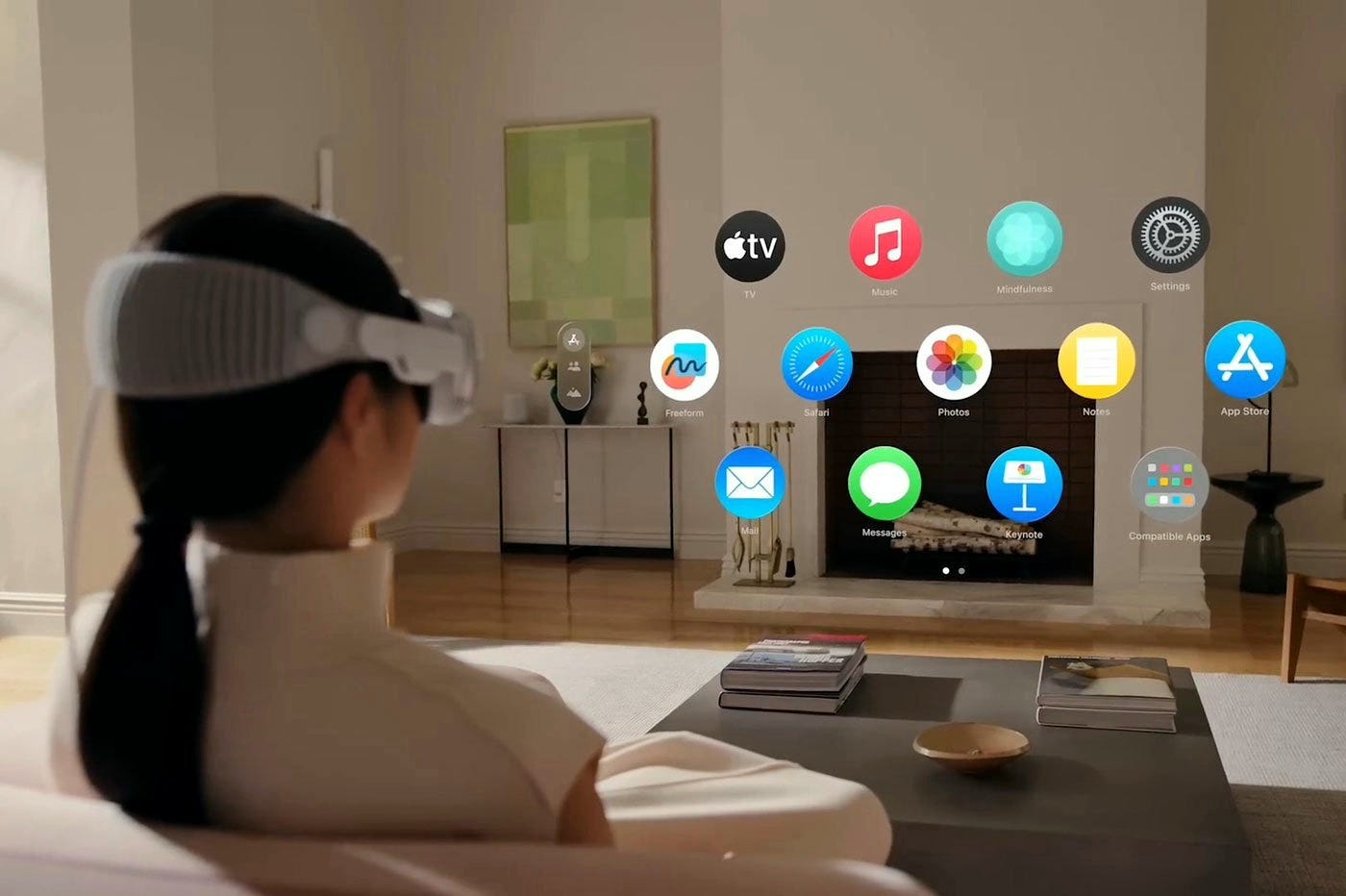
App Icons
App icons are three-dimensional with depth between layers that causes them to expand when people look at them.

How to create App Icons?
All app icons can have up to three flat layers, a background layer and up to two foreground layers on top. Each layer is a square image, and their size is 1024 by 1024 pixels. Both foreground layers should have a transparent background.

Then all layers get cropped by a circular mask. And finally, when layers match together, a glass layer is applied automatically, adding depth, specular highlights, and shadows to them. Always keep the graphics centered.

Materials
Windows are designed with a new visual language, known as the Glass Material, that adapt to different lighting conditions. Spatial platform does not have a distinct light or dark mode. Instead, glass and UI naturally adapt and become brighter or darker when placed in front of light and dark backgrounds respectively.

Windows live in our space and feel like part of our surroundings. Interfaces are placed within windows so people can comfortably see them and use them.
Design Familiar Elements & Windows
Interface design in spatial apps must be recognizable and familiar by making them similar to 2D apps.
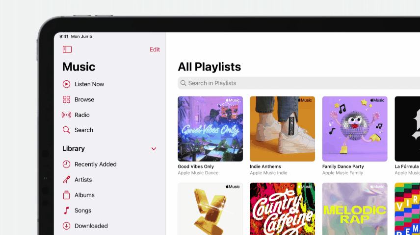
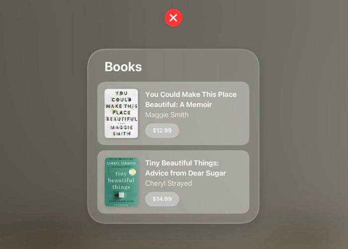
In the example below, the elements in the Music Spatial App are similar to the Music App in 2D devices.
How to design legible windows?
- To maintain contrast between separate sections of an app, use a darker material on top of a lighter material and use a lighter material on top of a darker material.
- For example, in the Music app below, the window is of lighter material, so use a darker material for the sidebar to maintain enough contrast. Then lighter material on top of side bar to bring attention to interactive elements, like buttons. To increase contrast for standard components, like input fields, more darker material can be used.

- Use white text or symbols so they are always clearly visible. If you need to use color, mostly use system color and use it in a background layer or an entire button so people can see it.
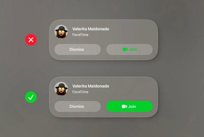
- In the example below, since the text is white and there are lighter buttons, it’s better to use a darker cell behind each region to add more contrast.
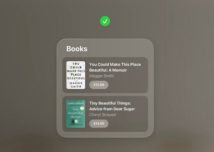
- As shown below, avoid stacking lighter materials on top of each other, as it impacts legibility and reduces contrast.
Typography
SF Pro is the system font in visionOS and text defaults to white.
visionOS uses bolder versions of the Dynamic Type body and title styles, like using medium instead of regular for body text, and using bold instead of semi bold for titles, to keep text clear all the time.
It also introduced Extra Large Title 1 and Extra Large Title 2 for wide, editorial-style layouts.

Use 2D text for legibility. Avoid 3D text as that’s difficult to read.
Vibrancy
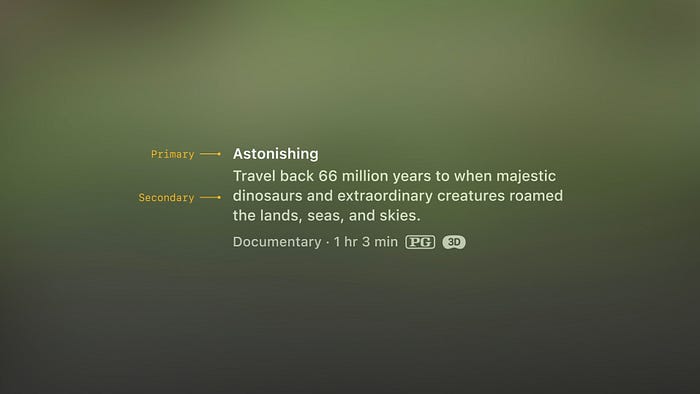
Vibrancy is one of the most important details to maintain legibility across the system. On spatial platform, since the background can be constantly changing, vibrancy updates in real time to make sure the text is always legible. In the example below, the vibrancy is turned on and off to show the difference.
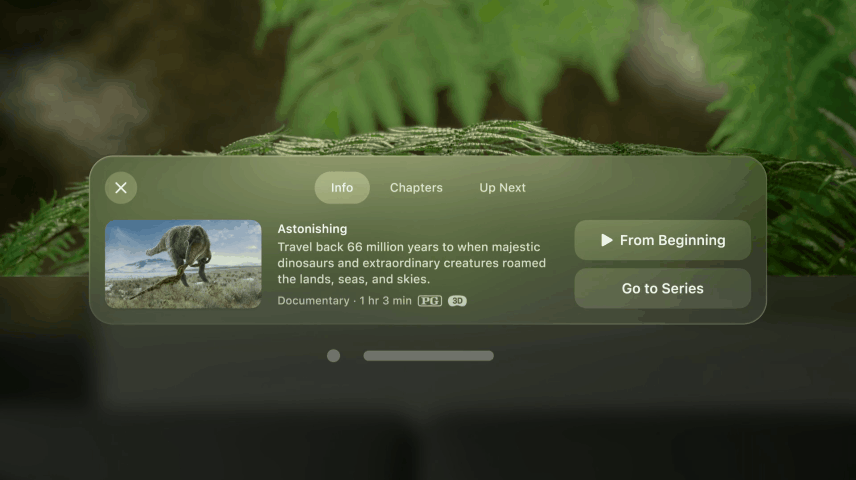
There are three modes in vibrancy: primary, secondary, and tertiary. Use primary for standard text. Or use secondary for description text, footnotes, and subtitles.
We have covered a bunch of important points on spatial UI design. In my next article here, we learn about another vital topic - how to size and space UI elements.
Credits: Apple
Let’s work together on an interesting project. Ping me at xrfuturism@gmail.com.

