Member-only story
Apple’s Fluid Interface Design
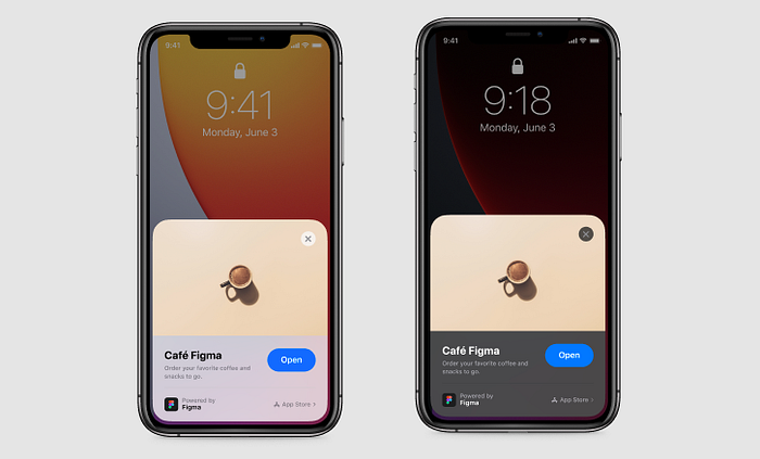
When we looking at iOS and Android, clearly Apple paid attention to smoothness and usability more than Android. Apple always uses only one method to get what they want: naturalness. iPhone was inspired by nature like Apple’s many products.
When we look at Steve Jobs’ biography, Jobs felt that Apple should create products that everyone can use; even without the user guide.
For example, iPhone’s home screen can be compared to a book page in real life. When you look at the movements you can understand what I’m saying.
We can’t flip a book page up or down, so we can’t do it with the iPhone too. If we ask that every smartphone is not like that anyway; old Androids were very confused about this.
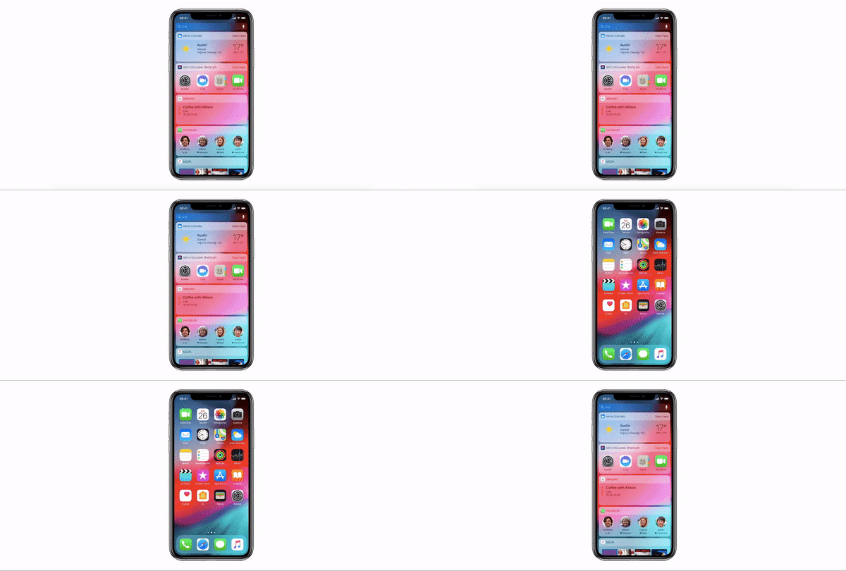

Another example will be the cursor. Gestures on the iPhone screen are designed according to our cursor usage habits. We move our finger on the screen like a cursor. Just as we used a cursor on the computer.
Screen Fluidity
Latency and Response
If there is a delay in the reaction on the screen after touching the screen, we will feel like the phone has not responded to us. Therefore, the fast response feels more fluid.
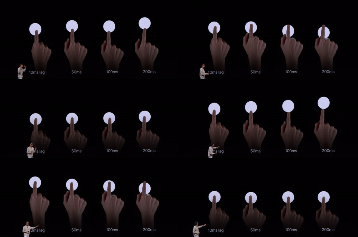
Apple didn’t just focus on the iPhone’s reactions. The user may also be delayed to a reaction. Apple wanted to prevent this too, but how? Of course with gestures designs…
‘Gestures’ became very important with the removal of the home button on iPhone X. It was almost the most important point. Because all the operations of the home button are done by the gestures that came with iPhone X. How can the gestures design speed you up? The answer is: If you don’t have to think…


