Member-only story
Are you kidding? The story of Comic Sans
As the great typography joke goes: Comic Sans walks into a bar and the bartender says, “We don’t serve your type.”

In 1994, Vincent Connare, who had previously designed type at Apple and Agfa/Compugraphic, was working at Microsoft as a typographic engineer. While testing a trial version of Microsoft Bob—a program that simplified the navigation experience for novice desktop computer users—he noticed that something wasn’t meshing with the interface.
The program provided instruction in the form of informal conversation, accompanied by vibrant cartoon illustrations and presented in speech bubbles above tour guide Rover: An animated, tail-wagging dog. But all of Bob’s conversational advice was set in Times New Roman, a typeface that appeared too formal when paired with the simple, saturated background illustrations and kid-friendly mascot.

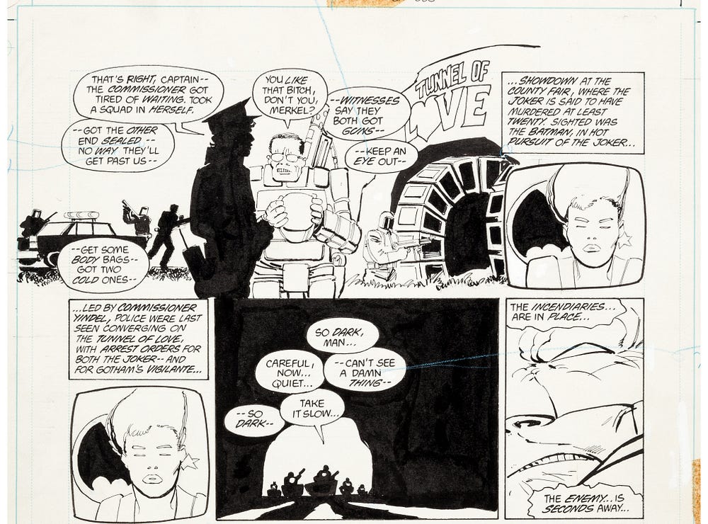
Connare happened to have a copy of Batman: The Dark Knight Returns by Frank Miller near his desk and, noticing how well the handwritten lettering paired with the imagery of the story, convinced Bob’s designers to let him take a crack at designing a more suitable font for the program.
And the rest, as they say, was history.
Comic origins
Comic Sans—or Comic Book as it was originally named—grew out of a specific need; a particular letterform design suited for a specific medium.

Connare recognized that comic books employed lettering that was hand-drawn to fit each individual box or bubble, providing both flexibility and variety. He drew each letter numerous times until satisfied that every glyph had it’s own unique shape and curve, while still functioning as a family.
If you love Comic Sans, you don’t know much about typography. If you hate it, you really don’t know much…


