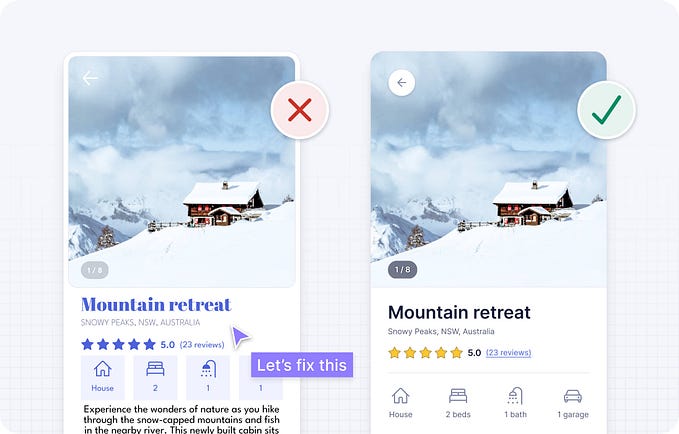
Hello designers, have you ever taken something for granted in design? For instance, when we have the “Next step” button, then the “Back” button must be existed. When we have the “Continue” button, the “Cancel” button needs to be there. They are just like twins, like the light and shadow or just like GGG and Canelo in boxing (I'm so excited about the fight). In this article, I am going to share one of my projects when I was working at WYWM which made me realised not every should go that way.
Before we get started, a big shout out to the design team members, Alice and Anna. Awesome people to work with, they have shown me although we don’t have the biggest team and richest resources in the world, a mighty team is still able to achieve the finest product with great teamwork and our growth mindset . Also, I put this case study on my portfolio as well, click here to read it, it might save you some time :)
Background
WYWM is a SaaS company which providing free training to upskill user’s digital skills and help identify their best matched career path and then put them in job.
About the project, the problem we were facing was due to the technology limitation, our users won’t be able to switch the current learning pipeline without contacting WYWM staff. It is not only a limitation of the user’s learning freedom, but also it will increase the staff workload. On top of that, we also saw an opportunity that could allow us to keep track of the user’s flow to understand how many users haven’t finished their course but then decided to drop out. It might help us to improve the learning quality.
Design requirements, solution and result
The design requirement was simple: add a switch button and unenroll button to empower users to make their own actions. Plus, adding a mandatory survey in the middle of the user flows to record where the users leave the course and gain feedback.
But in the end, we didn’t put the unenroll button and abandoned the mandatory survey. Basically, we haven’t done half of the requirements, and here is why.
Plot twist
Buttons
As I’ve mentioned, a lot of buttons are like twins, like the yin and yang. Therefore, when some features come up, we might instinctively apply them with the same mindset.
However, as a designer, when we consider our company's business model and the target of these features. Then we will realise WYWM is providing free online training, which means there is no actual cost to the users but their own time. In other words, there is no reason for inactive users to return to the platform just to unenroll from the training that hasn’t been accessed for ages.
Therefore, when a user is no longer interested in completing the course, they most likely will be inactive on the platform. Having the unenroll button on the dashboard requires users to actually return to the platform, which is unlikely to happen if users are going to drop off anyway.
Feedback Survey
Collecting data and feedback are important to the business. However, if we forced users to give us feedback and make the feedback section unskippable, it would lead to the opposite ending. In most cases, users just want to achieve their goals ASAP.
For example, for Youtube users, their goal could simply enjoy entertainment on Youtube. Therefore, most of the users would probably answer the youtube survey casually. In this sense, the data might not be accurate and doubtable.
Therefore, we have decided to remove the mandatory feedback section, and instead, we targeted the inactive users and email them for their feedback in order to collect the most accurate feedback.
“What is the deal?”- Joey Tribbiani

Expectation management
Perhaps having a unenroll button won’t cause too much trouble for the B2C users. However, on the company side, having an unnecessary button might be a waste of resources and also set a wrong expectation.
If we back to the original intention, the whole requirement is not only allowing the users could make their move by themselves but also able to gain data so that could pass it to the marketing/user growth team, and then they could do their work. In this sense, the unenroll button has contained more than one meaning: to keep our company growing and increase the user learning experience. And yet, it would be too late to find out 6–12 weeks after that the button is actually unable to help teams to achieve those expectations, plus the time and effort our developers have put on.
Takeaway
Two lessons I’ve learned here,
First off, take nothing for granted. No matter who sent you the design documents, no matter who gave you the order or what design pattern you have been using for a long time. Take some time to think about every detail and doubt everything you can. This is our value and this is what they pay us for.
Secondly, work align with the business model and business goal. Understand how your company makes money and put your design values into it. Adapting business needs is also something that has been overlooked and underestimated by most designers.
“You can’t be a good boxer if you only have the skills, you need to adjust every time in your fight.” (my coach didn’t say that to me, I made that up.)
I know it is not rocket science, but I hope you all can gain something from my story.
Feel free to connect me on Linkedin. We talk about design stuff or fighting stuff is also welcome:)


