Articulate design specification using Spacer in Design System
The unconscious components that drive efficiency and articulate design specification to simplify collaboration.
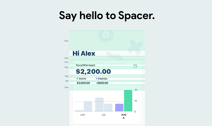
Spacing in a design often refers to the space used in screens to visually separate sections by functionalities, and to rationalise visual hierarchy.
The closer objects are to each other, the more likely they will form a larger whole. — Proximity law of Gestalt theory
If you’d like to delve into this fundamental visual theory, here’s an authoritative reference with quintessential case studies, Law of Proximity.
Spacing is, at many top-tiers, getting translated to be Spacers in the design system. Spacer components are used to rationalise spatial relationships between two components in an interface, to eradicate the guesswork to reach a clear, shared knowledge on layouts. Meanwhile, it can also be used for the grid system, in responsive design, mainly.
📚
Four Ws you will take away from this article.
- A good understanding of why spacer in the design system
- A big picture of why spacer empowers the components
- Pitfalls of when not using a spacer for an informed decision-making
- What is the value spacer added to streamline design-dev collaboration
🤔
Why Spacer?
- Solidify design system to craft design scientifically
- Articulate design specifications for collaboration
- Lay a solid foundation for responsive design
Not having a well-thought-out design guideline to facilitate the handover and articulate design specifications would make designers not that happy. The pet peeve, things like manual tweaks on the inconsistent spacing across design for design handover, also identified as an Achilles heel in our design system that led to endless guesswork, previously. No surprise, developers had no clue about the source of truth either, which prevents us from achieving a smooth collaboration and enjoying working on the things that generate happiness.
The pendulum should be swung back to the design system itself, instead of labelling spacing on components, or each screen. Fleshing out the design system with Spacer standardises the way of separating functionalities, and also visually articulates how components were built with minimal single elements from an atomic level. Wanna see more about atomic design methodology? Check out Atomic Design Principles & Methodology 101 written by Matt on Adobe Design.

What’s more, spacers are basic components that can be adjusted to cater to the design requirements. Adjustment on the master components can automatically sync with variants in no time, so spacers can
- support design iteration without manual tweak on each component
- break down components with design specification
Therefore, we just left no stone unturned for team with a consistent spacing hierarchy. By using spacers, we’re hitting two birds with one stone.
🧐
Case study of how Spacers get infused into components?
If design doesn’t make its way into product, it’s just like a language without extant literature or seminal text.
IBM is now structuring the layout using a spacing token scale, it includes small increments needed to create appropriate spatial relationships for detail-level designs. Spacing tokens are consumed within components, and either to frame the screen as the screenshot stands.

In my team, we’re leading the mobile design system for our Xero app. A stack of Spacers is now in use to standardise spacing values from 4px to 64px, which follow a 4px increment to deliver the spatial density and hierarchy for clear and comfortable readability.

For an extension, by stretching the height or width of spacers, fine-tune tweaks are much easier to present their look and feel as spacers in components are just variants, they obey updates from the master component.

🚀
How Spacer drives execution efficiency at scale?
- For designers: free up time from a manual tweak to adjusting at scale
- For engineers: access specification by fewer taps
- Scrape the red tape on design-engineering collaboration
UX friction happened within design execution is also a big pain for us designers. The strenuous adjustment on every single component is not the right decision, then why the spacer for design iteration.
Simply adjust the spacer vertically, or horizontally(depending on the use case) to reflect what’s the new design look and feel immediately. Again, this is a spacer simulation that is designer-facing only, for iteration.
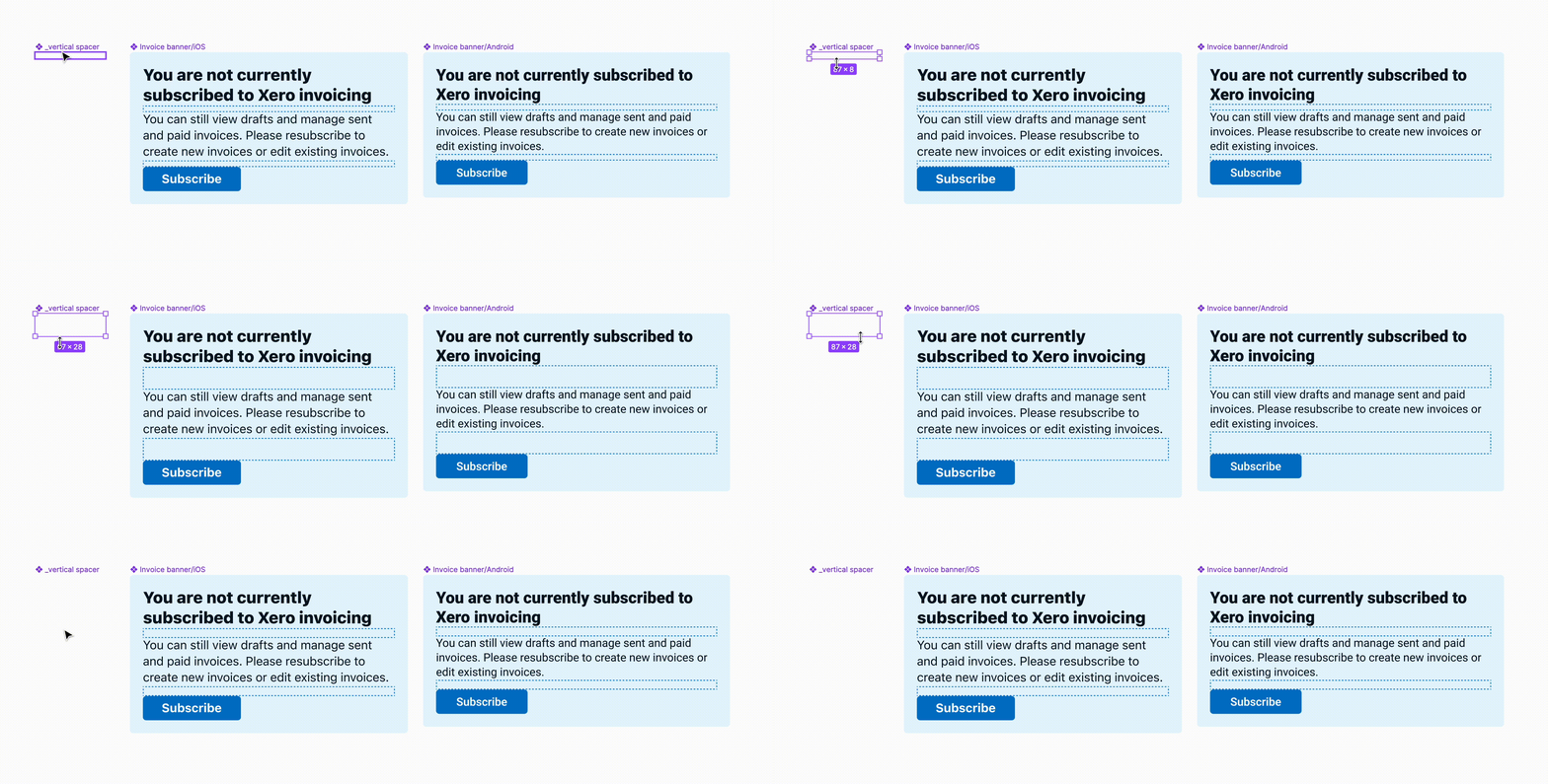
Similarly, the spacer can be used for connecting design and engineering by scrapping the red tap of accessing specification. Only tap fewer for engineering, can they access the target design specification.
This also relates to a special topic of whether the value of adding spacer truly opts-in, since you may be curious that why not use 12px as padding within this component. The short answer is, yes, it works either, but hard-code using padding for each component indicates we will lose the possibility of bulk actions on fine-tune tweaks and on iterations.
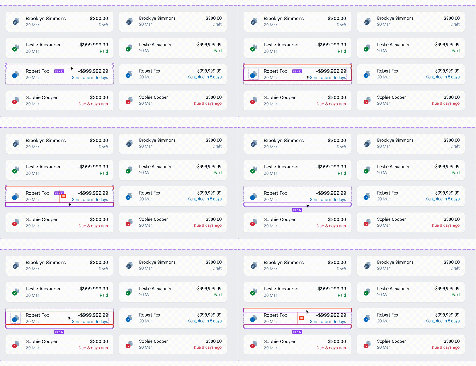
For engineers, navigating within components that were built with spacer just minimises the taps of accessing the specification, let’s have a look at how it works in the Uber design system.

⚠️
Caveats of using Spacer?
- One spacer might NOT work for all scenarios with the same spacing
- Spacers start off adding value once a spacing hierarchy established
Long story short, mobile components are anticipated to utilise Figma auto-layout for horizontal padding(e.g., 16px for left & right) whereas the verticals can be organised with Spacers. It’s more for consistency’s sake, and to eradicate rabbit holes while iterating on spacing(e.g., spacing within components using the same spacer on horizontal padding).
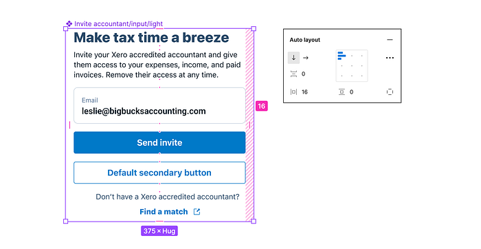
Apart from that, Spacers should be well considered for their semantic meanings. For an instance, we have 4 pieces of spacing now using 16px spacer(labelled in light green), but the first one is not expected to get changed. Hence, there should be two 16px-spacer in this scenario for design iteration.
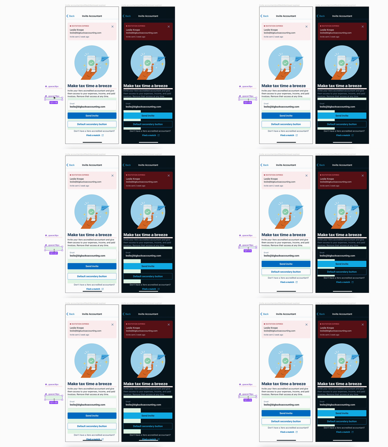
When it comes to sage advice about when to use what. There’s no shortcut answer down to this super granular level, unfortunately. The good news, alternatively, can be reckoned as the best practice: Have a spacer hierarchy with semantic/alias token on each spacer variant. Things like:
- Spacer/header-subtitle (-xsmall)
- Spacer/button-text (-medium)
- …
- Spacer/nav-offset (-xlarge)
- Spacer/footing (-2xlarge)
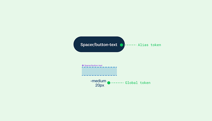
Only by having this scale, can we master the spacers performing in a way that caters to design needs in a meaningful manner.
😎
What’s in for collaboration with non-designer audience?
- Connect with engineering in an intuitive and common language
- Weave a seamless experience of design specification access
- Visualise complex ideas that are difficult to deliver verbally
Speaking in simple, apprehensible language matters for collaboration between different functional teams. Design engineering is no exception to that.
As we’ve covered, spacer performs a strong and clear indication of the spatial relationship between components, and within components. I’ve called to mind that one of my engineers told me:
Jacob, in answer to the question of how designers connect with engineers in a language that both can easily comprehend, the first thought in my mind is to contemplate, what’s the sage advice of human communication?
No wonder, it is the right level of information to deliver. I was desperate on reproducing the same way of structuring, laying out, naming, etc.. on the design system development that engineers can easily compute. From perspective-taking, however, engineering has certain sorts of technical implementation that our of our knowledge. As such, let’s just deliver the specification with maximum readability/accessibility for engineers, e.g., painting the transparent spacers with different colours as a legend.

In the end, to further deliver a seamless collaboration pattern, presenting complex design ideas such as responsive design by visualisation is a kicking approach! For example, by using a grid spacer to illustrate how the layout may be changed by adjusting the gutters, the designer can successfully convey a single source of truth to the non-designer audience in an apprehensible manner.
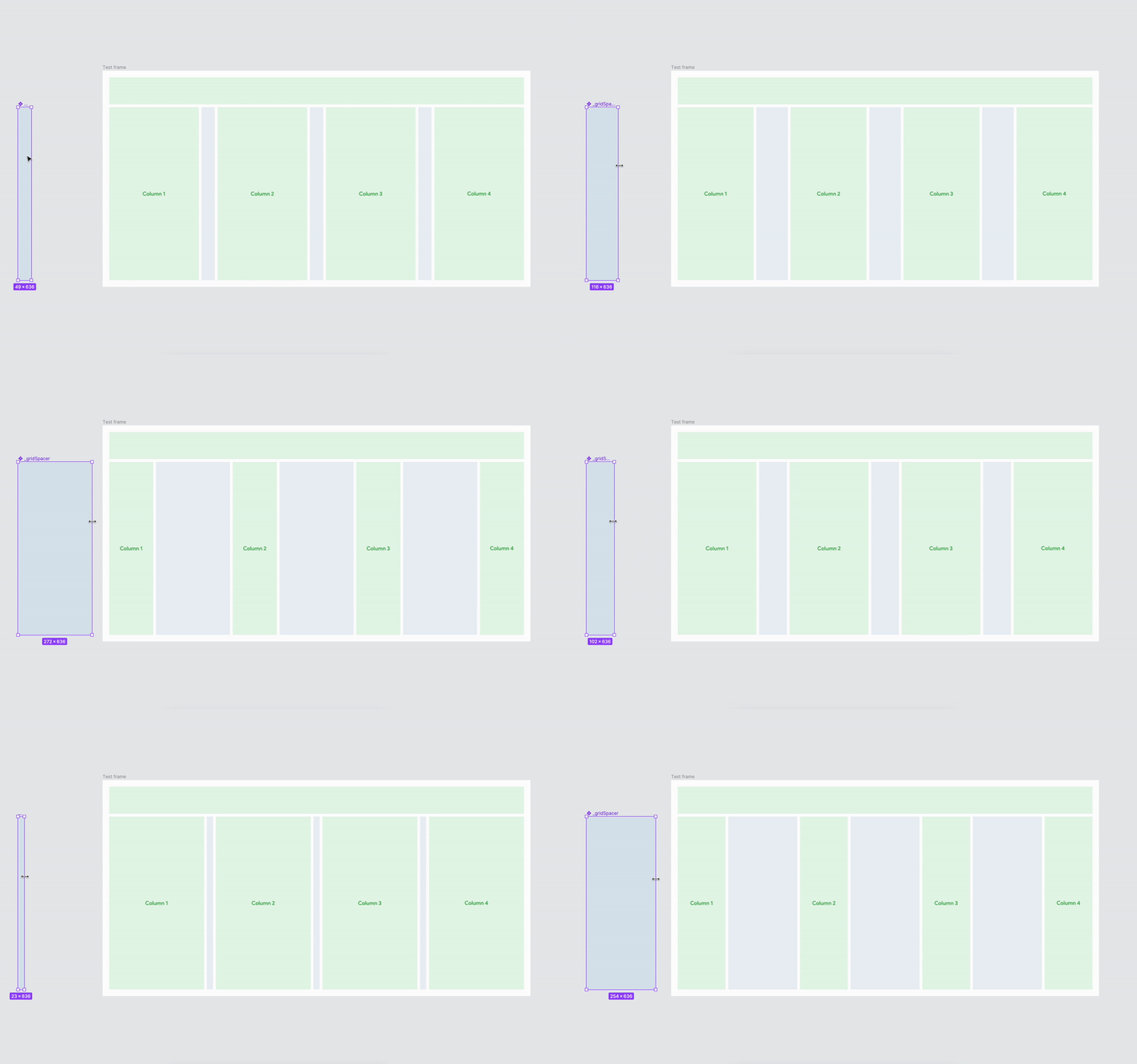
Last but not least, there’s no shortcut to a single answer of using spacer in your design system but acquiring a few kicking ways of collaborating brings team performance up there as we’re committing to deliver design in an intuitive, scientific and distinguishable manner.
Not every reasoning is evidence-based, sometimes making testable assumptions can help us go a longer way than just waiting for evidence to support a decision.
Most of the time, we can’t make decisions with thorough evidence, so believe in your design expertise then reflect and iterate on your methods in the design system, and design life journey.
👋
G’day, I am Jacob, a product designer who has been dedicated to UI/UX design, interaction, animation and design systems for years globally, currently living in Sydney, Australia, and working for Xero.

