A basic guide to understanding colors
Color is one of the first elements we register when we see something for the first time. Our understanding and culture lead us to develop associations based on colors, this tells our brain in what way we should react to colorful objects or designs. Colors certainly have meanings and our interpretations of such meanings are highly attached to our cultural background, age, trends and individual preferences.
Primary colors
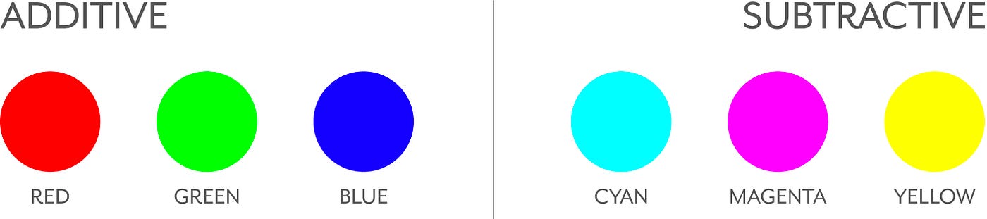
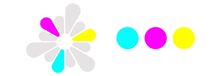
There are two types of primary colors, additive and subtractive. To put it simple, the additive primary colors are those obtained through the light it emits: red, green and blue. The combination of these three results in white. The subtractive primary colors are the ones associated with the subtraction of light: cyan, magenta and yellow, the colors used in four-color printing. The combination of these results in black.
Secondary colors
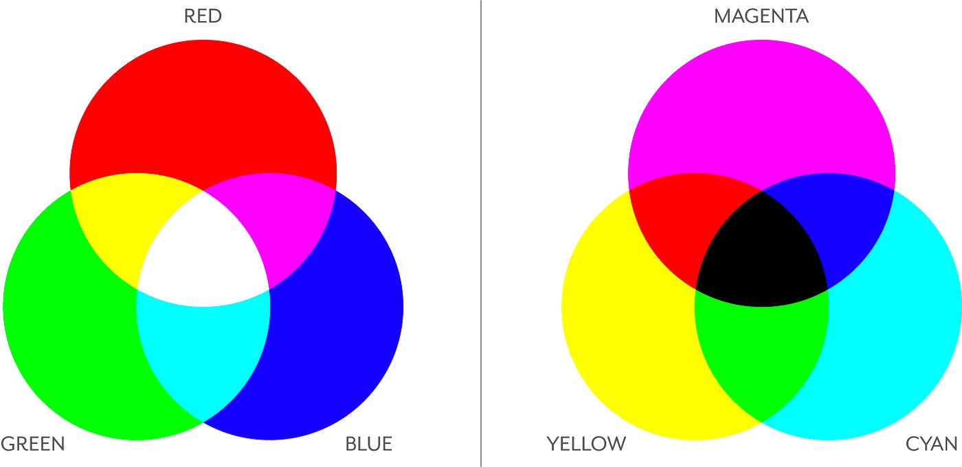
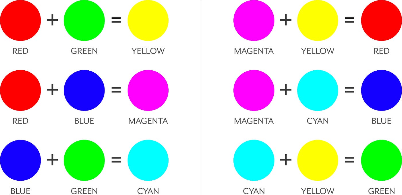
We can obtain a set of secondary colors within each group of primary colors. Secondary colors are created by the combination of any two primary colors in the same proportion. In the additive color space the secondary colors are cyan, magenta and yellow. In the subtractive color space the secondary colors are red, blue and green.
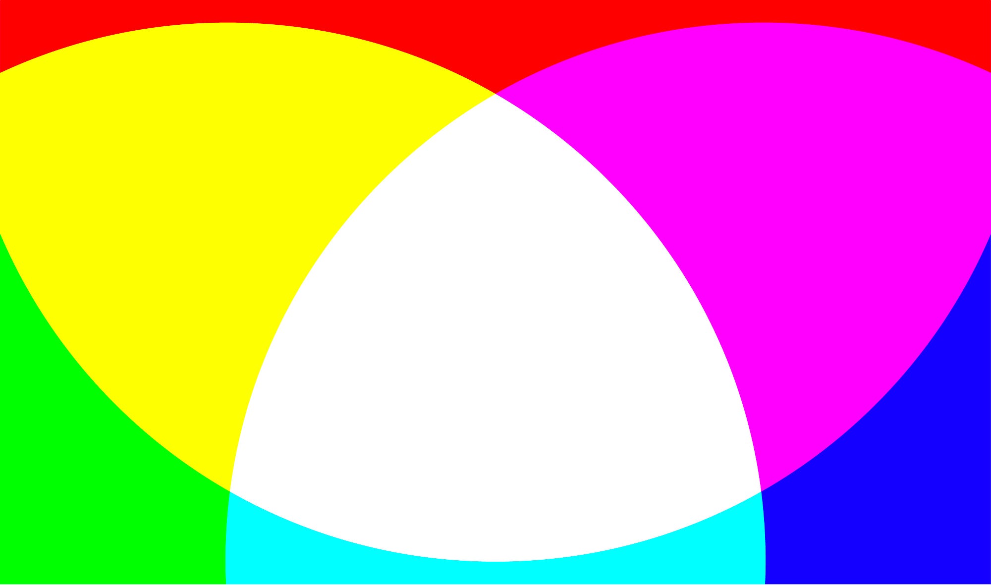
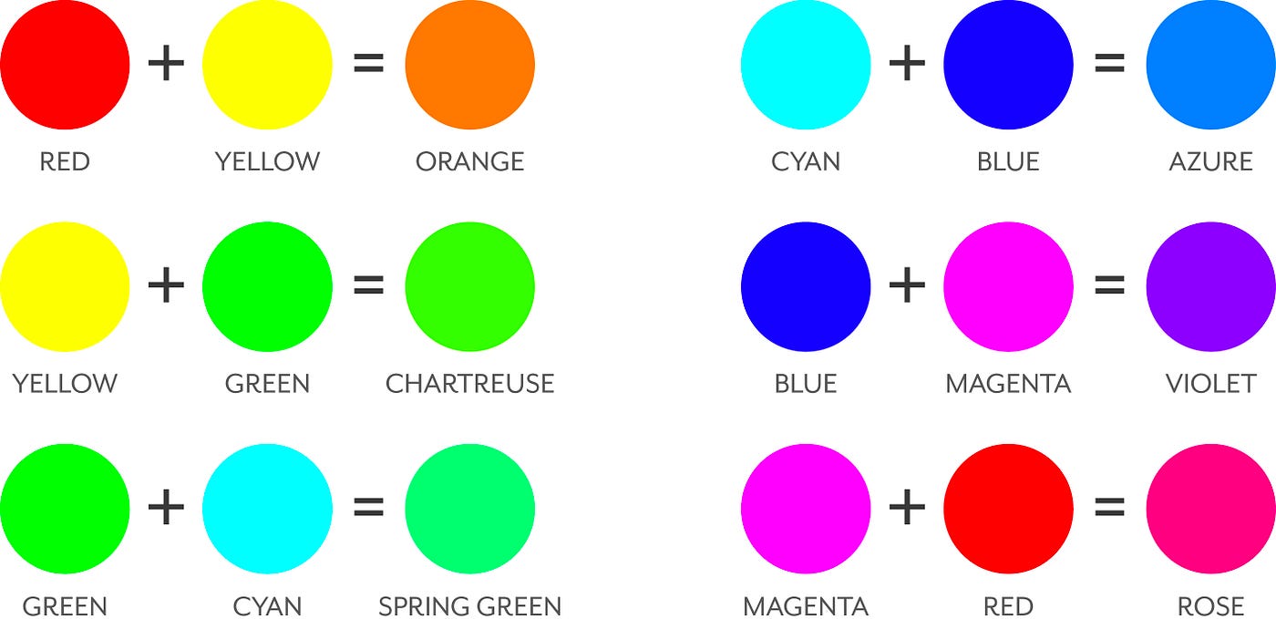
Tertiary colors
These colors are created by the combination of a secondary color and a primary color that was not present in the secondary color, in other words, mixing the subtractive primary colors (cyan, magenta and yellow) on the proportion of 2:1 or 1:2.
Describing colors
Every color represents an unique wavelength, but a list of different wavelengths values wouldn’t be a really useful description of each color. Imagine describing a beautiful green as 510nm? Not really practical and hard to visualise, right? At the same time, by just naming colors, we hit a descriptive barrier: what does “dark green” really mean?
For these reasons, to better describe colors, we use hue, saturation and brightness.
Hue
Hue, or just color, is the unique characteristic that helps us visually differentiate one color from the other. Hues are formed by the different dominant wavelengths. We’re talking about red, green, blue, etc.
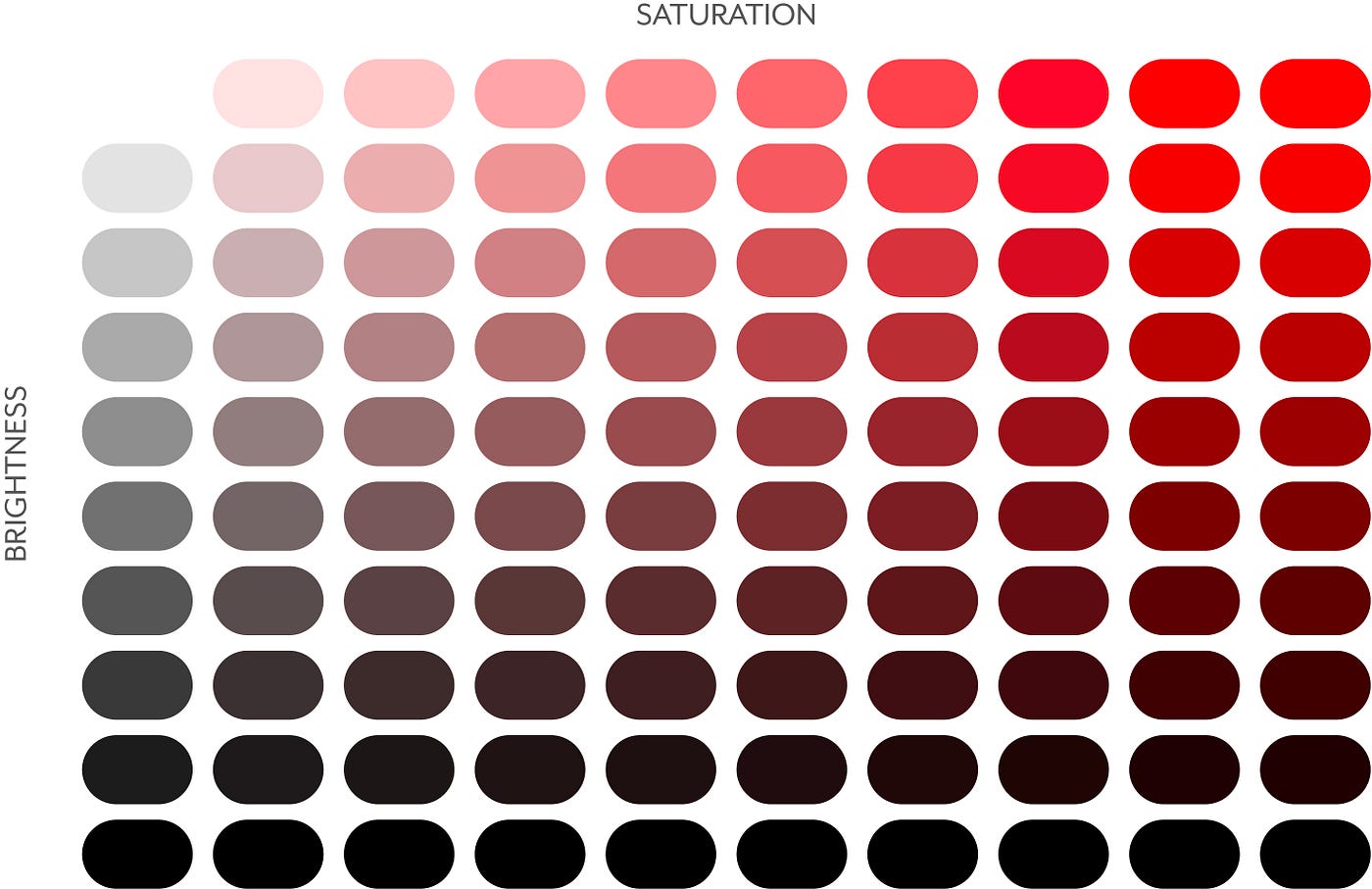
Saturation
Saturation refers to the purity of the color. The highest the saturation, the more pure the color is and the more vibrant it looks. The lowest the saturation, the less pure the color is and the closest to gray it gets, resulting in pale or softened colors.
Brightness
Brightness refers to how bright or dark a color is. Changes in brightness are made by mixing the color with different proportions of white or black
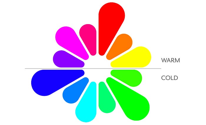
The color wheel
The color wheel helps explain the relationship between different colors (hues) and it’s an essential part of color theory. It classifies colors being a quick reference guide about primary, secondary and tertiary hues. Colors can be perceived as warm or cold based on how we experience them. Reds, yellows and oranges are considered warm colors, associated with the warmth of the sun or fire. Blues and greens, on the other hand, are considered cold colors, reminding us of grass or water.
Color harmonics
There are many ways in which it’s possible to harmonise colors, below are a few of these ways.
Monochromatic:
Any isolated color on the circle

Complementary:
Those on the exact opposite side of the wheel. These combined colors represent a high contrast.

Analogous:
The colors immediately adjacent to the selected color. These combined colors allow a harmonic and natural palette.

Triadic:
Any three colors that are evenly spaced on the wheel. Since all three colors are in contrast with each other, a triadic palette creates tension. The primary and secondary color spaces are triadic.
Split complementary:
Consists of three colors: the selected color and both the adjacent colors of its immediate complementary color.
Adobe has a great tool to quickly generate and visualise color harmonics: https://color.adobe.com/
Color models
A color model is a specific system of colors grouped together in order to create a whole range of colors based on an initial set of primary colors. It allows for colors to be described in a certain way, both in analog and digital representations. The two most well known color models are: RGB, referring to the primary colors of light: red, green and blue, and CMYK, referring to the primary colors of pigment: cyan, magenta, yellow and black.
RGB
Red, green and blue, are the primary additive colors, they correspond to the primary colors of light, each of which stimulates one of the three types of our eye’s color receptor. These three colors mixed cover a large part of the colors perceived by humans, and thus produce a good representation of the human color experience. Media that emits light, such as monitors and televisions, will use this color model.

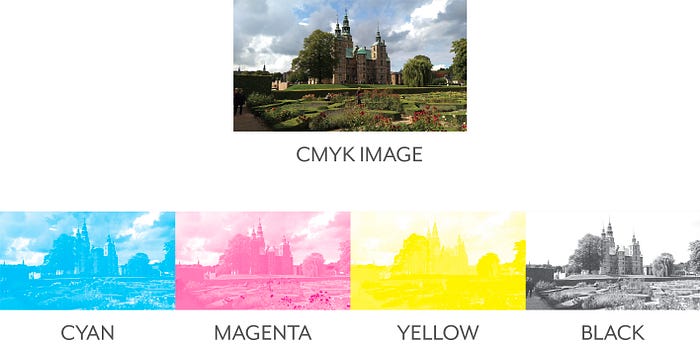
CMYK
Cyan, magenta and yellow are the primary subtractive colors, they correspond to the primary colors of pigment. Theoretically black can be obtained by mixing cyan, magenta and yellow, but in reality, a fourth pigment, black, is added to give more depth since the black generated only by combining the other 3 colors is not satisfactory commercially. The “K” in CMYK refers to “key”, being the Cyan, Magenta and Yellow printing plates carefully keyed or aligned with the key of the Black key plate.
Color symbolism
Colors hold meaning and trigger our emotions. The associations we make with colors can be on universal, cultural or personal levels. The meaning of colors are also dependent on context and can be influenced and changed with time. Since colors can influence the way we feel or relate to something, they’re usually described with emotional words such as “cold”, “warm”, “relaxing” or “uplifting”.

Conclusion
Being color one of the first visual elements processed by our brains, it’s important, especially for those who work on creative industries, to understand how they work and the meanings attached to them. This guide is far from being complete but I hope it helps those starting their careers and those that want to refresh what they learned years ago.
References
Color meaning and psychology: https://graf1x.com/
Ambrose, G., & Harris, P. Color
https://en.wikipedia.org/wiki/Color
Adobe color: https://color.adobe.com/
All images used in this article were produced by me and should not be used without permission.