Dashboards can be such a powerful tool. They can help you discover potential issues, investigate trends and give an overview of the performance. Despite this, dashboards could be useless if they are not designed well.
I have been designing complex, data-heavy web and mobile apps for the past 10 years. Furthermore, recently we were redesigning our operational dashboard so I want to share the steps we followed and what we learnt from that process.
4 questions you need to ask before building a dashboard:
- Who are your users?
- What type of business problem you are trying to solve?
- What type of decision needs to be made looking at your dashboard?
- How do data need to be visualised?
1. Who are your users?
Your dashboard starts and ends with your users. You need to design the dashboard considering the target audience and their interaction requirements. For example, depending on your audience, you may be designing dashboards for consumption on mobile or desktop devices.
Your target audience could be one of four categories:
- Executives
- Business users
- Data analysts
- IT users
Executives and data analysts will need analytical or strategic type of dashboard in order to investigate trends and improve business strategy. Business and IT users will need operational type of dashboard to closely monitor daily performance and report business activities.
10 questions to ask during user interviews in order to gain a better understanding of your users needs:
- What are the top goals in your role and how using analytics help you to achieve them?
- How often do you review metrics?
- What triggers you to look into data?
- What data would prompt you to immediately take an action?
- If you see this number increase/drop, what will you do next?
- How would you use data to understand the problem?
- What mistakes or missed opportunities could be prevented if you have data?
- What information do you need on a daily basis?
- What do you compare these numbers to? (historical, average, location…)
- How do you share information with others?
2. What type of business problem you are trying to solve?
There are plenty of key performance indicators (KPIs) your business will want to monitor. Identifying the right information to include is important to the success of your dashboard.
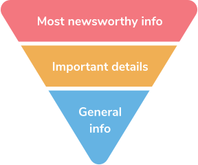
Key information should stand out and needs to be presented on the way that is clear, easy to understand and inspire action. Raw data is often complex and hard to digest. It would not be so easy to realize if you are doing better or worse looking just in raw data, at least not at first glance. Therefore, it is crucial to show insights and not only data.
For example, in our case one of the most important KPIs to track performance were final approval rate and fraud rate. Showing just approval rate would not help user and the insight that would help is to show that there has been an increase/decrease in numbers. It would be also helpful having the following scenarios why did increase/decrease happen and how it will impact the customer. If approval rate would significantly drop, it would require immediate attention and actions as it might be an indicator of fraud attack. In that case implementing notifications would be very helpful to trigger user attention.

3. What type of decision needs to be made looking at your dashboard?
There are two main types of dashboards: operational and analytical. Choosing which type of dashboard to build depends on the type of the problem you are trying to solve and decision needs to be made looking at your dashboard. Is it supposed to help users understand and monitor performance of an established process or to explore a new course of action?
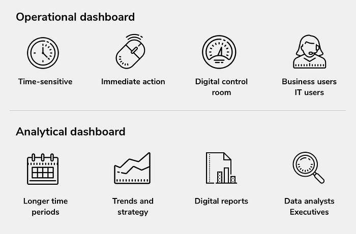
An operational dashboard is designed to provide a comprehensive snapshot of the performance of the day. An example of an operational dashboard is a Daily Web Overview Dashboard. It tracks hourly web performance against predetermined objectives for a digital marketing team.
Analytical dashboard is a tool that helps users analyse large volumes of historical data across multiple variables in order to investigate trends, predict outcomes and discover insights. An example of an analytical dashboard is Financial dashboard that helps decision-makers to see how efficiently the company’s capital is being spent and to establish a specific operational task to structure future decision better.
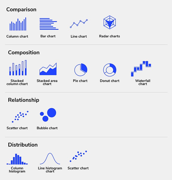
4. How do data need to be visualised?
Visualisations are an essential part of dashboard design. It is much easier for users to spot trends in a chart rather than going through a data file that could have thousands of entries.
Here are a few tips for better data visualisation:
- Avoid scrolling when possible
- Choose the right type of graphs
- Put the data in context
The most important information in a dashboard must fit on a single screen. If your users have to constantly scroll to read data or see filter panel, they will eventually get tired and discard your dashboard.
Choosing the right type of the chart for your data is the most important part but often could be the trickiest one. For example before redesign of our dashboard, line charts were used for almost everything. We also used pie chart for decline distribution comparison between different countries. Bar charts for example would be much more suitable for displaying a comparison between several sets of data.

When to use which chart:
When it comes to analysing data, context is everything. If you present just raw data, user will have a hard time trying to find the story hidden behind numbers. User needs to have some references to compare in order to evaluate if shown numbers are positive or negative sign.
If you are e-commerce service, at first you want to know how many payments your fraud prevention system is automatically accepting, how many it rejects, and how many it sends for manual verification (if any). Second you will want to see if your fraud rate getting minimized over time without sacrificing legitimate business. Also the appropriate references may change depending on the KPI you are dealing with. Some of them you will want to compare to last year’s or month’s performance, but others may be by country distribution, card scheme, industry standard or product.
Key learnings
- It is crucial for dashboard design to identify who are your users, what business problem you are trying to solve and what decisions will be made by looking at your dashboard. If you are unable to answer either of these questions, building dashboard will in all likelihood be a waste of time.
- The type of dashboard you create depends on the metrics and KPIs that you need to track. By identifying these metrics at the start of your project, you will understand what you’re trying to accomplish.
- Showing insights rather than just raw data will help your users to instantly spot trends and figure out how business is performing.
- Choose the right type of charts to present your data
- At the end of the process, you will need to integrate your audience’s feedback into future iterations of your dashboard design. User-driven feedback allows you to make your dashboard as effective as possible, and address the specific objectives of your audience.
Thanks for your time :)
References: