Best Practices for Designing App Store Screenshots
App Store Screenshots are very important marketing assets. They illustrate compelling stories, showcasing the app’s primary function and purpose. App Store Screenshots are the first thing users see when they search for your app. Many of the Apps are not limited to screenshots only, and use video to stand out their app from the competitors.

Why Care?
I know what you are thinking, why do I care about App Screenshots? Why not just download a template from the web and put some of the best screens of your app in it and share it? But think again, App Screenshots are the first impression your app gives your customer, screenshots comprise of almost 75% of the app listing the App Store search result page, and the list goes on and on. But here are the main reasons I personally think why do we care about App Screenshots:
- Apple and Google app stores have made screenshots more prominent — now more visible than the app description text.
- Customers often compare screenshots to competitors to validate potential purchases.
- Localized screenshots open your app to entirely new and large customer bases
Some Important Points
Before you start designing those beautiful App Screenshots, here are some points to keep in mind:
- It takes an average of 7 seconds for a user in the App Store to make up their mind whether they want to download your app or not.
- Only 4% of users click on App Screenshots in portrait, 2% in landscape mode. And this number is very low for games, 0.5%.
- Only 9% of users scroll the past first screenshots (portrait) and only 5% (landscape).
We consistently observed that fewer than 4% of users looking for an app enlarge portrait screenshots, and only 2% enlarged landscape screenshots. For gamers, it’s even less at just 0.5%. This is probably because the gameplay is usually clear enough even from thumbnails — Peter Fodor
No. of Words and Font Size
After seeing the above metrics, designers tend to design screenshots that are clearly visible and convey their message without tapping them. Let’s look at some screenshots redesign from 2016 to 2018. Notice how almost every one of them has fewer words and bigger fonts.

Number of Screenshots
78 of the top 100 apps have five screenshots, 13 apps have four screenshots, 6 apps have three screenshots and 3 only have two. I say that we have to explain the most important user story of the app in the first two screenshots.
The findings of our research make it clear that you HAVE to explain the core benefit of your app in first two (iOS10, Google Play), or three (iOS11) screenshots if you are using portrait images. If you really want to use a landscape image, you’ve got just one — Peter Fodor
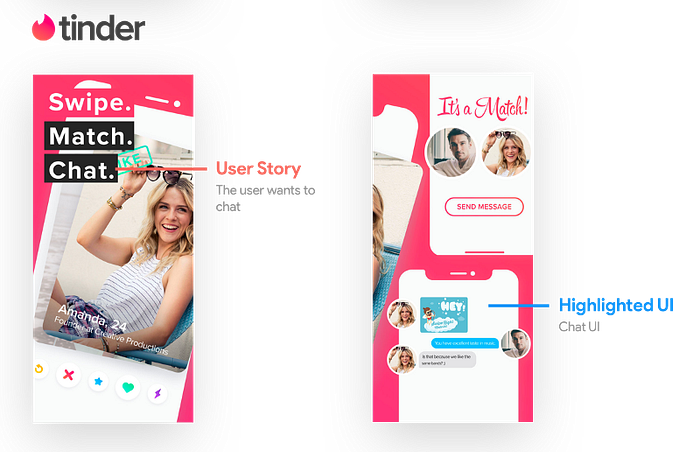
Highlighted UI Elements
Users glancing at your screenshots are trying to gauge the functionalities of your app. Text captions help them understand the context behind the screens. Designers are making it even easier for users by highlighting UI elements that the text caption is trying to explain. Below is a good example of that:
Video
- On average, only 2% of users play videos on the store listing (source: AppAgent).
- Another source claims that having a video can increase install rates by more than 25% (Source: Storemaven).
- Despite having auto-play in the latest App Store versions — there are many scenarios where the video doesn’t play automatically like when the device is on low battery mode.
It probably depends on the type of app: in games, being able to view the game in action is critical before downloading cause screenshots are often not enough.
Best Practices
- Explain the most important use story of the app in the first two screenshots.
- Increase font size and cut down on the text.
- Highlight UI elements that represent text captions.
- By combining screenshots, you can maximize the value that you and your app store page viewers get from them.
Further Readings
If you find this article useful please share that with your designer friends and follow me on Instagram where I share more cool stuff related to design.