Member-only story
Best Practices for Designing UI Cards
Cards UX Design Guidelines + Types of Cards

Non-Medium members can read the story here.
Cards are important UI components that organize and present information in a clear and user-friendly format.
Due to their flexible and modular layout, cards can be used across various applications, helping users quickly engage with content.
Designing a card requires consistently applying UX principles to ensure it serves its purpose effectively.
This article covers best practices and UX guidelines for designing cards. In the later section, we will explore different types of cards that can be used in various situations.
Why UI cards are important
- UI cards are versatile containers that visually group information and actions related to a specific subject.
- They help break down complex data into digestible sections, making it easier for users to navigate and understand content.
- Cards can dramatically improve engagement by allowing users to interact with the content effectively.
Best Practices for Designing Cards UX
Anatomy
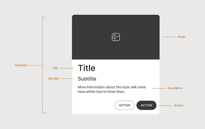
This is a basic card structure. Other optional elements can be added based on requirements.

Header: Typically includes a title or image that describes the card’s content.
Image: Images add context to the content. Add a relevant image to make your card visual (like product cards).
Content Area: This section contains the primary text, such as a brief description, title, or other key information. Keep content concise and well-structured.
- Title
- Subtitle
- Description: A brief description of the card content. It can contain a few icons, tags, etc. to support the content.
- Image: An optional image can be included within the content area.

