
Best Practices for Flat Design
by Nick Babich
Flat design is a more sophisticated cousin of minimalism —all elements of flat design are centered around the idea of simplicity. However, the simplicity of flat design is hard to achieve because everything in your product should be both visual attractive and functional.
Let’s look at what you can do to make flat design works for your users.
Invisible Design
Remove unnecessary styling
Practice “invisible design” — make design choices that your users won’t notice. Every time when user’s attention is focussed on individual design decisions the visual design dominates on the message you want to convey. Your goal is to help users quickly and easily understand certain actions and messages. Thus, your design should strip down visual elements to expose their core functionality.

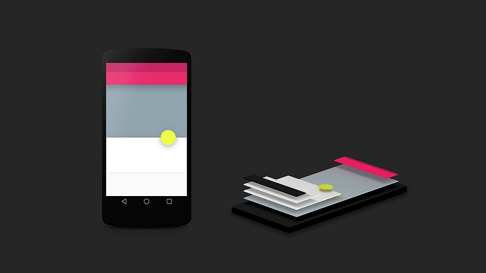
Vibrant Colors
Color is a major part of flat design’s efficacy
Color is a large part of flat design — it basically sets the whole feel of your product. Flat design uses bright and colorful color palettes.
Tips:
- Material Design and Flat UI Colors provide a good guide for choosing colors.
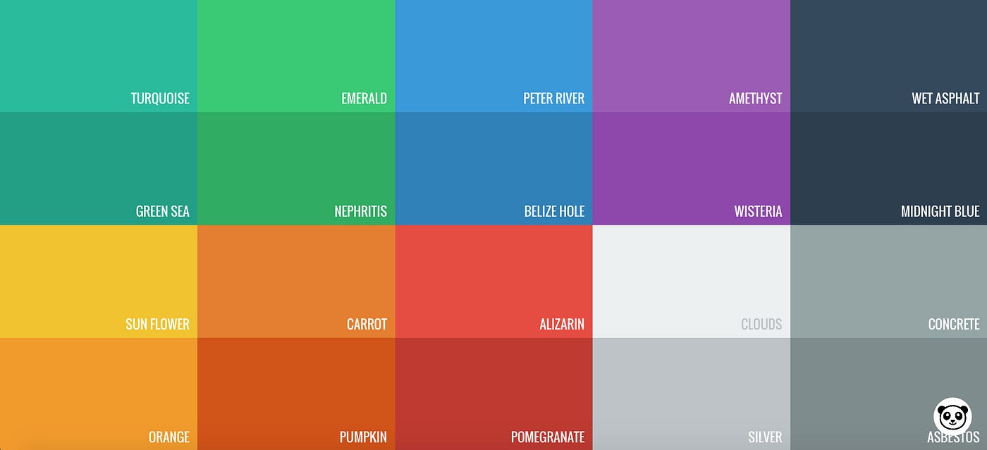
- Try to use slightly desaturated colors because they tend to add aesthetic beauty to your page without making your reader’s eyes bleed.

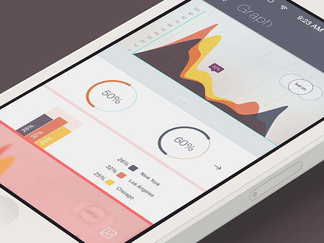
- Use bright colors as accents. Notice how accent colors make the imagery seem to pop off of the page in example below.

- Ensure that the colors you choose are accessible for your users. Test your color palette to make sure you have enough color contrast.
Focus on Typography
Reinforce your design with good typography
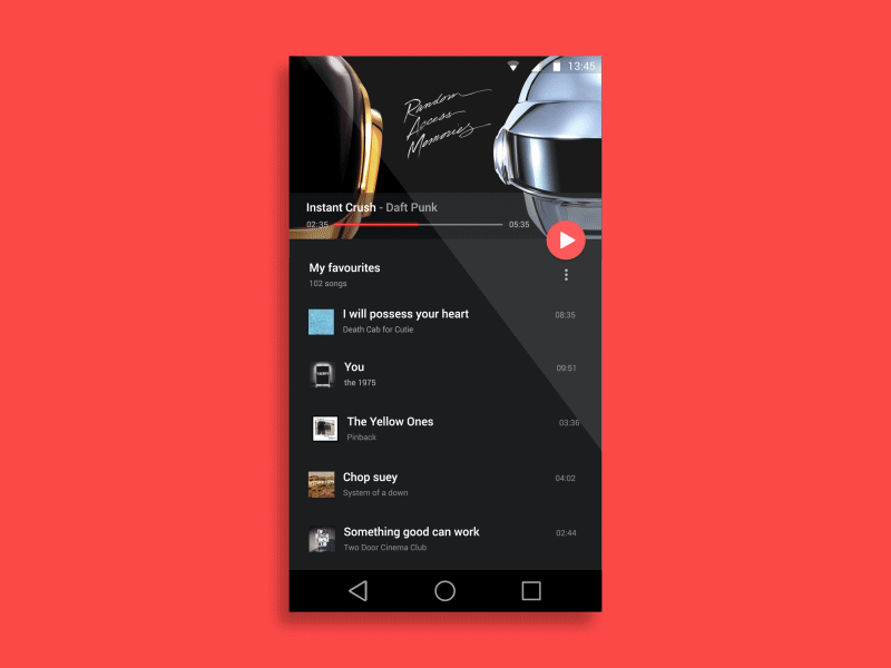
Most information in your product is provided as text. Typography is one of the key elements for creating a visual hierarchy. It should tell users what is most important on the page. It’s better to use simple typography because it’s easier to read — users won’t focus on individual typefaces and focus on reading your message.
Tip: The tone of typefaces should match the overall design aesthetics. A highly embellished font might look odd against a simple design.
Motion
Motion makes flat design more user-centric and alive
Motion can reinforce flat design visual simplicity. When users interact with your app or site, they typically ask the following questions:
- “What’s most important on this page?”
- “How do I know what to do next?”
- “How do I know I have completed my task?”
You can use motion to help users answer those questions. Motion can:
- Drive user’s attention and hint at what will happen next.
- Help you orient users within the interface and provides visual cues
- Help you keep user focus between states.
- Provide a visual feedback on user interaction. Motion acknowledges that users completed a certain operation.
Motion-based design elements can be seen in a variety of forms, including transitions, animations and even on texture to mimic 3D depth.
Illustrations
Use illustrations to convey the key ideas about your product
Pictures speak louder than words
Properly-created illustrations clarify messaging by boiling down concepts into easily-understood visuals.

Flat 2.0 Design
Interaction should be intuitive for users
The biggest problems you will face when designing a flat UI are the interactive elements. Users need to know which areas of the page are static and which are interactive. True flat design lacks of visual affordances. In many cases users have to guess what objects are interactive and what are static. Recently, designers have begun to realize this problem. As a result, a more mature and balanced interpretation of flat design has emerged — Flat 2.0 design:
Flat 2.0 design takes the best from minimalism and skeuomorphism and makes them work together
Flat 2.0 design uses subtle shadows to convey the interactivity. Shadows give the necessary visual clues to users so they will know what can be clicked.
In example below you can see how the subtle use of fine shadows all around the edges of CTA buttons gives buttons raised impression.
Conclusion
Flat design brings us a step closer to a new paradigm of digital design, where the functionality and aesthetic live in complete harmony.
P.S. If you want to know more about Flat Design I suggest to read the article “Flat Design. History, Benefits and Practice” full of amazing illustrations. Enjoy!
Thank you!
Learn how to design user interfaces
Interactions between computers and humans should be as intuitive as conversations between two humans. Interaction Design Foundation will help you to learn how to design for efficiency and persuasion.
Follow UX Planet: Twitter | Facebook
Originally published at babich.biz

