Best Practices for Hero Images
by Nick Babich
When users come to your page, they’ll have some kind of reaction. Whether it’s positive or negative, in large part, is determined by what they see. Since vision is the strongest human sense, hero images are one of the fastest ways to grab a user’s attention. Powerful imagery helps to engage the user and engage them into interaction with your website.
A hero image is more than just a pretty picture. It’s a powerful communication tool.
In this article I’ll give you a few tips on using hero images.
Use Only Relevant Images
Be choosy when it comes to photo selection
Images can make or break UX. It’s important to choose pictures that fit the purpose of your product. When you choose the wrong image you give your visitors a wrong message.

But when you pick the right one, your visitors will know what you offer without reading the text.

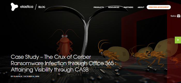
Make The Image Your Centerpiece
Hero images are the perfect container for one bit of information
Hero images should make visitors stop and examine the site each time they visit. That’s why choose pictures that are distinct and stands out.

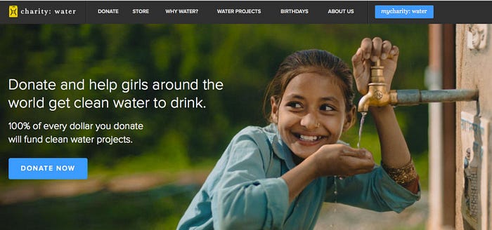
Select Emotionally Persuasive Images
Bake emotion into the design
People are both rational and emotional. When products create emotional connection with users, they have a better chance for success. That’s why try to select images that have a positive emotional impact, create inspiration, and reinforce the feelings you are trying to create.

Use Only HD Visuals
Images should not appear pixelated or blurry
Nothing is worse than a large, low quality image. The image is everything if you’re going to use this technique. It’s vital to make sure that a user’s first impression is positive. Include high-quality images to make sure this happens.

Emphasise Call To Action Buttons
CTAs should’t compete with a colorful image
While the image will steal the show in this type of design, you still need to include essential elements, such as a calls to action. It’s vital to use contrasting color to create emphasis on certain elements.
Design For Contrast
Make typography legible on the top of imagery
If you are planning to use a text-on-image design, ensure that the main part of the image is visible and understandable when text is placed. Perhaps the easiest method to put text on an image is to add dark overlay over the hero image.
Alternatively you can apply text protection in the form of scrims:
A scrim is a visual design technique for softening an image so overlaid text is more legible.
You can find more techniques in article Design Considerations: Text on Images
Tip: If you are planning to use a text-on-image design, ensure that the main part of the image is visible and understandable when text is placed.
Consider Different Screen Sizes
Make sure your image works on all devices
Make sure your images are appropriately sized for displays and across platforms. Optimize image for all devices, even if this includes resizing or swapping out a larger image for a smaller one on a smaller device.
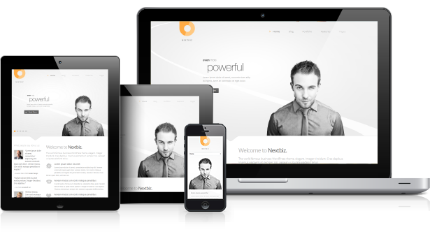
Tip: Use tools that allow you to manage multiple sizes for your image. One of them is Cloudinary which enables you to interactively generate responsive image breakpoints.
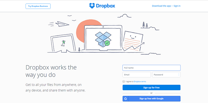
Consider Using Illustrations
Add your personal touch
Illustrations are quickly becoming a popular alternative to photos. They help designers to convey more details. But if you will use illustrations for your design ensure you have a consistent design in different parts of your app. Illustrations should feel like they created by the same person.
Conclusion
Hero images are great way to create interesting look at and empower your content at the same time. Just don’t forget about color contrast and clear call-to-action buttons to make the user experience great.
Thank you!
Learn how to design user interfaces
Interactions between computers and humans should be as intuitive as conversations between two humans. Interaction Design Foundation will help you to learn how to design for efficiency and persuasion.
Follow UX Planet: Twitter | Facebook
Originally published at babich.biz