
Best Practices for Long Scrolling
by Nick Babich
The days of “above the fold” are over. Long scrolling and infinitely scrolling sites are becoming more and more common lately, and it’s no mere trend or coincidence. The technique that allows user to scroll the content without any interruption or additional interaction has the following benefits:
- Simplifies navigation.
- Has more storytelling potential to engage users.
- Translates well to mobile devices.
The increased use of mobile screens has definitely played a key role in the widespread acceptance of this technique:
The smaller the screen, the longer the scroll
Furthermore, the gesture controls of mobile devices make scrolling intuitive and fun. However, long scrolling isn’t without its drawbacks. Here are a few best practices to follow to make sure that your long scrolling meets user expectations.
Use Visual Cues
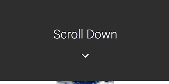
Inform users that most of the content is below the fold
A subtle visual cue, such as an arrow pointing off-screen or a copy “scroll down”, can inform users that most of the content is available below the fold.

Keep Navigation Options Persistently Visible
Use sticky navigation or jump-to-page option
Disorientation is one of the biggest problem of long scrolling. Users may get lost along the way and this inability to understand current location causes annoyance and confusion to the users, and hurts the overall user experience.
When you design longer-scrolling pages, keep in mind that users still require a sense of orientation (“Where am I?”) and navigation (“Where can I go from this page?”). The obvious solution for this problem is a sticky navigation menu which shows current location and remains on the screen in the same position at all times.

If for some reason you cannot add a navigation bar, you should consider a jump-to-page option that is visible at the right side of the page.

Mobile devices only: Because a mobile screen is much smaller, a visible navigation bar can take up a relatively largely portion of the screen. It’s a good idea to hide a navigation bar on scroll and reveal it when users start pulling down trying to get back to the top.
Design Screen as Page
Let the content dictate the scroll length, not the other way around
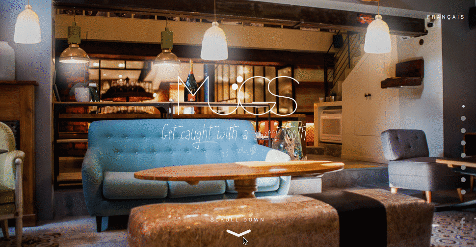
Some websites can benefit from using a technique of digital magazines-when a user goes through a set of screens that represent a part of the same story. This format helps visitors understand the message because screens are revealed in a linear fashion. For example, each section in Le Mugs site includes its own piece of information that is wonderfully bolstered by activated animation.
Incorporate Functional Animation
Use animation to establish a connection with users
Animations is essential part of interaction design. Long scrolling enables creative elements like parallax scrolling and scroll-activated animations. They turn scrolling experience into something more fun and makes the user wonder “what will happen next?”
Parallax Effect for Storytelling
Parallax scrolling involves the background image moving slower than the content in the foreground, creating an illusion of depth and immersion. Parallax is more than an entertaining visual effect. When properly used, it can provide the kind of smooth visual narrative that will keep a user engaged.

Conclusion
Long scrolling can create a completely immersive browsing experience. If users like the UI and find it intuitive, then they won’t really mind the length of the scroll. Thus, focus on your user goals and make things more convenient for your users.
P.S. In article Five Rules For Good Infinite Scroll you can find best practices for infinite scrolling.
Learn how to design user interfaces
Interactions between computers and humans should be as intuitive as conversations between two humans. Interaction Design Foundation will help you to learn how to design for efficiency and persuasion.
Thank you!
Follow UX Planet: Twitter | Facebook
Originally published at babich.biz

