Best Practices for Mobile App Navigation: The Basics

Design is not only about nice looks, it’s also about how easily users can navigate through the product and how well they can interact with it. It’s better to view navigation as a conversation. If the users think it’s beautiful but they cannot use it, then throw it away! That’s not what product design should be like. That said, you might want to know what are some of the best practices of mobile app navigation. Let’s take a look at a few basic things below.
Don’t forget about the thumbs
Steven Hoober has conducted a research study where he has found that 49% of people use only one thumb to do things on their phones.

This means that when designing, take into consideration the fact, that your app will be used in different ways. As a rule of thumb, it’s important to place frequently-used actions at the bottom of the screen. This way, the users will be able to reach them easily either when holding the phone in one hand or two hands.
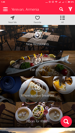
Note the bottom tab bar
A lot of apps including LinkedIn and Instagram, use the tab bar for their most important features. For example, Instagram makes its core functionality features accessible through the tab bar. This allows switching between features really fast.

Note that you can display a badge on a tab bar icon to show that there is new information associated with that view.

There are a few things you should keep in mind when designing bottom navigation:
- Show only the most important and the most frequently-used destinations
- Avoid using scrollable icons in the tab bar
- Avoid using icons of different colors in your bottom tab bar
Use Card-style design
Cards are a great thing to use in your mobile app interface design. They can display actionable content. They allow content to naturally reveal itself. And they also give the user this very fun feeling of swiping this way or another.
An example of a common approach would be Google Primer app. You can tap on each card and then swipe away the cards inside every time you are done with reading what is written on each of them.
Avoid clutter
By avoiding the clutter, you make the design cleaner. And you also prioritize content this way. Space be it white or not contributes to readability. It makes the UI look simple and easy and also improves the UX.
Think about full-screen navigation sometimes
Full-screen navigation is just the opposite of saving some space but it can be the best navigation design option for some mobile apps. The full-screen navigation is basically a home page that lists all navigation elements. This kind of navigation is good for coherence and simplicity. Of course, if you choose the pictures/colors properly.
Add a search box
When there is no search box or at least a magnifying glass icon in an app, it feels like you are locked in a very dark room. So, make sure you give your users the freedom of searching for whatever they want. Don’t hide that search box.

Don’t underestimate the hamburger menu
A hamburger menu is basically the main menu which contains a few lists of detailed options in it. Note that the popularity of both the hamburger navigation concept and its alternatives is growing. But the sad news is that sometimes people cannot guess that there are some more things behind the hamburger icon unless they see the word “Menu” there. But still, if you have got a complex app and you have a lot of content to display, then hamburger menu is what you need.

Final thoughts
Product and UX designers are facing the challenge of making app navigation simple and easy to use. While doing this, they also struggle to preserve enough screen space to display all the interface elements, to avoid clutter, and to prioritize content. These are real struggles they face every day. But with these basic navigation best practices in mind, it will be easier to design user-friendly interfaces. Happy designing!
If you enjoyed this article, feel free to hit that clap button 👏 to help others find it.
Follow Inapptics: Medium | Twitter | Facebook
Originally published at blog.inapptics.com on February 15, 2018.
Read Next:

