
Best Practices for Modals / Overlays / Dialog Windows
Modals, Overlays, Dialogs, whatever you call them it’s time to revisit this UI pattern. When they first came on the scene, modal windows were an elegant solution to a UI problem. The first being that it simplifies the UI, the second, it saves screen real estate. Since then designers have readily adopted the modal window and some have taken it to the extreme. Modals have become the today’s version of the dreaded popup window. Users find modals annoying and have been trained to instinctively and automatically dismiss these windows.
Definition:
A modal window is an element that sits on top of an application’s main window. It creates a mode that disables the main window but keeps it visible with the modal window as a child window in front of it. Users must interact with the modal window before they can return to the parent application. — Wikipedia
Usage
You may consider using a modal window when you need to:
Grab the user’s attention
Use when you want to interrupt a user’s current task to catch the user’s full attention to something more important.
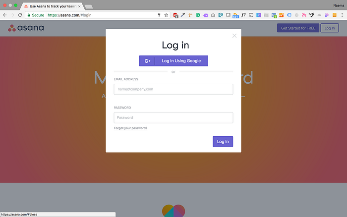
Need user input
Use when you want to get information from the user. Ex. sign up or login form.
Show additional information in context.
Use when you want to show additional information without losing the context of the parent page. Ex. showing larger images or videos.
Show additional information (not in context)
Use when you want to show information that is not directly related to the parent page or other options that are “independent” from other pages. Ex. notifications.
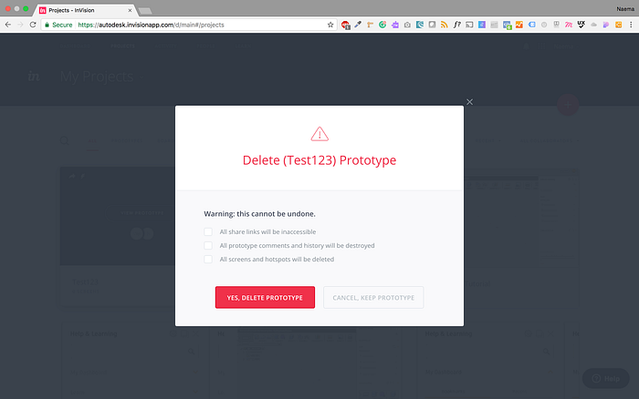
Note: Do not use to show error, success, or warning messages. Keep them on the page.
Anatomy of a Modal Window
Poorly implemented overlays can hinder task completion. To ensure your modal doesn’t get in the way make sure to include the following:

1. Escape Hatch
Give users a way to escape by giving them a way to close the modal. This can be achieved in the following ways:
- Cancel button
- Close button
- Escape key
- Click outside the window
Accessibility Tip: each modal window must have a keyboard accessible control to close that window. Ex. escape key should close the window.
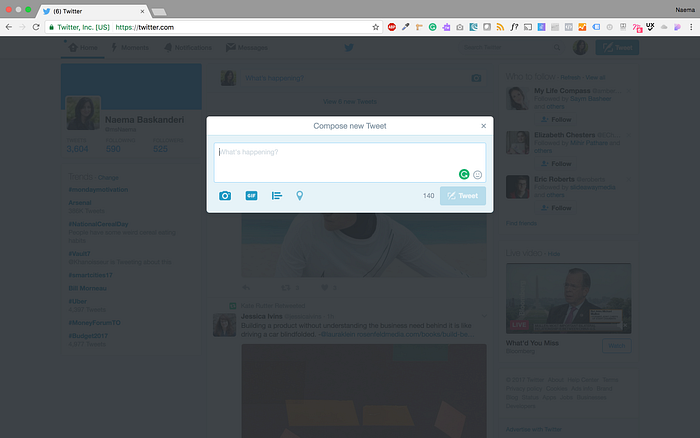
2. Descriptive Title
Give context to the user with the modal title. This allows the user to know where he/she is because they haven’t left the original page.

Tip: button label (which launches modal) and modal title should match
3. Button
Button labels should have actionable, understandable names. This applies to a button in any instance. For modals, a ‘close’ button should be present in the form of a labeled ‘close’ button or an ‘x’.
Note: Don’t make the button labels confusing. If the user is trying to cancel and a modal appears with ANOTHER cancel button, confusion occurs. “Am I cancelling the cancel? Or continuing my cancel?”
4. Sizing & Location
A modal window should not be too big or too small, you want it juuuuust right. The goal is to keep context, therefore a modal should not take up the whole screen view. Content should fit the modal. If a scrollbar is needed, you may consider creating a new page instead.
- Location — upper half of the screen because in mobile view modal may be lost if placed lower.
- Size — Don’t use more than 50% of the screen for the overlay
5. Focus
When you open a modal use a lightbox effect (darken the background). This draws attention to the modal and indicates that the user cannot interact with the parent page.
Accessibility Tip: put the keyboard focus on the modal
6. User Initiated
Don’t surprise users by popping up a modal. Let a user’s action, such as a button click, following a link or selecting an option, trigger the modal. Uninvited modals may surprise the user and result in a quick dismissal of the window.
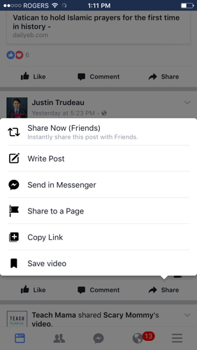
Modals in Mobile
Modals and mobile devices usually don’t play well together. Viewing the content is difficult because modals either are too large, taking up too much screen space or too small. Add in elements like the device keyboard and nested scrollbars; users are left pinching and zooming trying to catch the fields of a modal window. There are better alternatives for modals and shouldn’t be used on mobile devices.
Accessibility
KEYBOARD
When creating modals remember to add in keyboard accessibility. Consider the following:
Opening modal — The element which triggers the dialog must be keyboard accessible
Moving focus into the Dialog — Once the modal window is open, the keyboard focus needs to be moved to the top of that
Managing Keyboard Focus — Once the focus is moved into the dialog, it should be “trapped” inside it until the dialog is closed.
Closing the Dialog — Each overlay window must have a keyboard accessible control to close that window.
For more information on the list above check out Nomensa’s blog article
ARIA
Accessible Rich Internet Applications (ARIA) defines ways to make Web content and Web applications more accessible.
The following ARIA tags can be helpful in creating an accessible modal: Role = “dialog” , aria-hidden, aria-label
for more information on ARIA, check out Smashing’s Magazine article
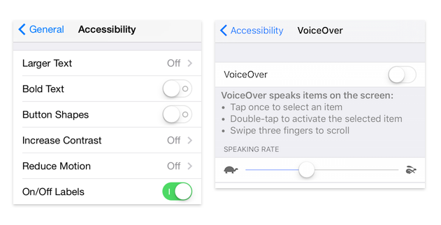
Also, remember low-vision users. They may use screen magnifiers on monitors to enlarge the screen content. Once zoomed in the user can only see part of the screen. Here modals will have the same effect as they do in mobile.
Conclusion
If people have been trained to automatically try to close modals, why would you want to use them?
Getting the user’s attention, keeping context and simplifying the UI are great benefits of modals. However, there are downsides as they interrupt the user flow and make it impossible to interact with the parent page by hiding the content behind the modal. Modal may not always be the answer. Consider the following when making your choice:
Checklist
- When do we show the modal?
- How do we show the modal?
- What does the modal look like?
- What information do we present and collect?
There is an alternative UI component to modals: non-modal or a.ka. toast (term used by Google in Material Design & Microsoft). Check out my next post to learn more.
If you want to learn more about any UI component or UX subject, please follow me and let me know. I’m always looking to provide insightful info :) And please recommend this article if you found it useful.

