Best typography practices for dyslexia
How to make websites more accessible for users with dyslexia.
Dyslexia is a language-based learning disorder which can lead to difficulties in reading, spelling, and writing. This is because individuals with dyslexia may have trouble identifying phonemes (or speech sounds) and connecting them with the letters that represent them.
With an estimated 9–12% of the worldwide population affected by dyslexia, how do we design our online UX experiences to best accommodate their needs?
But first, some basic typography terms
Before I get into typography for dyslexia, I want to quickly go over general typography terms.
A typeface is a set of glyphs (or characters) which share common characteristics. A font is a distinct, or specific, style within the typeface. For example, Helvetica is a typeface and Helvetica Light is a font. (It might be easier to think of a typeface as essentially being a font family.)

A serif is a decorative line or stroke that may appear on glyphs. Times New Roman has serifs, so it is a serif font. Arial does not have serifs, making it a sans serif (without serif) font.
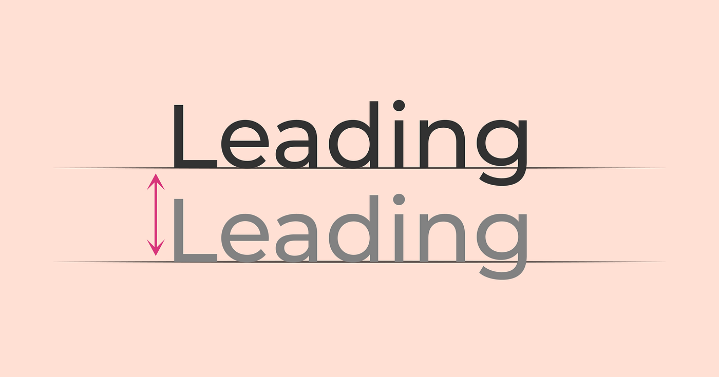
Leading is the vertical distance between lines of text.

Tracking is the evenly distributed horizontal distance between all characters in the text.

Lastly, kerning is the distance between two individual characters.
River effect

Now onto the main topic of the article: let’s start with the “river effect”, which occurs when there are large gaps of whitespace within a text block.
Most seasoned designers will tell you to stay away from justified and center-aligned text blocks because they can look messy or ugly.
But besides being more aesthetically pleasing for longer paragraphs of text, there’s a functional reason why you should typically make text left-aligned: it reduces the river effect.
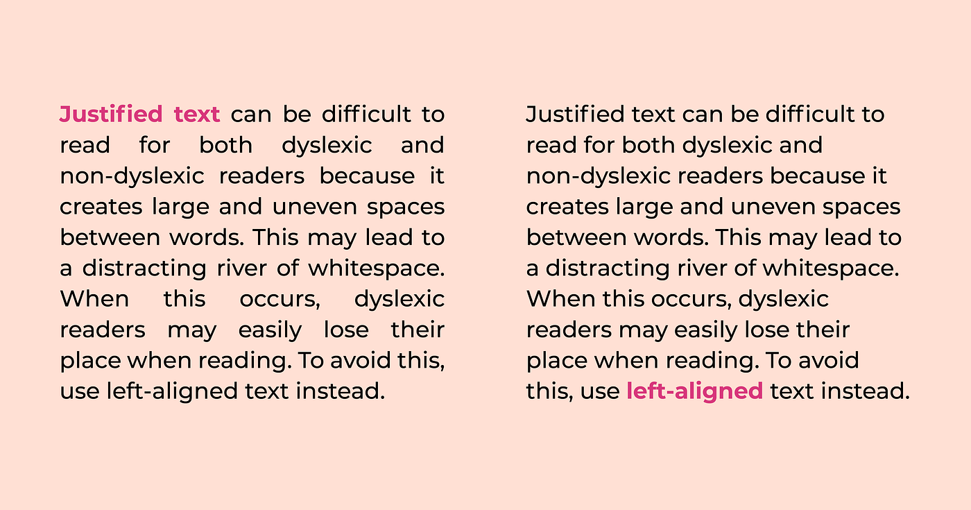
When a software justifies text, it will forcefully align words into a set amount of space, and will create ample amounts of whitespace if necessary. Additionally, when a software center aligns text, it becomes much harder to read, as there is no consistency where users can look for the start of a new line.
To reduce the river effect and make things easier for all readers in general, it’s best to stick with left-aligned text if you have a long text block.
Another thing to watch out for is double spacing after periods. This creates unnecessary whitespace after a sentence, which may lead to readers experiencing the river effect.

If you’re looking for a font that will minimize the chances of creating the river effect, look for something monospace. In a monospace font, each character and space takes up the same amount of space because the width of all the characters is completely the same. So if I wrote “Cat” in a non-monospace font, the ratio of widths for each individual character might be 6:4:3. Whereas “Cat” in a monospace font would have a ratio of 1:1:1.
Blurring text
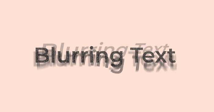
Some readers may experience a type of visual distortion where text appears to blur or swirl together. This is because while the left eye may be focused on one letter, the right eye is focused on a different letter. The brain then alternates which of these two images to focus on, resulting in the word appearing to move, blur, or double.
One thing that can lead to this blurring is using a true black font on a true white background. Dyslexic users can be sensitive to the brightness created by this high contrast color combination. Instead, try to use an off-white or a dark gray.
(Notably, true black on true white is never a good idea for anyone. Please read my other article, “Why dark mode isn’t a UX panacea” to see why.)
It’s also best to avoid tight tracking and leading, as that can cause text to fuse together horizontally and vertically.
Long paragraphs
Try to condense copy to small, digestible paragraph chunks. In long paragraphs, dyslexic and non-dyslexic readers alike may lose their place. Headers and concise paragraphs centered around one key point are the best ways to arrange written information.
Font styles
Serifs reduce the amount of whitespace between characters, which can make letters appear to connect and blend into one another. Sans serif fonts are better for readers with dyslexia because the letters are less obscured by decorative designs.
Italics are also harder to read. Because the words lean over, it becomes harder to discern what the words are. Try bolding text instead as emphasis.
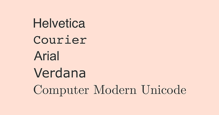
The best fonts for readability would be Helvetica, Courier, Arial, Verdana, and Computer Modern Unicode.
Assistive technology
Finally, some users with dyslexia may prefer to use screen readers or speech-to-text. Make sure your websites are compatible with these features, and provide useful alt text if your graphics have text in them.
Thank you for reading my article. As a disability ally, I am in a constant state of learning — and that means I might make some mistakes every now or then. So please feel free to leave a comment (or even correct me!) if you have any questions, comments, or concerns.
All images displayed in the article are designed by me.