Ecommerce Website Redesign
Boosting Conversion Rate using Design — UI/UX Case Study
In this UI/UX Case Study, I’ll be sharing my detailed process and the reasoning behind the design decisions that I took to redesign an E-commerce website and increase the conversion rate.

Now before we get started, I’d like to do a super small plug to one of my highly requested courses!
It’s Free! The Mega Product Design Course for Beginners!
If you’re looking to drastically upskill and change your career trajectory for the better, make sure to check out my Mega Product Design Course for beginners on my YouTube Channel.
I’ve had the good fortune of working with some of the biggest companies and startups and have learned a lot through that. And I share all the knowledge with you all for free on my YouTube Channel.
I cover everything from the core foundations of Product Design, UX Design and so much more. Get to see and learn what it takes to be a skillful product designer which can get you any opportunity you want.
Anyway, let’s get into the case study!
Woah! Protein Coffee?
Yup, that’s right. Complete Nutrition is a company that sells Maine Roast Protein Coffee. (Check out the brand new website)
They reached out to me on Instagram and asked me if I could help them redesign their website. Of course, I said yes!
But why?
The current website wasn’t really doing quite well in terms of making enough sales due to many reasons.
Can I see the old design?
Sure thing! Here is my Figma file with the old and new design (web and mobile), research, iterations, and heatmaps. (Feel free to zoom around)
One last thing before we get started. You can check out my full presentation on Behance and all the Dribbble shots. Leave me a follow while you’re at it 😉

Alright then! Let’s get the party started!
Symptoms of bad conversion rate
The first thing I needed to find out were the core reasons for the bad conversion rate.
There were 2 sources to gain this information.
- Feedback from its customers over email and their Facebook group.
- The client used a 3rd party tool called Hotjar to gather certain user data. It collects information such as heatmaps, recordings, and feedback given by the customer on a popup.
The information from the heatmaps and recordings were not really actionable. They basically proved that there was a bad conversion rate which we already knew.
So what were the main problems with the website?
- Slow load times — When the customer clicked on the CTA to checkout, it used to take around 5 seconds. There was neither any loading state nor visual feedback.
- Customers wanted to try out samples of the product.
- They felt that the product was expensive.
- They had doubts and concerns about the ingredients. Too many!
- Some customers found it hard to read the text on the website.
- They couldn't find the nutrition chart.
- Customers didn’t know about the return back policy.
- Customers did not feel that it was a legit and premium product.
These were some of the major problems with the website. However,
Not all problems can be solved by the designer. It’s not in the designer’s control sometimes. He isn’t god!
The first 2 were the biggest problems and it was the job of the business and development team to deal with that. I was able to deal with the rest of the problems.
But wait!
What’s my value as a designer if I don’t do some heuristic analysis of my own?
Here were a few problems that I faced when I did some analysis of my own.
- Super cluttered interface. There were text and images all over fighting for attention.
- Customers had very little idea about what the product is about. The checkout is right at the top above the fold.
- Repetitive information about the ingredients and nutrients. In a few places, there was less information and in some places, there was more.
- Overall, the website looked very outdated.
So now that we know what the problems are, let’s see how I dealt with each of them.
Aesthetic Usability Effect
It refers to user’s tendency to perceive attractive products as more usable. People tend to believe that things that look better will work better — even if they aren’t actually more effective or efficient.
One of the easiest ways to make the users feel that any product or service is legit, reliable and worth the money, is to make it feel premium. So by having a website that has really good aesthetics, you can make the user feel that the product/service is premium.
Hero Section
Right of the bat, you can see a huge difference in the Hero section of the website.
The first thing you want to do is to educate the user about the product. Give them an idea about what the product is all about. You don’t have to slam everything at once.

In the old design, everything is so cluttered. The information about the product is crammed into the top right corner. The text isn’t big enough to read as well.
The new design clearly gives a slight idea of what the product is all about with a big hero text. It also has a beautiful and attractive hero image showing the product in all its wonderful glory.
But dont you think its better to have the checkout part right above the fold? Why make the user scroll?
Here is a fun fact… People scroll!
Scrolling on a website has become a reflex action. Don’t believe me? I dare you to open a website and see how long you can look at the website without scrolling 🤣.
And what’s the point of forcing a customer to buy something if they have no idea about what the product is all about. Hence it made sense to move it below the fold.
Oh okay. So your idea is to tell the user everything about the product in the beginning? This means that the checkout part would be at the end of the website right?
Not really my friend. Let me tell you why.
Information Architecture
One of the things that bugged me so much was the order of the content on the website. I wanted every section of content to have its own bedroom.
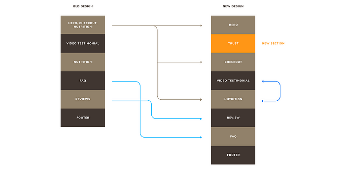
So let’s break this down piece by piece.
- Brown line — I broke up the top section into 3 individual sections in the new design.
- I added a new section that is colored in orange (shown below). This section gives very crucial information to the customer about the product. It provides an inventive and keeps them hooked. It instills a sense of trust.
- Dark Blue line — The Videos and Nutrition section could be easily interchanged. It doesn’t really matter much.
- Light Blue line — I interchanged the order of the Customer Reviews and the FAQ. I felt it made sense to have the FAQ at the end as people would be more interested in the reviews. Honestly, the order of these 2 doesn’t make a big difference here too. But having FAQs at the end is a common practice.

By showing the overall rating and a real written testimonial, the new section clearly instills a sense of trust in the customer.
Also communicating to the user that the purchase comes with a 100% money-back guarantee and free shipping is very crucial. It acts as an incentive for the user to try out the product. In the old design, this information was totally lost and customers were not even aware of it. Hence, it made sense to give it enough prominence and make it quite evident so that it catches the eye of the customer.
Alight! Now tell me why the checkout part should not be at the end of the website?
Simple. Repeating customers who return to the website to make purchases more often should not have to scroll all the way to the bottom. Instead, they can either scroll down a little bit or click on the CTA in the Hero Section.
And for new customers, it’s better to show it in the top section of the website. So that they know where to navigate to once they are done checking out the whole website.
Checkout Section
At the last minute, the company changed the business model.
Why?
They wanted to try out a new business model and see how it goes.
Old Model — Customers can buy any number of packets they want. Even one. But if they purchased 3 packets, they would get a free shaker.
New Model — Customers have no choice. They have to buy 3 packets and they get a free shaker along with it. Basically, all they have to do is to click the checkout button.

Now let’s take a look at the differences between the old and new designs.

One of the problems that customers felt was that the product was expensive. So here are 3 significant changes I made to make the product feel less expensive.
- In the new design, I showed the original price of individual line items right beside the discounted price. Now, the old design also shows the original prices but it felt a bit disconnected. In the new design by showing it in context with every line item, the customer feels that he is getting a lot for a smaller price. It feels as though he gets an offer/benefit for every line item.
- Customers like to see the word FREE. I made the word FREE stand out by making it the only text in green color. This definitely ensures that it catches the eye of the user. This is completely lost in the old design.
- I made the incentive of free shipping and free shaker stand out quite a lot with even an icon. This was less evident in the old design.
Video Testimonials
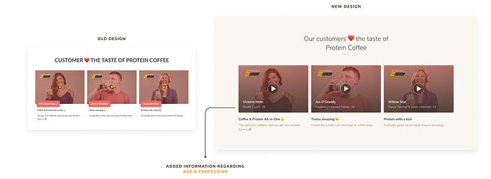
By including the age and profession of the person giving the review, customers of similar age group or of a similar profession can easily resonate with them. They feel encouraged and comfortable enough.
It’s simple psychology. People always try out new things based on the recommendations of others, who are in a similar situation as you are in. You always want to do it, because someone else did.
Nutrition Section
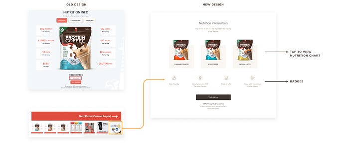
- So the first thing to note is that the nutrition value for all the 3 flavors is the exact same. Except for one tiny difference between 2 of the flavors. Hence, there was no need to show the same details about the nutrition separately for all the 3 flavors.
- Also, customers prefer to rely on the nutrition chart that is printed on every product. So to see that in the old design, a customer had to click on the small text ‘Ingredients’ (enclosed in a red box in the image). This was clearly not visible at all. Hence, I came up with a solution where the customer could tap on the respective flavor to see the ingredients of the flavor.
- Badges — It was also very important to educate the customer about the authenticity of the product such as the place of manufacture, certification and more. In the old design, it was the last image in the carousel.
It’s a proven fact that a majority of users skip carousals. And even if they did view it, they would not go through the entire carousal. As a result they would totally miss it.
Hence showing the badges right upfront felt like a sensible idea.
FAQ Section
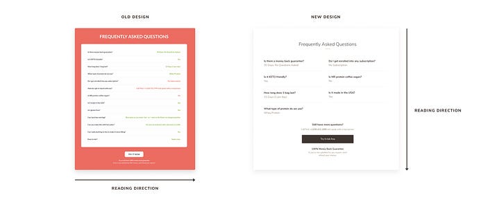
This was a simple one. All I did was split all the questions to 2 columns to save some real estate.
Also, I placed the answer right below the question so that users do not have to keep moving from one end of the website to the other end while reading. It makes it faster to read the content when they are placed below each other.
Footer

Again, this was a quick one. Links and payment options were clearly missing in the old design. Also, I changed the UX copy to something that would incentivize the user to subscribe to the newsletter. So I changed the text from ‘Like what you see’ to ‘Get 10% off’.
And… That’s a wrap!
So that’s pretty much it. This was my entire process of redesigning the website. Hopefully, you found this article very helpful and insightful. Do reach out to me if you would like to share anything with me. I’d gladly accept it.
🔥 2 Free months of Skillshare Premium!
If you want to learn to build a fully functional website from scratch without using a single line of code in Webflow, make sure to check out my Mega Webflow Course for Beginners! You can find the course on Skillshare
Register with my link and get 2 free months of Skillshare Premium and watch it for free.

Did you know?
You can give up to 50 Claps for this article? Just hold the clap button for a few seconds and bam! Try it out 😋
My other articles on medium
Hit me up on Social Media
Twitter, Instagram, LinkedIn, Dribbble, Behance and YouTube.

