
Building a Design System from scratch
A design system is a communication platform that helps an organization solve problems consistently, but most importantly it helps companies evolve so they can focus on getting to market faster.
I’ve been involved in multiple initiatives for Iron Mountain, Guardian Life Insurance and Cybernetically; and even before Angular and React standardized application development, my bread and butter was the creation of application development kits for the enterprise.
Thanks to my experience, I was asked to lead the design system for Guardian Life Insurance, which now consists of 100+ Lego pieces that can be assembled in near-infinite ways.
And thanks to a Design System our team won the fintech DALBAR award. The DALBAR Service Award symbolizes the achievement of the highest tier of service to customers within the financial services industry.
Aspects of a design system include guiding principles, brand elements, WCAG guidelines, code standards, architecture and a software library component.
A well crafted Design System helps companies go from product inception to market in a much shorter time. Building it is an effort of its own and requires resources, it might even slow you down initially, but it will pay dividends as you scale your market opportunities.
A Design System is a way of managing responsibility within the product development process. You’ll be surprised, but a lot of companies have multiple teams building the same exact set of components and user experiences without recycling the effort. The communication with a Design team is not centralized and resources are spread out thin. This doesn’t scale; instead, the design system team focuses on enhancing user experience by refining and adding new features and guidelines, while product design becomes a core function of the development team.
The design system becomes a single source of truth within your organization and most importantly makes communication with your customers more efficient, directly affecting your company’s bottom line.
When using a Design System, I have witnessed 30% decrease in cost of application development followed by increase in revenue, all thanks to efficacy of the user experience.
At Guardian, traffic for an application dropped by 90%, which confused the marketing, developers kept looking for a technical root cause to only discover that users weren’t coming back to the product because they were satisfied with their experience. Lesson learned, increase in traffic doesn’t translate to better user experience, but a Design System does!
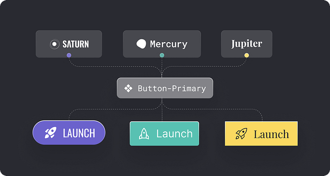
Every Design System starts with a Button.
A button is the most basic atomic element of the design language. It incorporates all the most important attributes — shape, color, typography and iconography. Buttons define the character of space in your application and define familiar behavior throughout your application.
You should start your Design System with a Flat button. An element with the following visual states: Default, Hover, Pressed, Selected, Disabled and Focused. You will need to design all these visual states for all interactive elements in the system; they make up an interactive component.
A button must be instantly recognized and easily understood, intuitive and well designed. On smaller devices with a touch interface, buttons will need to have an increased size (Large) to make tapping with a finger easier, instead of a more precise mouse cursor.

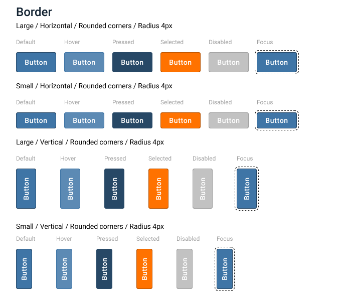
Border Button
To help the Flat Button distinguish itself from the background, you'll need a style with a border. The Border Button is a little more pronounced and accents an action. In this example a border was added, but some styles might have a fairly complicated border pattern.
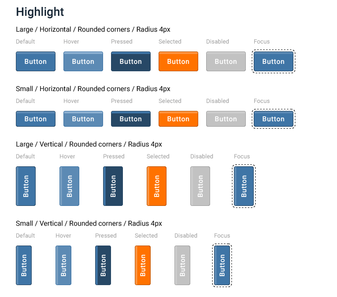
Highlight Button
A Highlight style is used to make an action pop, and adds a little more oomph and excitement to your action.
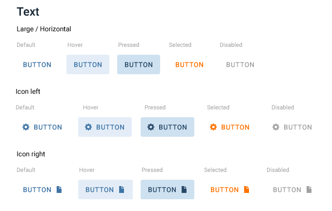
Text Button
Another common style of a button is a Text Button. You can think of it as a button with an invisible background for the majority of its visual states. This style is less prominent and should be used for secondary actions, or to help decrease cognitive load of the interface.
Sometimes a button might include a combination of both, a text label and an icon, to help users identify its purpose, so if adding an icon makes sense, consider using it.
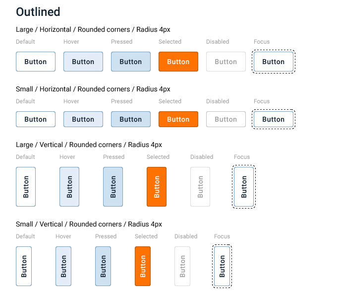
Outlined Button
Outlined Button comes naturally after the Text Button and helps people quickly identify an action. Visual architecture of a particular product workflow should help you avoid too many filled buttons in your interface.
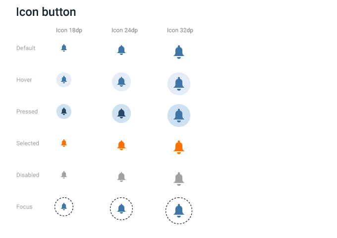
Icon Button
We’ll need buttons or links containing only icons. “An image is a thousand words”, often it makes sense to represent an action as a symbol, which saves space and takes into account the sociocultural embeddedness of language and cognition.
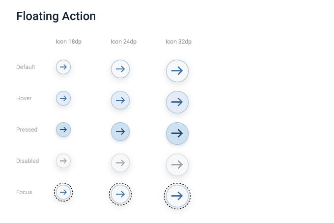
Floating Button
A floating action button (FAB) is a circular button that triggers a primary action. One or many would usually appear somewhere at the bottom or center of an interface.
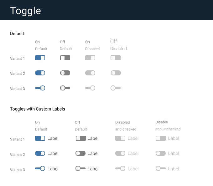
Toggle Buttons
All the buttons above are singletons, representing one action and display one visual state at a time.
A Toggle Button displays multiple states and quickly switches between them.
A Toggle Button is a powerful concept because it uses symbols to represent an action.

A Toggle
A simple toggle is a “switch” used for binary actions. Toggles are used for actions that occur instantly after user initiates them.
A label must describe the action that the toggle performs, so that the action is clear. The description should be short, not more than a few words. Adjectives should be used rather than verbs to describe an action.
Text Input
Text Inputs are a special kind of element. When focused they capture keyboard interaction and let user enter text that’s no longer than a single line, like a name or an address.
Under the hood they are similar to a Button in how they interact with the system. They are a “hot element” and when clicked on or focused, they take keyboard input and display it.
Because its an interactive element, it must be designed with these basic visual states: Default, Hover, Selected, Disabled and Focused, including additional Error, Success and Read Only.
A label must appear above the input, it should be short, direct and written in a sentence.


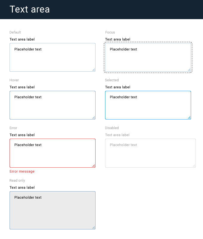
Text Area
A text area is similar to the Text Input, except it should be used when the expected input is longer than a single line. Its used for free form data entry; text which spans over multiple rows.
Its visual states are going to be identical to the Text Input, in fact all textual input components should have these states by default: Default, Hover, Selected, Disabled, Focused, including Error, Success and Read Only.
A label is aligned above the component. It should be short, direct and written as a sentence.
Dropdown
Dropdowns represent a list of options or actions, from which users can chose one or multiple options. The options are hidden by default; once triggered, the element opens a menu of choices, which scrolls after its height exceeds the predefined amount.
The anatomy of a Dropdown consists of two elements, the Dropdown button and a Dropdown menu.
Its best used when more than two options are presented, otherwise refer to a Toggle Button. The rule of thumb is to use a Toggle Button whenever possible, then a drop down.
Drop downs are harder to use in comparison to a Toggle Button option, meaning they are cumbersome to a user experience, and require more interactive steps to select the same option. Drop downs work well with more complex scenarios.
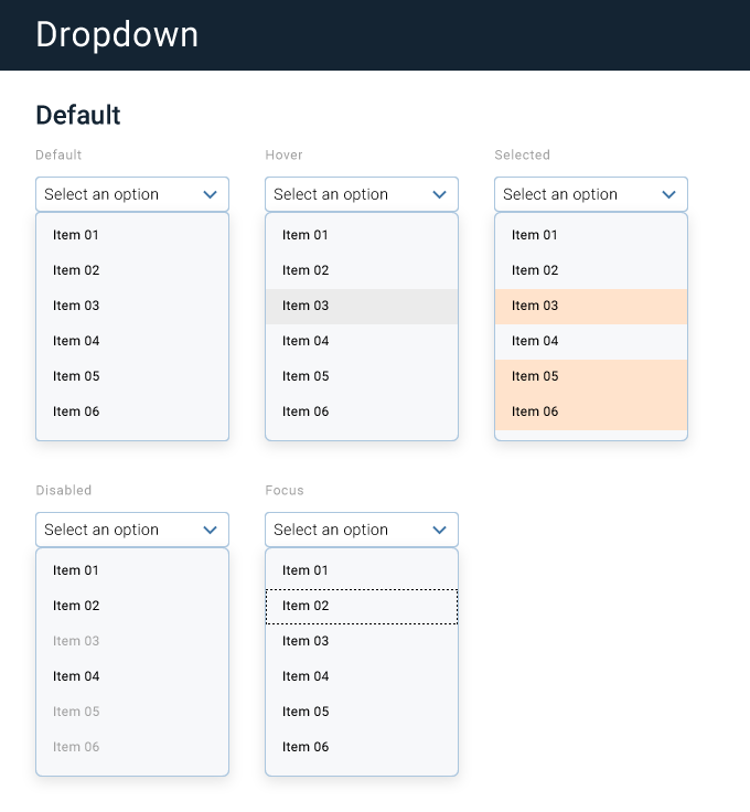
A drop down may have a list of options divided in sections or categories. Or may be used to select multiple options.
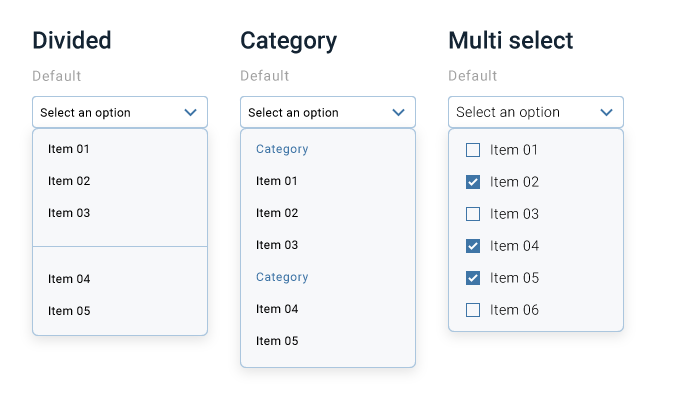
Drop down could be used as a menu option when number of options is less than a screen height. Or as a search control when number of options is too many to display at once.

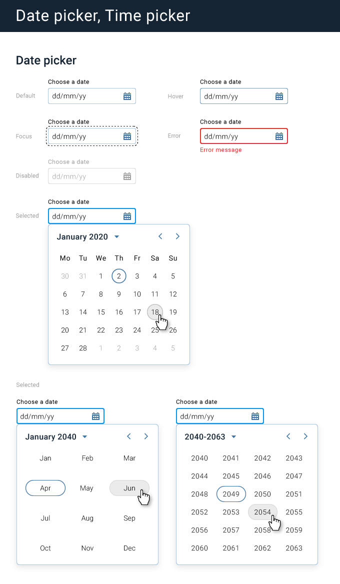
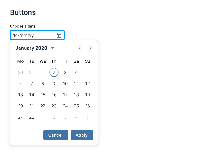
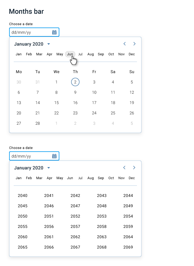
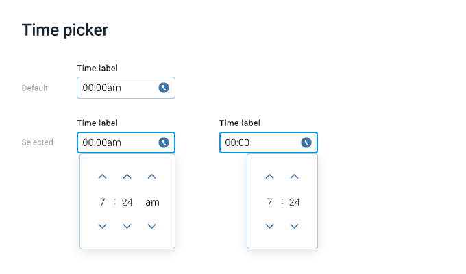
Date Picker & Time Picker
A date time picker is a natural progression after you’ve designed a Dropdown element. Its an input control that allows the user pick a single date or a range of dates.
The Datepicker consists of two elements, the input and a calendar modal.
The kind of date you are requesting from the user will determine which date picker configuration is best to use.
A Date picker must be accompanied by a label which appears above the picker and instructs the user what to do with the control. The date format should be displayed within the picker, which depends on location of the user. Some countries use day/month/year while others use month/day/year.
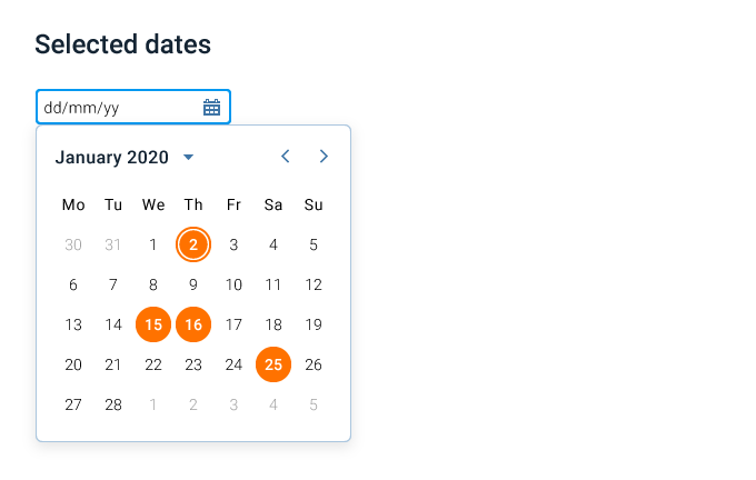
Depending on the requirement you might want to indicate multiple available dates for the user to chose from; or perhaps those dates would be unavailable instead.
The Date picker behavior by default is to close the calendar modal right after user picks a date, but in some cases you want to keep it open until a user clicks the Apply button.
The Date Range picker functions just like a single date picker, except it helps users pick a range between start and end date.
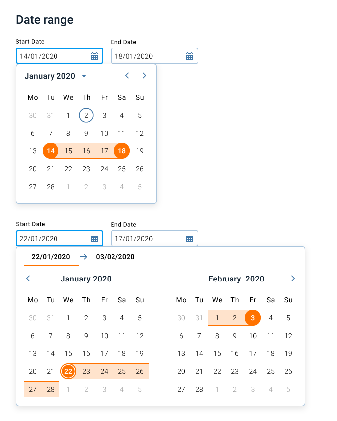
Date picker is a challenging component which is why you’ll see many variations of it on the internet.
Here I designed the most optimal experience as far as the amount of clicks to perform a date selection.
Time picker is used to select a specific time.
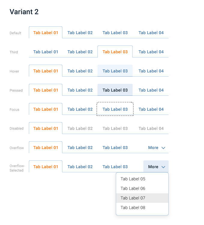
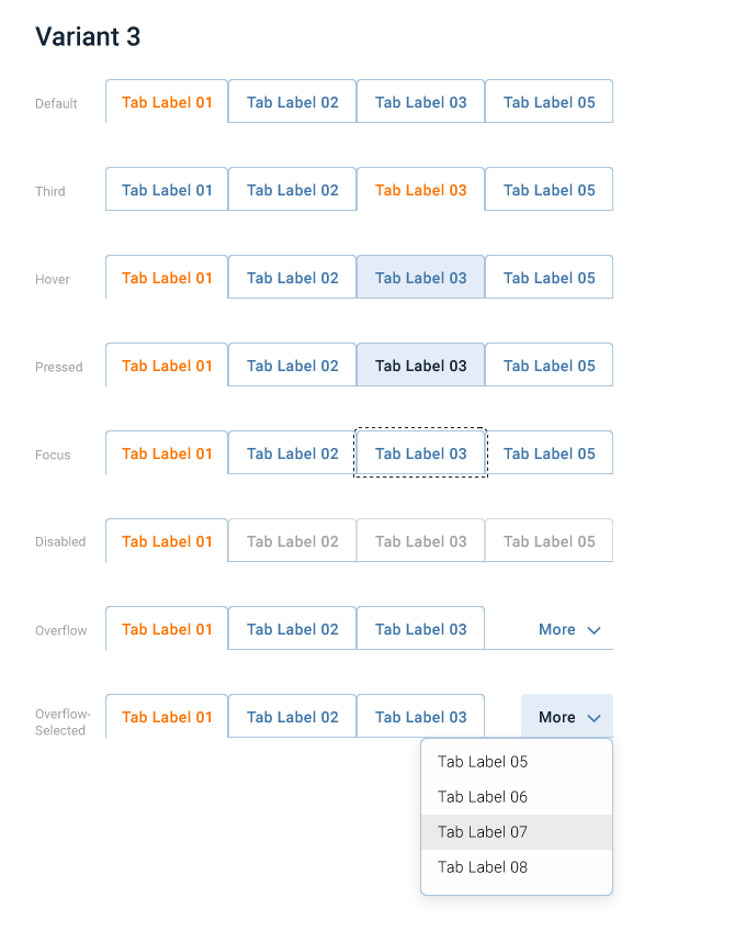
Tabs
Tabs are used to organize content by grouping similar content on the same page into smaller groups.
They organize and tuck away content into panels; they start to organize the content into a visual hierarchy.
Technically, tabs are Toggle buttons or should extend them when implementing the element.
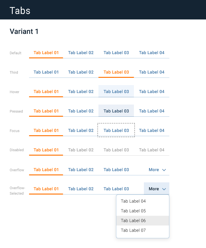
When too many tabs are on the screen, a More button should be displayed at the end, which opens a drop down with a list of additional tabs.
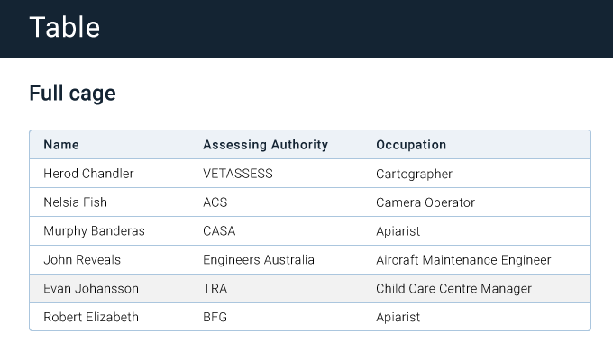
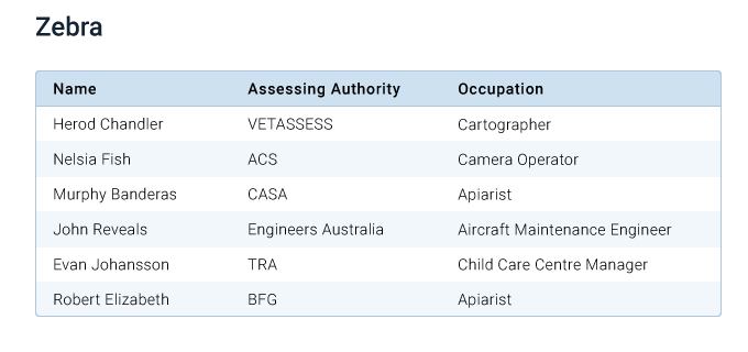
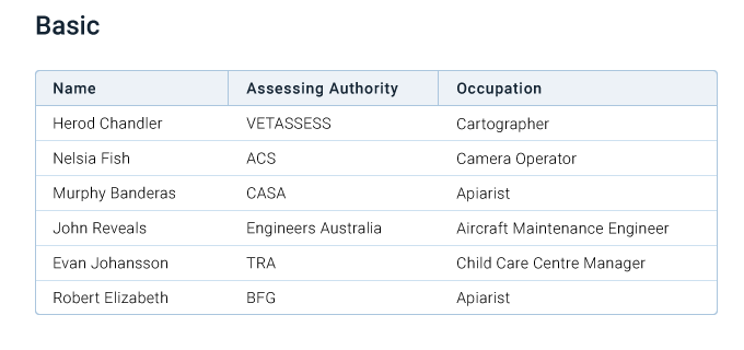
Table
Table is used display tabular data clearly and efficiently. Its often used to display simple data sets in a grid format and can be used to structure static and interactive data. It can also be used to display a list of actions, or organize information across rows and columns, so its easy to scan, examine and compare it.
Tables can get complicated very fast, a table can show nested hierarchies of information with expandable nested rows.
By default a basic table should have headers and rows. However if your data set is more complicated, you can still use the individual table components like custom rows, headers and pagination to display what you need.
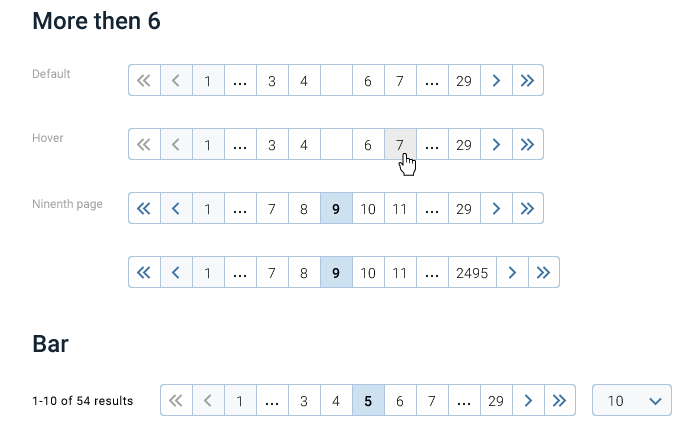
Pagination
Pagination is a controller element, which functions in conjunction with a Table element to divide large amounts of data into multiple discrete pages.
A set of data is separated into its own page once the number of rows exceeds a display limit. Generally, the limit of 25 items per view should be used.
Dividing the content into multiple pages makes it easy for a user to process a large set of data without feeling overwhelmed. Pagination lets the user feel more in control when viewing content.

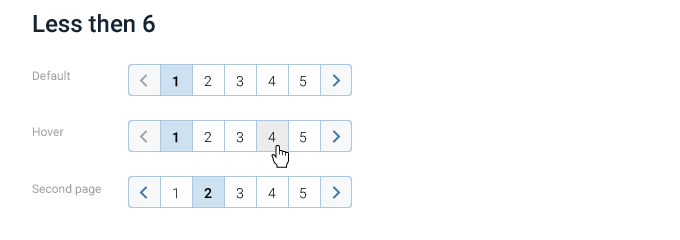
When the number of pages exceeds the maximum display limit, an ellipsis (3 dots) is used to truncate the remaining pages.
Double truncation is used when the current page is separated by more than five pages from both the first and last page.
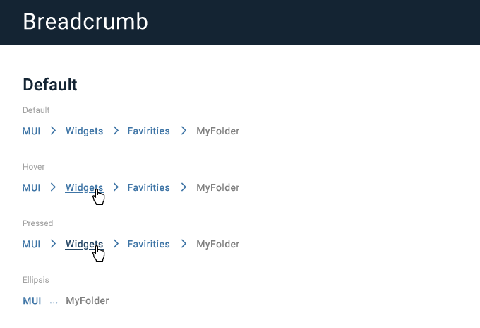
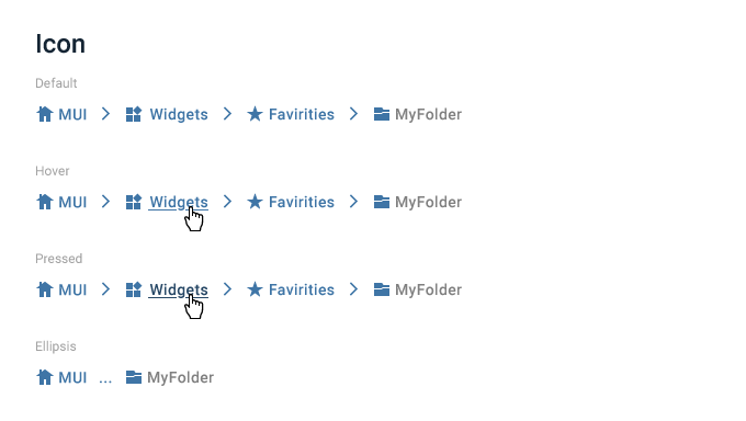
Breadcrumb
Breadcrumbs are a navigational pattern used to show a user’s current position within a hiearchy and allows them to navigate back through interaction with the element.
It’s usually located at the top or bottom of the view.
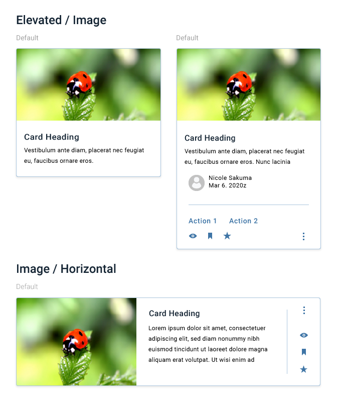
Card
Cards are container of high-level information related to a single subject. They can guide the user towards related actions and details, or display featured information, or navigational choices. A group of cards presents a collection of similar content associated with a singular subject or destination.
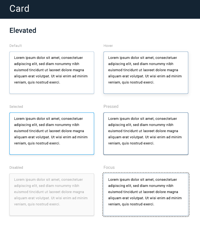
A simple card only contains a content area, but cards can contain complex structures where users can perform actions or link to additional details.
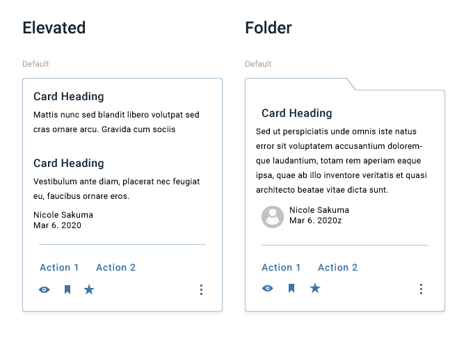
Cards let users preview and discover more information without leaving the page.
Tooltip
Tooltips display description or relevant information about a visual element, usually on hover, but often can appear without user interaction.
On hover tooltips are revealed when short time has passed, or when user initiates a long-press, or focuses on an element.
Simple tooltips display just a few words

While more complex versions can display a description or even actions
The best design system is always evolving
Good systems are like organisms, always adapting seamlessly to a company’s growth and changes. The real magic of a design system is in minimizing the effort by the designers and engineers who bring a product to life.
Design systems are just the beginning to a no-code — an environment that blends the roles of designer and engineer, eliminating the friction of the traditional handoff.
Check out my open source framework QQ:
https://github.com/jsmuster/qq
Check out my other articles
Please give the article some 👏 and share it!.


