Building a roadmap for myself
Using Figma for an exercise to bring myself some clarity on what will keep me occupied for the next few months.
The issue
Over a year ago, there were a lot of changes happening at work and us being a small team, had our hands full. I personally faced the following:
- Not being able to focus and prioritise my time well
- Losing track of competing deadlines
- Too occupied with the day to day deliverables to focus and calibrate my personal goals
- Stakeholders were lost as they didn’t have full context on what’s on my plate to support them
Building a roadmap
Roadmaps are not something new. Every team and individual has it in some shape or form. A lot of project management tools can solve most of the issues mentioned above. In fact, many teams use Google sheets because of its ease of use for making gantt charts.
These tools just didn’t work for me. Be it the traditional pen/ paper or software alternatives. They were too restrictive to maintain at an individual level. In case of digital solutions, they were adding a couple of added layers of complexity.
The experiment
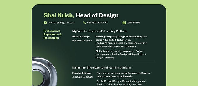
I decided to make a simple roadmap of my own. Since my go-to design tool was Figma, I decided to create one within my workspace. Figma had a template available, but it didn’t serve my purpose.
I took inspiration from different tools and fused them within Figma to keep it flexible. Another advantage for Figma was its ‘default to open’ approach to design in general. Being web based made it easier to share with others for feedback. It also avoided extra effort of logins/ learning new tools. However, you can do something similar on other tools as well. (Sketch/ XD/ Illustrator/ Google sheets etc.)
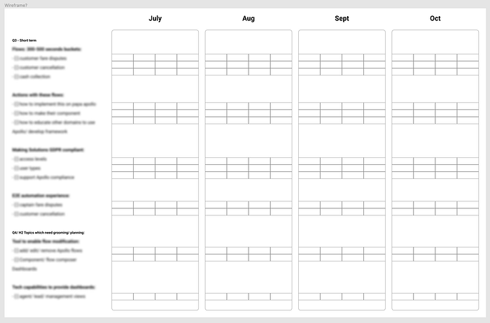
It started off being pretty simple. Time progressing left to right as columns. Rows being the individual projects themselves. I initially thought of a few colors to highlight my focus for that time period.

Where it got interesting…
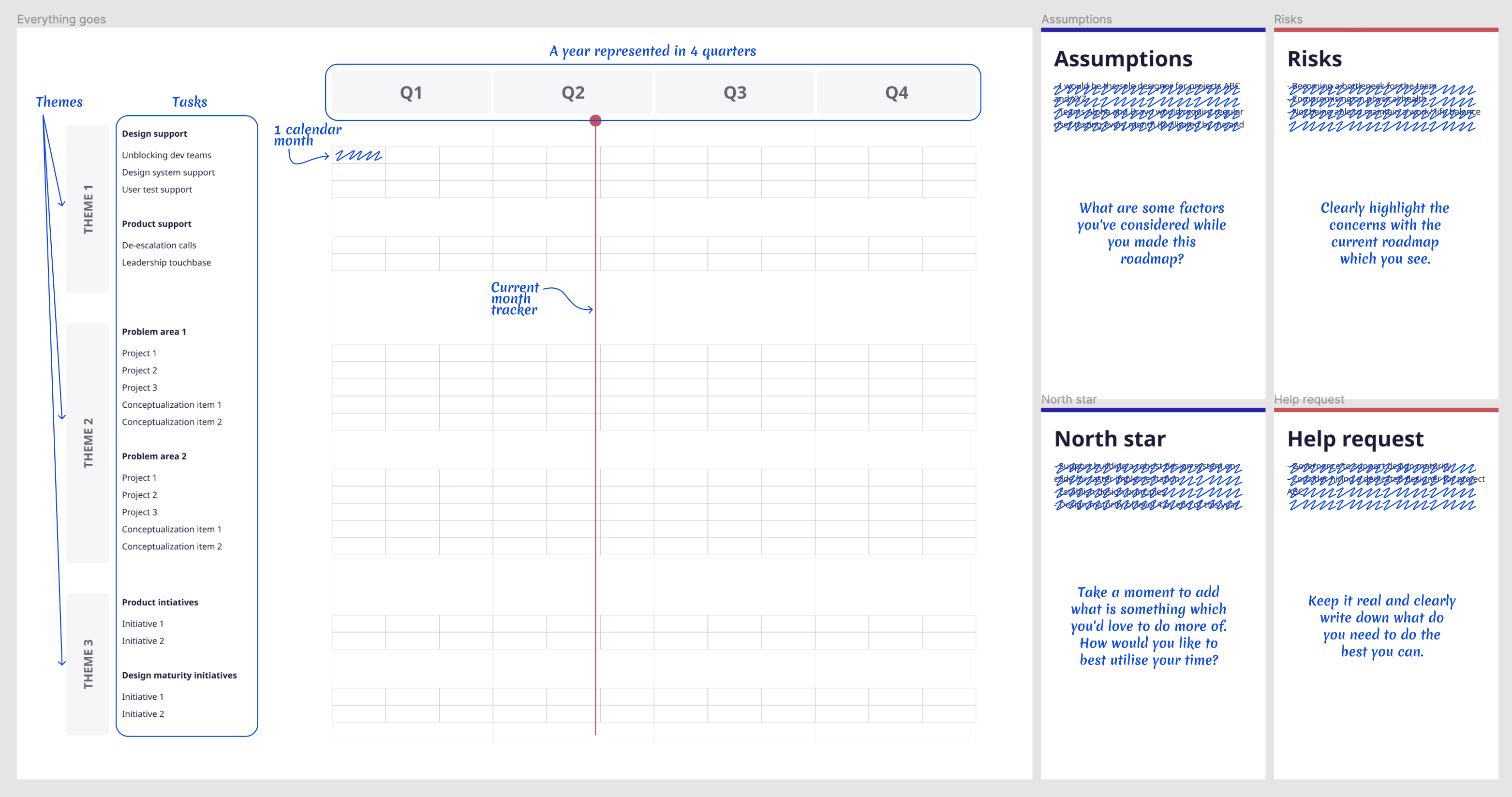
Sometime mid last year, I was introduced to a few management frameworks. They looked pretty useful and relevant. So, I decided to add them to the roadmap. Surprisingly, these were great additions! They added a good layer of details along the roadmap. Will describe them briefly below:
Assumptions: What are some factors you’ve considered while you made this roadmap? Add them. It’s always good to mention assumptions. These can be around team dynamics, your workload and team budgets etc.
North star: The buzzword you’ve all possibly heard a lot of times by now. Take a moment to add what is something which you’d love to do more of. How would you like to best utilise your time? In my case this was the part which helped me emphasise my personal goals and how teams could help.
Risks: Clearly highlight the concerns with the current roadmap which you see. Do you clearly see there’s too much on your plate? Any approvals / pieces of the process really holding you back from doing your best?
Help request: Keep it real and clearly write down what do you need to do the best you can. If it’s some buffer space for personal projects, write it down. If it’s budget for a new tool, pen it down.
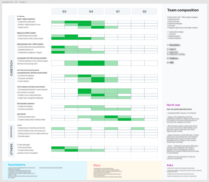
Team breakdown: For you to always have an idea of team breakdown/ peer to design ratios. No other purpose but found this context useful for discussions.
Reflections
This exercise works because of its simplicity.
It comes in handy when I’m welcoming a new member to the team. This visual becomes important especially when I want to escalate something to leadership. With the right context, it enables me to ask for help and provide the right amount of visibility.
You’re doing this for yourself, please keep that in mind!
Pro-tips:
- Don’t worry too much about it. This is a self-awareness exercise. Change things whenever you like. Stop doing it if it’s not useful for you.
- After every couple of months, make a duplicate of the artboard and make the changes. See if you spot any patterns emerging around your priorities.
- Don’t review it too often. Don’t view/ make changes more than twice a month.
- Keep in mind the more micro tasks you add the more of a burden maintaining this will become.
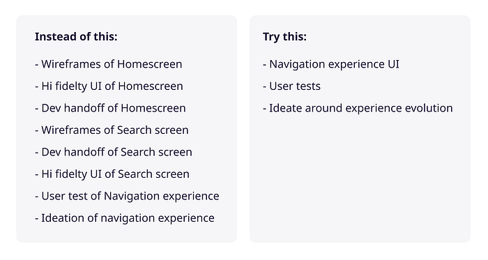
Let’s take an example. You’re building an app and it’s due in 6 months. Don’t write “Design home screen UI” as a task. Instead, bucket them together as “Conceptualise navigation,” or “Complete sign up flow.”
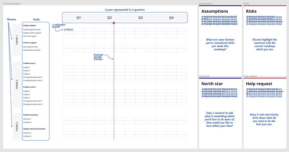
Get started with this freebie!
Thanks for reading. I’ve prepared this Figma template incase you’d like to give this a shot. I’d love to know if you have any other hacks which you’ve come-up to manage yourself.


