An open source project and case study on combining UI, UX & AI to help you; instead of merely sustaining consistent demand and serving even more advertisers.
Current food apps are falling short on customer experience; designed primarily around endless scrolling lists, overwhelming users with options and leading to decision paralysis. When combined with poor search refinements and a limited number of interactions to learn from, users are left with impersonal and shallow recommendations leaving a massive untapped potential for the way we look at and interact with food and apps as a whole.
The problem revolves around the idea of an app that can sort through a new menu I’ve never seen before, and pick out a combination of items for me, while taking my current context (i.e. Am I eating out? With friends? At a sports game? Is it hot and sunny? My diet etc.) and taste preferences into account. I also wanted to create an interface that allowed a user to easily remove any inherent bias and fine-tune a given selection.
However, in trying to answer that I quickly realised there were a lot of obstacles stopping current companies from simply adding it to their app in an update, and this is my attempt at trying to walk everyone through those problems, the solution I’ve posed and how we can expand this into something that can truly benefit everyone (take it all with a grain of salt, because I’m definitely not an expert on any of this. So please correct me where I’m mistaken).
I) So… What’s actually wrong with the current food industry and why?
Over the past few years, we’ve seen a rapid increase in the number of services that provide a way (something to interact with) for you to order and receive food — Whether that’s; using one of the many on-demand food delivery/pick-up services, weekly pre-cooked meal, meal-prep kits, online grocery delivery or loyalty apps. Even if you don’t use any of these services, it’s pretty damn amazing that we’re able to do so with such convenience.
However, I want us to take a closer look at how we’re interacting with these websites or apps, and choosing the items you want to order. As in the end of the day, that’s what’s important right?
This becomes more apparent when looking at the business models behind current on-demand food services in particular, which in many cases are completely reliant on linear transactions. With commissions taken from both customers & merchants totalling ~60% (split roughly 50/50 excl. Doordash) of the order, per order, make up 75–80% of current revenue (in the case of Just-Eat, GrubHub). Combined with User Interface (UI) designs composed of a series of scrolling lists, we’re lead into a scenario where these services must manipulate early listings to reduce decision paralysis to ensure a successful transaction. Current services reduce this decision paralysis in several ways such as:
- Placing the last restaurant a customer ordered from near the top of the lists, and allowing one-click reordering of the previous meal.
- Using Collaborative Filtering (and other ML techniques) to find other users with similar purchase histories (food item, restaurant etc.) and share their successful purchases with you.
- Another method employed, first popularized by GrubHub/Seamless in the late 2000’s and more recently, Doordash and Uber Eats is to partner with high-chain restaurants in order to sustain higher, more consistent demand and supply.
- Charging merchants to increase their ranking on this endlessly scrolling list of restaurants in order to have a higher chance of being discovered by customers.
- Gamification (mostly using Loyalty Systems).
- Making ads/offers, more visually appealing than surrounding listings.
- And finally, just putting the “Most Popular” items first…
… And this is where the problem lies. When the majority of your user interactions and purchases are occuring due to convenience driven decision making, you start to see several worrying patterns that can’t be ignored — especially when Artificial Intelligence (AI) is concerned. (Read more on AI Ethics)
When compared to some of the lofty expectations of using AI, it could be said that finding a decent meal would be a relatively straight forward application. However, we already have a myriad of issues all leading to a terrible experience for the user and shallow data inference:

Ok, the business goals affecting AI is pretty straight forward. If you run lots of ads and you’re good at making them enticing, you’ll have people order from it and so the data gathered would reflect this. But how does the UI and UX (User Experience) itself affect what an AI can learn? In order to explain this, I think it’s important we take a quick second to see what we would do to chose a meal without an app in the first place.
II) The Menus we encounter everyday, and how we interact with them.

From a quick glance you can easily tell that all of these menus are curated for different audiences in mind. However, with all these differences I would argue the thought processes needed to complete an order are almost always constant:
- Your personal tastes and preferences.
- What you might recognise on the menu at first.
- The total cost and whether it fits into your monthly budget.
- Any dietary restrictions and health concerns that you want to stay on top of (Diabetes, Blood Pressure, Allergies etc.)
- Whether or not this is going to ruin your diet.
- Whether you want something cool and refreshing during a hot, humid summer day or something warm during the winter months.
- What drink would pair well with your food.
- And god forbid you’re in a group with other people… I mean now you’re taking all of the above into consideration as well as what items might be shared best among the people sitting there, what kind of audience/situation it is and so on…
It really does get overwhelming quite quickly, especially if it’s a restaurant you’ve never visited or seen the menu of before.
Unfortunately, almost every single food app available today has played it safe and stuck to this formula… Yeah, they can be more convenient, helping you order something with just one click. But in the end of the day, it’s not much better than pulling a take-out menu out of your drawer and calling the restaurant yourself.

Pretty much all of these apps do the exact same thing and consist of the same core elements, with slight variations:
- Main Page
- Deals/Ads
- Search Area
- Filters
- Reminders to share the app with your friends for $5–10 in credit…
Of all of these elements, the most important is easily the Main Page. It’s the first thing you see when you open the app and those first interactions will make or lose a potential sale. So if we really want to design something better with the correct goals, we should begin to understand how these things work past just the aesthetics.

Here, I’ve tried to break down the series of interactions a user goes through when ordering a meal today (Steps for tracking & receiving an order were removed, interaction data here is mostly used for logistics optimisation and time for delivery estimates).
To begin, items on the home page (in the vast majority of cases, these are just restaurant listings) must be sorted and ranked. Traditionally, services would allow users to sort by Distance, Price, Rating (Score or Stars) and Popularity providing quick and easy ways to narrow down the options presented. However, more and more apps today are ranking restaurants according to Multi-Objective Optimisation Algorithms, where the aim is to display items that will be a balance between keeping users happy (with a restaurant/food item they may order from) and merchants happy (getting an order, more preferably one with larger profit margins). Other than this, services have employed their own algorithms to further integrate user data, highlighting trends they can then use to further influence what you see:
- Uber Eats uses logic to create certain groups within the ranked list, comprised of top picks of specific categories.
- Doordash on the other hand tracks a number of features such as how much overlap there is between the cuisines in a particular restaurant a consumer has ordered from in the past. They would then include similar features based on which stores you’ve been shown (and ignored at varying values for time in the past & present), price range, type of food, size of order, type of order, subtotal, delivery time, merchant details. In super simple terms, positive scores (1) are awarded to features you ordered from, and negative scores are awarded to restaurants (and their subsequent features) you were shown and ignored. They then use ML to calculate the probability of how likely you are going to interact with any particular restaurant, with a specific feature set (Read more).
- Other Rating/Recommendation systems (Decision tree, Collab Filtering, etc.)
Cool, but how do these services take and magically turn what I’m clicking on, scrolling past, searching for and ordering into trends & patterns they can use to understand us on the masses?
First: The Fast Fourier Transformation Algorithm:
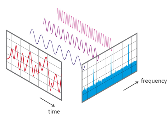
- Used billions of times every single day from mp3 compression to medical imaging.
- Essentially, works by breaking any sequential/time series data plot into its component sine/cosine functions.
- Able to highlight trends/seasonal data really well, as repeating signals will correlate to spikes at certain frequencies that can then be served a specific solution.
- Although powerful, such a method is only good for omnidirectional and very periodical data.
- Not good for new input data (e.g: weather, time of day, sports game) and so can’t adapt to changes in environment states.
To learn more about how revolutionary FFT’s have been and how they actually work, check out this video by 3blue1brown, and this more in-depth presentation regarding it’s application on time-based measurements by William Cox.
Second: Let’s see what happens when we throw some Deep Learning up in here:

- Obviously, there’s a tonne of ways you can apply Machine Learning, Deep Learning or collectively Artificial Intelligence to such a problem. However, seeing as the data currently collected by platforms and what we want to predict with it, can also be described as a Time Series Problem I thought Google’s Seq2Seq Deep Learning Model was quite appropriate.
- On the surface, it works by first splitting the sentence you’re trying to translate into a few bite sized chunks of words the model can actually use, turn these chunks into a single input and over time learn what singular output (another sequence of words) is the most correct (likely) answer for any given input.
- What’s interesting here is the ability for Seq2Seq to learn how to translate phrases between English and French, as well as between French and Japanese, and then be able to extrapolate a translation between English and Japanese. You can read more about it’s use and implementation by Google here and more about Zero-Shot Learning itself here.
- Moreover, we can do more than to rely on the hidden state created by the encoder. We can also add the notion of attention to the inputs themselves, allowing the model to understand that certain words (inputs) in a sentence (sequence) have more or less value and affect the output than the others. For example in a sentence the value for “Are” would be larger than the values for either “How” or “You” (Read more on this blog post by Guillaume Genthial).
- It can pick up much more nuanced and hidden patterns that aren’t completely periodical and is easily able to incorporate and account for different weather, time of day and more.
III) Designing for Meals, instead of an endless list of food items.
Alright, so now that we have a slighty better idea of how your interactions with these apps dictate what you and everyone else sees in the long run, we’re still left with the question of how can we design something that adds more context without adding even more filters and options for users to have to navigate through.
Thus, I began by pulling the food items right out of the menus and placing them onto a home page. After a user taps on an item, the aim would be to guess and display several of the most likely items they might tap next.

Unfortunately, after creating a few mockups and testing it out with friends/family this was even more overwhelming than current apps, with a myriad of potential issues and limitations:
- We would be limited to rewarding items a user taps on, and assume all other options were worse.
- Why did a user choose one item over the other?
- What if a user wants something different from what they would normally choose but it wasn’t displayed prominently enough?
- Does the user prefer combination x-y-z over combination a-b-c taste wise, or is it just because they had no idea such a combination was possible?
What would a GAN/DeepRL do?
After a considerable time mulling around and a flurry of headlines in the news, I came across some research regarding Generative Adversarial Networks and in particular Deep Reinforcement Learning. And although on the very surface these are similar to the Seq2Seq model I discussed above, DeepRL goes several steps further and instead of merely focusing on what the correct response to an input should be, is able to take each individual input and learns what the best sequence of steps are needed in order to produce a positive outcome. Such techniques have been implemented by DeepMind with their infamous AlphaGo AI, which has already shown a solid track record of quickly learning and applying that knowledge to incredibly abstract problems, by intuitively understanding how to reach it’s goal. You can read more about this from DeepMind themselves, here.
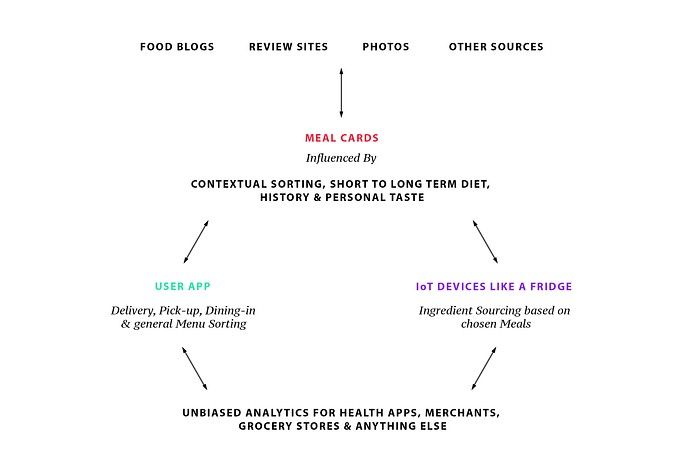
I was inspired by this goal oriented approach and even though I would be ignoring the fact that there was little to no data easily available (in current form) to back any of this up, I came up with what I called Meal Cards — A container comprised of what could begin with a decent guess of what a meal could be but, with the right tools could eventually learn to bring some order and sense to menus.

Here, I’ve tried to give an idea of how meal cards could further be grouped by different Scenarios; Breakfast, Sports Game, Night Out, Dining w/Family etc. & Food-based Themes.

At this point I had a basic idea of what I wanted the focus of my design to be, as well as several key goals it had to achieve:
- Three general situations; Ordering while Dining-In (Single Menu); Pick-Up; Delivery
- Easily switch between Scenarios/Theme Playlists.
- Remove as much chance of any potential bias snowballing out of control.
- Reduce a user’s short term memory load.
- Make a fun & interactive way to fine tune the Meal Cards!
Now to begin putting all of that together into a neat package.
Armed with this list, a bunch of crude drawings and diagrams, I downloaded Framer.js and decided to use this as a task to get acquainted with Coffee Script itself; made a rectangle in the design page and eventually I managed to come up with this.

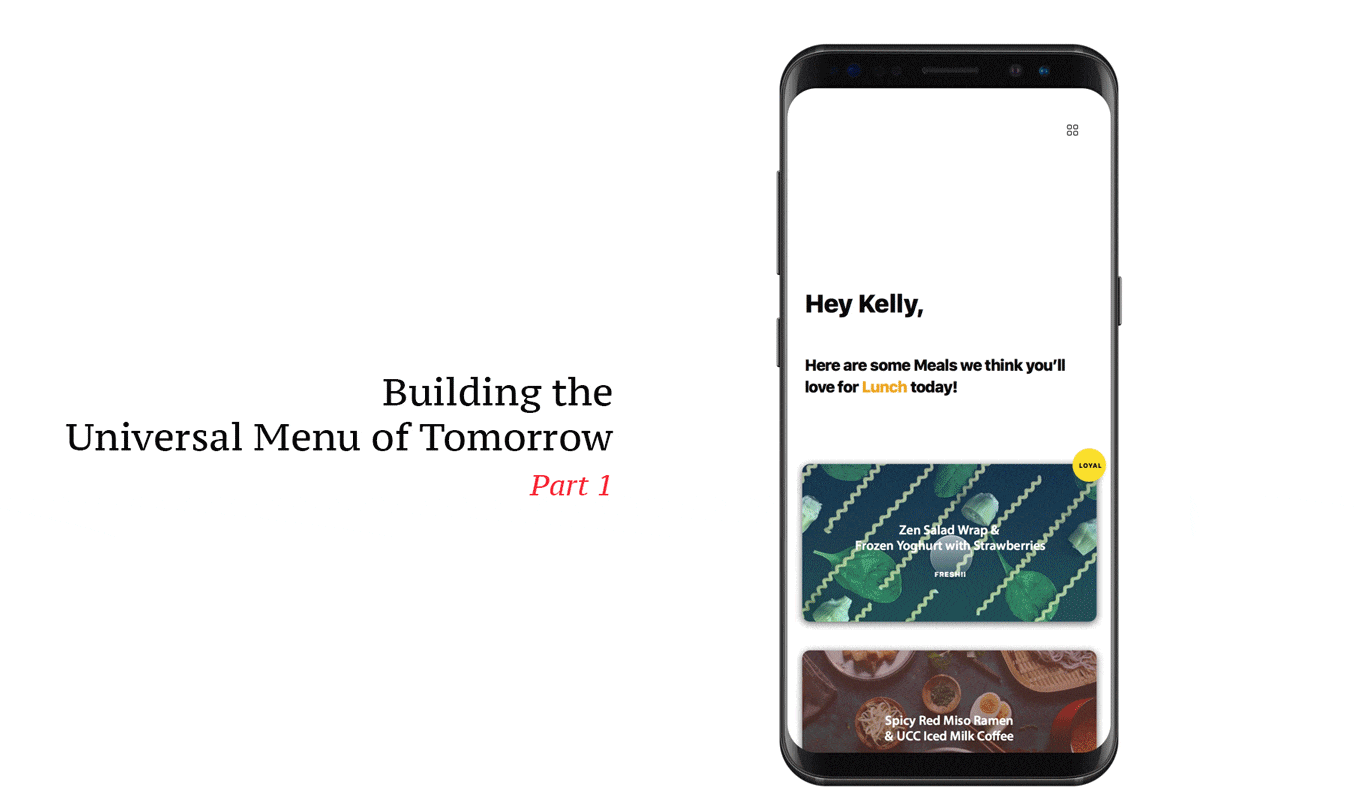
What I wanted to do was make the Home Page the absolute centrepiece of the entire app and have the user’s context drive what to display on it, whilst always keeping a consistent centre of navigation, with natural positioning of the complimentary sections of the entire app (Swiping up moves you to the section above, wherever you are; swiping back down should return you to your original position).
Home Page
“Hey User’s name” is a nice and friendly welcome to the app and will stay constant, allowing you to always click on your name to see an Overview (I talk more about this section below).
“Here are some meals we think you’ll love for Most Likely Scenario & Playlist today!” This section would adapt to your location, weather, time of day and try to suggest what type of meals you’d be interested in looking through right now. Moreover, you can tap on it and switch the suggestion for another one or search and find Meal Cards that fit in that parameter instead. Also, if you’re Dining-In it would only display meal cards that fall under the same scenario but from that specific restaurant.
Below this we would display n types of Meal Cards (composed of multiple suggested items) that fall under the Scenario (e.g Lunch) that you can swipe left if it’s unsuitable and you don’t want to see any more suggestions like this. Or swipe right if it’s good but not quite good enough. By n types of Meal cards, I essentially wanted to allow users to swipe within a specific lane of Meal Cards, where each lane is composed of generally similar Meal Cards but with slight changes with the combinations. Each lane will also be different, but all n lanes will fall under one shared Scenario. Personally, I think having five would be best as it’s not overwhelming you with options, while also giving you enough to compare between.
Once, you’ve found a Meal Card you like you can hold down on it and complete the order with any additional modifications. We would then use these modifications to help autofill subsequent next Meal Cards.
Contextual Sorting (Playlists)
As described above, this section would bring together the most likely scenarios and themes of food you would interact with based on the time of day, weather and so on, as well as taking whether you’re dining in, picking up or ordering for delivery into account. They’re akin to Curated Playlists, composed of Meal Cards you can swipe through.
Power Search
Irregardless, of how the Home Page has adapted to your context (Scenario/Theme + Dining In, Picking Up or Ordering In) you can always swipe up to enter what I call the Power Search. Why the cheesy name? Well it allows a single or multiple users to combine their different taste preferences, budgets, current contexts, etc. together and use that to drive the curation of Meal Cards on the home page! Specifically, your history would dictate what would be on each of the three sections and allow you to the fine-tune it to your likings (The third page would be populated and weighted using a mix of your preferences as well as what’s currently popular).
The main aim for this section was to help individuals who quite literally have no idea what their stomach is telling them to eat, and for those moments when you’re in a group wishing you could read everyone else’s minds to help you decide what to actually order.
IV) Design continued: Further applications of Meal Cards in our daily lives
Health & Wellbeing Overview
By having a platform that allows use beyond a single scenario and is able to compose the meals themselves we’re able to help drive more than short term recommendations. In fact, if we allowed individuals to simply choose the level (maybe as simple as a scale from 0–3) of “healthiness” their long term diet should aim for, and allow users to catalogue meals they’ve eaten outside of our platform (through manual input, barcode scanning & taking pictures of their meals) we could create a connected meal planning, diet tracking & curation service in one. Moreover, such a system could solve a pretty big problem healthcare professionals face today in understanding the general eating habits and even cravings their patients with diabetes, hypertension, allergies, etc. have and find suitable meals when eating out and throughout their daily lives — it’s just too arduous today).
Why didn’t I post the design? Well because, I’m pretty sure I would rather offhand most of this to your centralised health app of choice, whether that’s Apple, Samsung or Google Health. The main aim would be providing these apps with the core information of what you’ve actually eaten and then have it work out how healthy you are and have been. We would then take that and your preferred long term goal and use that to drive Meal Card generation for you. It’s not like we’re ever going to have the same level of data on your actual health as they would. This would just be one part of the growing control we should all have over our health in the future.
Currently Trending, Social & Interactive (API) Recommendations
Ok, the first two are pretty straight forward. Just have friends recommend Meal Cards to one another (or everyone they know), create your own Scenarios (add Meal Cards and we’ll guess similar ones? Maybe), and display generally popular Meal Cards. We could also have Merchants create their own Meal Cards (tbh, this would probably be necessary no matter what) and this would work both ways with Merchants getting better insights of how to improve their menus to serve their own niche, instead of just the masses.
On the last point, I was thinking about how helpful it would be to expand this specific functionality. What if we were able to standardise the way we actually display and interact with food data?
I know we already have hrecipe — an XHTML Microformat for recipe data structures on websites. But what if you could come across a food blog where each meal they’ve reviewed has a Meal Card that you can add to your personal recommendations? Going further than just recommending that exact meal from that exact restaurant, it could allow users in different cities and countries to experience a meal similar to it. Other than integrating Meal Cards into into food/travel blogs, review sites we could help IoT (Internet of Things) devices like your fridge composing Meal Cards from what you’ve got left, or let you order from your self-driving car on the way to the restaurant… Hell maybe, one day you’ll have Meal Cards autogenerated after posting a picture of your meal to Instagram? Who knows.
In conclusion, a complete platform that removes the hassle of tracking & maintaining a healthy, balanced diet, personal tastes & habits and applying it to the real world, whilst ensuring the whole experience is enjoyable. It’s not perfect, and it’s clearly not feasible to build this tomorrow, but I guess I’m just not a huge fan of the Agile Methodology.
V) On a path to transparency and understanding.
The main reason for writing this here, isn’t just to share my cool idea to make the experience of finding your next meal better in every way.
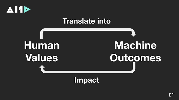
It’s because after all my time researching, meeting & talking to entrepreneurs, designers, engineers and somehow managing to make it into the Next.ai finals without a team last December. It became clear to me that there’s not a lot of people who understand how to build with human goals at the heart of their businesses, so we’re all royally fucked as everyone and their moms start racing to add AI to everything they can get their hands on.
And it’s not intentional at all. It’s just because no one really understands what’s going on and there’s even less people who understand how to design anything for users with them in mind. Which, makes sense seeing as recent reports state that there are as few as 22,000 people in the world who even understand the subject enough to create AI solutions for companies. Meanwhile on the design side of the world, we’re still debating whether the hamburger or tab bar is better for navigation, talking about how innovative it is to use gradients over mere solid colours and even our supposed saviours at Apple can’t seem to understand what a consistent design language is anymore…

And yes, I understand this case study is barely a breakdown of menus or food, it’s a shitty UI design/UX research overview and an even worse AI blog post. However, I really do believe it’s about time we start taking a step back to ensure we’re creating AI that’s truly serving us. Moreover, platforms such as this allow more than just one app allowing anyone to choose and even create their own an app that best suits their particular needs, instead of being forced to use the only one available because no one else could compete with their proprietary data. Or what’s more likely, the app that was simply the first to flood the market with coupons and deals and were able to ride out the huge losses to barely become the market lead in whichever locale they started in.
Even when talking about my idea itself, it may not be that important for anyone right now. I’m sure we’ll be able to walk into a restaurant and be given the standard printed menu we’ve come to expect, have a nice waiter ready to give us some advice and take our order. But, just as quickly as we saw ordering kiosks replacing human cashiers at McDonald’s, it won’t be long before everything will be replaced by a single tablet in the middle of the table.

Anywho, with Part One being a rough overview of the problems and solutions we can implement to improve our menus as I’ve learnt the fundamentals of business development, UI design/UX research, some coding languages and the very basics of ML/AI. I’m happy to say I’ve enrolled into the Deep Reinforcement Learning Nanodegree at Udacity in an effort to better understand how the inner workings of the tools that will one day run our lives for us function and hopefully learn how to properly build and implement this idea. If this sounds interesting you can follow me on my journey and catch Part Two of this, where I’ll be going over my first small scale attempts at sorting menus into meal cards you can interact with! Whenever it comes out that is...
But seriously, thank you so so much for reading this horrendously long post. It really means the absolute world to me and if you liked what you read, why not check out some of the shared resources below, and don’t forget to try out the prototype for yourself! (N.B For now it’s just visual, but I hope to update it over the coming months and give it some real functionality to create & interact with Meal Cards using some simple JSON, as shown here. Or just skip that & make it for real).
If you see any errors I’ve made, have any suggestions, can’t work out what I’m saying, would like to contribute or just want to reach out and say hi you can always email me at hammaad.mahboob@gmail.com.
You can check out the current code so far and follow me on Github for updates in the future!! 😁
*If you’re on mobile request the webpage to load as a desktop site*
Feel free to try and download this prototype out for yourself! I made it a while ago before Framer added the ability to have any device newer than the iPhone 6 Plus, and the code gets pretty janky. I’ve elaborated a bit on my github, it’s not much but I think it’s much better than a series of pictures. If there’s decent interest in this, I can re-write the code and just replace this one if it makes things easier before Part Two.
As you’ll see in the footer of this post, I’m releasing the framework described above under the CC BY-SA 4.0 license. The tools to build this, once there’s some real source code to share, will be released under a GNU GPL v3.0 or similar license.