Building an app for restaurant managers to receive online orders.

Zomato enables over 200 thousand online orders to be placed in India every day. There are two sides to each of these orders, one is the customer facing interface which lets them get delicious food delivered right to their doorstep. The other is the restaurant facing interface through which they can receive orders made on Zomato. When an order arrives the restaurant manager can accept, reject or take other actions on the order. Zomato provides an order management interface for the restaurant in the form of an android app or a web dashboard.
The earlier version of the app and the web dashboard were released with the initial launch of the online ordering business in 2014. With the addition of new verticals, increase in our merchant base, higher adoption rate of the app and the subsequent integration of our delivery partner — Runnr, the app needed a redesign.
I worked closely with Naveen Durga, who at the time was managing the app.
Getting to know the users
Before we jumped into the redesign, we tried to understand the problems restaurant managers faced with the then current version of the app and the circumstances in which they operated. We visited five restaurants in Delhi and Gurgaon around lunch time and were fortunate enough to see the restaurants operate at high order volume. The following is my artistic rendition to best describe the condition of the restaurant manager during this time.

Here is what we observed. Constantly increasing new orders, customers calling to know the status of or to make changes to their orders, back and forth with the kitchen to pass the new orders or check up on the old ones, keeping a track of the delivery executives, managing inventory. Their job was chaotic and tough!
Being a fly on the wall for these sessions taught us a pattern which the restaurants generally operate in:

To better empathise with the managers, apart from understanding the problems they faced at their job, and the ones that they faced with the current app (more on it later), we also talked to them about their personal lives.
Most of them were from surrounding towns and villages and had migrated to Gurgaon in search of livelihood, often leaving their families behind. All of them were unaware of the internet before buying their entry level android smartphones. They mostly used their phones to WhatsApp and watch videos. Based on these insights it soon became clear that we would be designing for the next billion with this project.
Defining the Problem(s)
On understanding the managers and the circumstances they operate in, we were in a better position to define the goals of the app redesign. Here they go:
- We wanted to overhaul the overall user experience such that it would be more favourable to their entry level devices and overcome their highly distracted conditions.
- Managers operated in a time-crunch and every second was valuable. We wanted to ensure that the major task of searching and identifying an order on the app was easy and quick.
- On orders delayed for more than 15 minutes, the order rating would plummet. Clearly, delayed orders were a frustrating experience for the customer. We wanted to shape manager behaviour which promoted urgency for delivering orders and cut delays.
- Order rejection by the restaurants was a very poor experience for all three parties. The already hungry customer not only lost on the food, but also on time. They were then hungry AND frustrated. The restaurant and Zomato lost not only the business but also the trust of the customer. We wanted to design a solution which would minimise order rejections and reduce its negative effects.
It’s problem solvin’ time!
Solving for lower end devices and highly distracted conditions
- A user interface with higher contrast: Lower costing phones generally tend to be lower on screen density and brightness. Since the managers were monitoring multiple systems at once, a lot of information consumption on the app would happen from a distance. High contrasting colours and typography made up for the low density and brightness of the lower costing devices as well as for distant viewing. This is how the app looks on a Lenovo 1000 device:

To make sure the app performs well on these devices we reduced heavy graphical processing tasks such as animations, transitions and shadows. These design decisions contributed to make the app lot more snappier with the response time of each tap reduced to 170 ms on a phone where the average response time to a tap is about 280ms
- Talking to them in their language: All the managers were proficient in Hindi (their native language) and understood only basic english. We thought of localising the app to the languages of different cities, but due to time constraint had to push the idea to a later release. Going forward with english, we decided to simplify the communication. Hence, replacing words like “Dispatch” with “Send Order”, “Dispute” with “Problem with order?”.

Solving for quick search and identification of orders
- The Order Card A noteworthy insight from our visits to the restaurant was how the restaurant managers communicate about the order to the different stakeholders. For e.g. — A manager when asking the status of an order from the kitchen would use the order items and the address of the customer to identify the order. When the customer would call inquiring about the status of their order, the restaurant manager would ask for their name or their phone number (in case of a generic name) to search for the order through their list.
All of this information was critical for the restaurant manager. Bringing this information together in a way which made the card feel like a cohesive unit and also allowed for easy consumption of the information was a challenging problem. We iterated several times to get the information hierarchy and density right.

- A clear navigation coupled with categorisation of orders: The bifurcation of orders to “Preparing” and “Dispatched” was made in to order to match the physical reality of the restaurant. At any given time an active order can either be in the kitchen being prepared or out for delivery. This would help the restaurant manager in getting a birds-eye view of the current state of the restaurant and would further aid in quickly searching for an order.

Shaping manager behaviour which promoted urgency to deliver orders
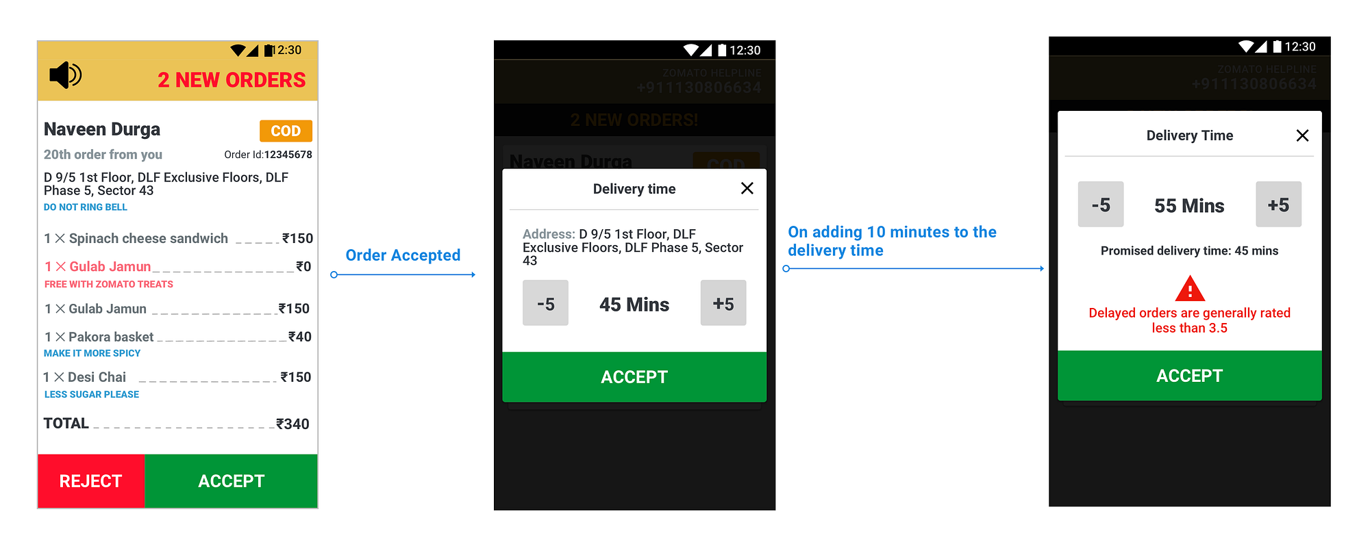
- Acceptance screen: In the previous version of the app, when the manager accepted a new order they would be presented with a time selector where they could increase or decrease the delivery time, depending on how busy the restaurant was. To discourage the managers from mindlessly increasing the delivery time without realising its consequences, we decided to surface its impact when the time would be increased by 10 minutes.
- Better ordering of the cards: The orders in the previous app would be sorted on the basis of recency (newest order first). This meant that the old orders which needed more immediate actioning would be pushed down the list and have less visibility. This further led to the managers forgetting to mark the orders as dispatched. Classic case of “out of sight, out of mind”. We decided to reverse the ordering of the list to show the orders close to being dispatched on top of the list.

To sure that this ordering does not make the managers forget about adding new orders (being appended to the bottom of the list) to their POS, we designed a button which would scroll to the newest order.

- Dispatch ticker on the order card: We decided to add a ticker to orders with dispatch time less than five minutes. This would ensure them to be even more mindful about the orders which needed to be sent out immediately.

Solving for minimising rejections
- The new rejection flow: On visiting the restaurants we asked the managers what were the main reasons they would reject an order. To decrease the negative effects of a rejection and accommodate more transparency in the system we re-worked the rejection flow. Now, on rejecting an order the manager would be asked the reason for rejection and depending on the reason chosen, specific actions would be taken which in turn aid the restaurant operations.

Selecting kitchen full & No delivery person: Selecting one of these reasons tells us that the restaurant is finding it difficult to deliver the already pending orders and definetely does not require new ones for the time being. At first, we thought of taking the restaurant offline for a certain time, so that they get no new orders. But this soon started to feel like we were taking valuable business away from the restaurants and also not letting the customers order from their favourite restaurants. After much deliberation, we decided to set the right expectations for the customer on the behalf of the restaurant. Once the manager selects any of these two reasons we start to show a disclaimer over on the customer app.


The customers, if they want can still order from the restaurant but are already aware of the more than usual delivery time.
Item out of stock: When the manager selects this as the reason to reject an order, it was almost obvious to ask them the item which was out of stock and then take it off from the restaurant menu over on the customer side. There would be no new orders with this particular item and would help in minimising rejections.

However, to make sure that the managers don’t forget to bring an item back in the menu when it is back in stock we designed a prompt on the app which would show up at the start of the next business day.

Testing out the prototype
We revisited the restaurants with this prototype to test out the above changes. This qualitative testing was done so that we could get merchant reactions and weed out the most obvious problems with the redesign which we might have missed.
Some scenarios in which we tested out the prototype:
- Imagine it is a national holiday and you are getting more orders than you can manage. You already have 20 orders pending and a new order comes in on the Zomato app. What action do you take?
- You run out of one of you best selling items, and the very next moment you receive an order for exactly that item, what do you do?
Manager Reactions (translated from Hindi):
“Yeah, 20 minutes is good enough for us to complete the pending orders so that we can take new orders.”
“Woah! who are you to decide to increase our delivery time, 20 minutes is too long a time and we will lose on our orders!”
“This option to mark items out of stock is really helpful. Otherwise, I have to do it manually and most of the time I forget to do it”
Manager reaction to the new rejection flow was mostly positive especially the flow for when some items were out of stock. Managers were divided about increasing their delivery time for 20 minutes and thought this might not be helpful all the time. Nevertheless, we decided to go forward with it and find a better answer after receiving feedback from a bigger merchant base.
3. To test out quick search and identification of orders: A customer calls in asking for the status of their order. The order was dispatched 5 minutes ago. What actions do you perform next?
We were excited to find out that all the managers adapted well to the two tabs design. They were able to switch between them effortlessly. Such high level of comfort with the tabs could be attributed to WhatsApp on android, an app which they used regularly.

However, the ticker on top of the order card seemed to be generating anxiety rather than creating a sense of urgency. Two of the five merchants were completely bewildered as soon as they saw the ticker..
“Oh! did i do something wrong?
“Everything seems so complicated suddenly, what did i do?!”
This made us rework the ticker to something which was not so visually appalling.

Closing in
One week after deploying the app at our partner restaurants in Delhi/NCR, the data suggested that we were able to bring rejections down by approximately one percent. Decrease in chatter on the customer support’s “Delayed Order” channel was attributed to increase in timely deliveries. Our first steps with the redesign were in the right direction.
My first experience designing an solution for businesses was fun and challenging. Shout out to Pradyot Ghate and Ashish Goel for their valuable inputs throughout our design process. I tried to cover the most integral parts of the redesign. To know more about it, hit me up on twitter.
If you enjoyed reading, appreciate by applauding 👏
Cheers!

