BuzzFeed News website launch teardown
BuzzFeed shows signs of maturity with a new website dedicated to news stories from around the world. But is a new website enough to convince users you’ve grown up?
Out with the memes and in with the scoop. The internet’s favorite quiz-generating factory, BuzzFeed, has grown up and turned into a Proper News Organization with the launch of a dedicated news website. And we’re going to dissect the UI for your reading pleasure.
Since its time as a finalist for a Pulitzer Prize, BuzzFeed has gone on to break major news stories and firmly established itself as a go-to news source.
But stories about shady government officials mixed with memes about cats surely isn’t the most effective way to be taken seriously in the world of hard hitting journalism.
Now that BuzzFeed News is equipped with a new domain and identity, Justinmind’s going to take a look at design and judge whether or not the organization really has grown up.
A tribute to minimal design
Buzzfeed News definitely does minimal website design very well. In stark comparison with their parent website, this is very muted design.
This new look has ample white space, giving its news articles the room to breathe. Nothing feels cramped or pushed in.

White space doesn’t show any signs of slowing down as it rises in popularity across the web. If BuzzFeed News has done one thing right then it is the composition of their website.
BuzzFeed News focuses their audiences’ attention by striking a balance between the use of text and imagery. Neither element is competing with the other and this makes the page coherent with few distractions. It’s offering users the main scoop from and center, they don’t have to hunt for it.
By designing a website with a reduced color palette (only black, red, gray and white), limited imagery and legible text, the busyness that you might experience on a traditional news publication like The Guardian isn’t there. It’s calmer.
Navigation and Layout
The overall layout for the BuzzFeed News website is not too dissimilar from other popular news publications. BuzzFeed News manages user expectations by providing a design that follows many news site conventions, like keeping it nice and elegant.
Because the website follows many conventions, it is… conventional. There are no surprises here. It’s definitely not like The Intercept. It is a standard news website. No bells or whistles. No distractions. Just news, plain and simple.
The column layout with a large middle splash surrounded by smaller medium-sized containers is what you can expect from online news websites. Look at US News.
If there’s one unconventional move that BuzzFeed News have chosen to make it’s to do away with traditional category navigation. But haven’t put anything in its place.
Where you’d normally expect to see categories for subjects like ‘Culture’, ‘Politics’ or ‘Entertainment’ there are none. Instead users are treated to a trending stories bar. This is great if you want to get to the hot topics in an instant. Not great if you were hoping to find that niche review of the latest Stephen King novel. But then there’s the parent website for that.
In TechCrunch, BuzzFeed Product Manager Sam Kirkland said that this was intentional because it “didn’t make much sense with how we work internally or how we consume news”. Without categories, how does a user decide which type of news they want to consume?
For users who expect to navigate as they would on other news websites, think again. You will have to scroll down the page to view a side panel. It’s there users have the choice to browse what can be described as loose categories.
However, be warned. Not all of those links in that side panel will take you to dedicated BuzzFeed News stories. There is a blend of news and typical BuzzFeed fodder in there.
Even with this new design, it is still difficult to distinguish between the brands. And with the interlinking of ordinary lol-worthy content and journalism it’s even more difficult, which is a shame when one of their editors found that this was a problem in user research.

Serif logo and tagline
The logo is nothing surprising. It is a custom design by the foundry TypeMates but it looks like a facsimile of the Medium logo. Sans Serif. Bold. Adult. Serious News Organization.
A nice addition is the red dot, which looks like the red recording dot you might see when recording a video. Or, recording news. A small nod to the journalism profession is welcome and adds charm.
What is really nice is the tagline. “Reporting to you”. The copy is direct, personal and makes a point of driving the reporting/investigative journalism message home.
Overall, the masthead is spacious and well designed.
Content design
The content is presented in digestible chunks. It isn’t overwhelming for a new user thanks to the generous white space. The headlines are very quick to read and the page makes for easy scanning — useful for a news website.
As mentioned, the layout is traditional. Don’t expect a design revolution with this website.
Inside the articles, the content follows a noticeable hierarchy. There is a large headline, sub headline and byline and large hero image.
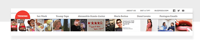
Bizarrely, under the trending topics navigation is a full width visual navigation strip which has images to other articles — but not BuzzFeed News articles, just BuzzFeed. Hovering over the image reveals the article title.
Typography and fonts
The text is both legible and readable. The font pairing is sans serif Basier and serif Pensum. They complement each other well on the page.
The fonts scale properly so don’t get compromised at smaller or larger sizes. The contrast ratio is appropriate and doesn’t cause any problems.
Mixed messages

Curiously, as you scroll down there are some stories which have a full-width gray banner as a background. It’s not clear if this is for visual interest or represents something to do with the story — are these popular stories? Highlighted stories? A user’s attention is grabbed but it’s not clear why.
The mix of information and entertainment continues in the right side column, with terrorism reports followed by an article on which emoji is the least used. Thanks, Trending News.
Blending entertainment and investigative journalism seems to be a strange move if BuzzFeed’s intention is to appear serious. If Burger King opened a new restaurant called Burger King Fine Dining, would any of us be fooled?
BuzzFeed News redesign — conclusion
To clear the BuzzFeed News of distractions and LOLs is a step in the right direction for a investigative-driven news publication that wants to be taken seriously. BuzzFeed News has done a good job creating a website dedicated solely to news.
The layout is easy to users to scan, there are no jarring visual elements and overall the simplistic design will work in BuzzFeed’s favor.
What remains to be seen is whether or not users will be able to distinguish between the brands and if this design is enough to create that distinction.
At the moment, the combination of hard hitting news stories mixed with ordinary BuzzFeed content is confusing and could be readdressed for a better solution. But maybe people want their GIFs served with the latest goings on in world affairs.