UX CASE STUDY
Calcy | The new-age calculator for 21st-century users
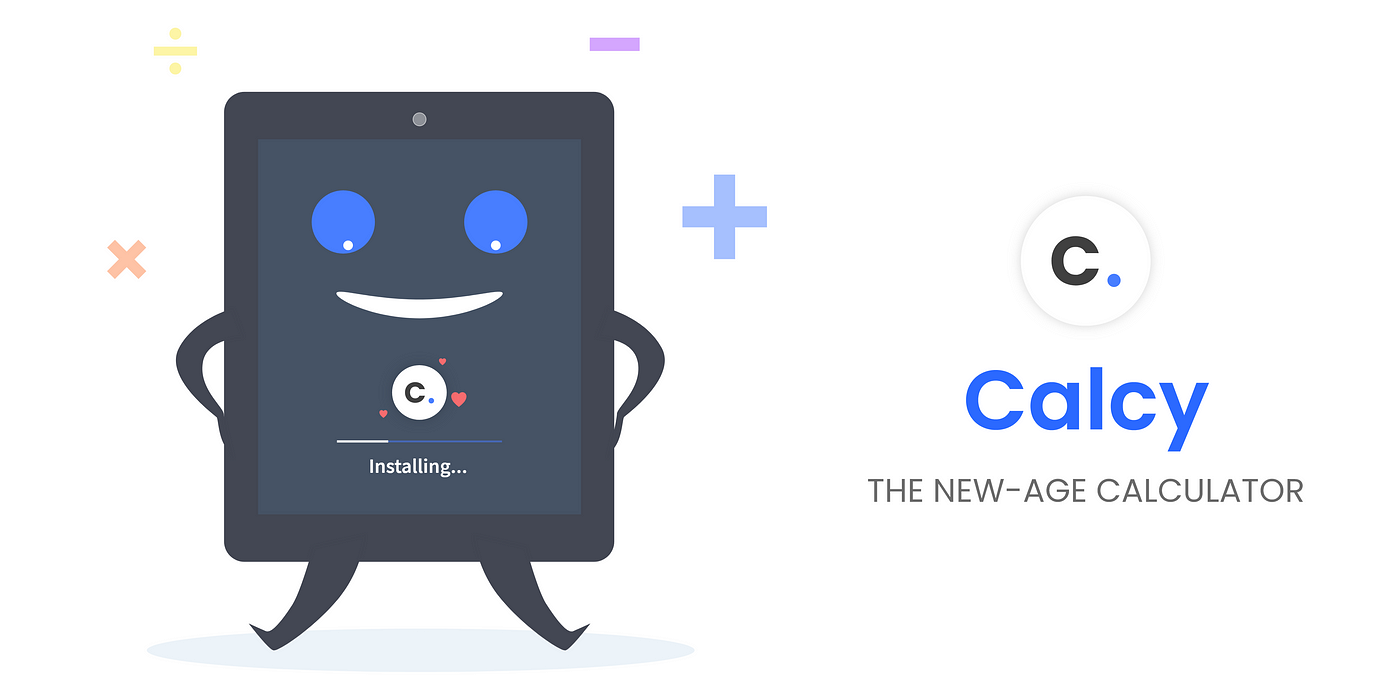
Calcy is a calculator app concept designed to improve the overall usability and speed of performing calculations for every kind of user who owns a digital device. Some best features like L-R mode designed for left-handers, Quicksave for instantly saving the current calculation with a name (Eg. Monthly grocery) which can be used for later purposes, and so on.

🔁 Design process
- (Understand) Observed the users & their problems being faced very closely.
- (Data collection) Talked to users about their experiences, personally used the existing solution, traveled along with the users for around a week to know them better about their usage behavior.
- (Make sense out of) Analyzed and collected important data points from the Research & also the existing solution.
- (Get inspired) I took various real-time applications and their methods of solving as my inspiration, and dribbble for my visual inspiration.
- (Mind Sketch) Get started with some initial ideas and sketching in mind.
- (Design-Test-Iterate) Start with the UI design prototype and test it with users ASAP — Repeat until a fully satisfied & optimized solution is obtained. For me, it was 2 intense iterations.
🤹♀️ My Responsibilities
- All the Illustrations, Visuals, Animated prototypes were created by me from scratch 😁.
- And, Multiple Design iterations were performed to reach the Final Design with lots of patience 🐌.
- I was responsible for the entire UX process, Micro-copy writing, Icon Design 🔁.
- Finally, Lots of learning • Lots of research • Lots of power naps.
👨👨👦 The Target users

🤯 Problems faced

- Left-handers cannot use the present-day digital calculators with full potential, they feel annoyed (Since the interface was designed for Right-handers).
- Users have to swipe every time in order to add any special operator to their equation or calculation.
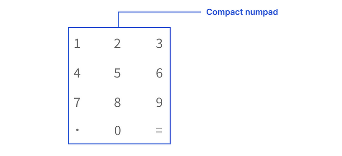
- Users cannot use the current calculators single-handed, the number pad is spaced out very much.
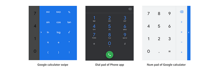
- Phones have different num pad layout for dialers and calculators. They want zero to be at the center and “.” , “=” to be on either side of the last row of the num pad.
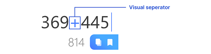
- On a long equation, it’s very hard to visually differentiate the operators and numbers.
- Users hate the whitish interface having more white spaces during nights, it hurts their eyes. And, whitish UI on OLED screens consumes more battery than normal.
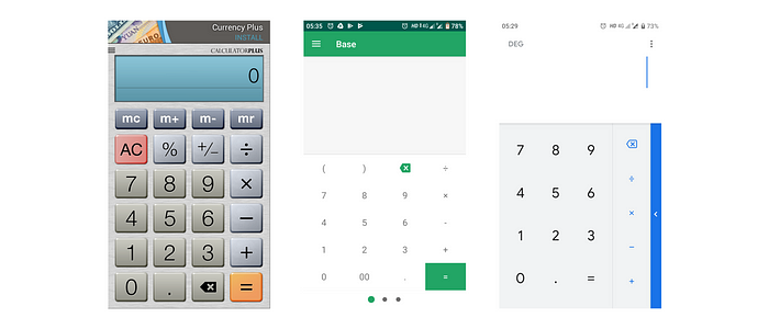
🤨 Some existing solutions
🎯 Design goals of this project
- Design a new & refreshing experience of a traditional calculator app that can be easily adaptable and usable.
- Better engagement with the target users.
- Solve every problem being faced by the target users.
- Integrate additional features to improve the overall usability and productivity of the app.
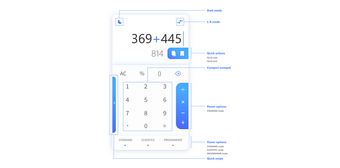
🧬 The Anatomy
New features
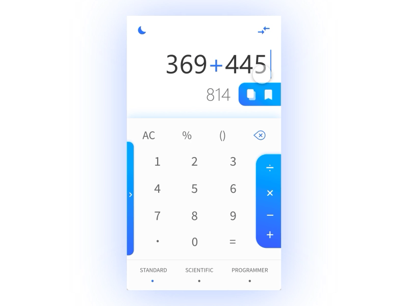
👈👉 L-R mode
L-R mode (Left-Right mode) is a cool feature that enables the users to switch the UI layout according to their convenience. Almost 10% of the world’s population are Left-handers. But, the UI layout of most of the daily used apps are adaptively designed for Right-handed people where Left-handers are left out during this process.
⚡ Power options
Ever noticed, how many times you would swipe the side-slider to insert scientific math operators into your calculation? This process drastically reduces efficiency and increases the time spent.
Power options allow users to instantly change a set of operators at once as per the 3 segregations:
• Standard (+,-,*,/)
• Scientific (ln, e, log, π)
• Programmer (√, ^, !, ±)

⏩ Quick actions
Copying your answers is quicker than before with Quickcopy! This feature enables the user to instantly copy the answers to the local clipboard.
Have you ever wondered, how cool will it be to save a calculation with a name and view it later? This is possible with Quicksave, this feature enables the user to instantly save the current calculation with a name and view or edit it later.
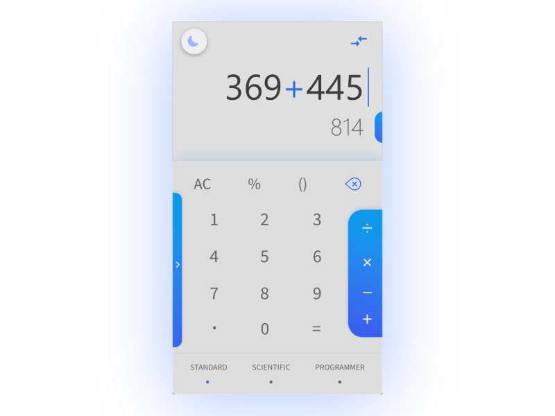
🌗 Dark mode
Love being dark? Enjoy your new calculator with Dark mode that is sweet on your eyes during your late-night calculations.
🥚Easter eggs!

🔥 Iconography of Calcy
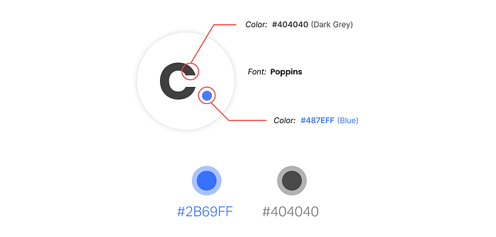
The circular shape of the app icon holds the recent Google Material 2.0 logo guidelines for a better look and feel in Android 8.0+ versions. Keeping the logo simple with the letter “C” will make the users remember the name of the app and become familiar with the app quickly!
The main aim of choosing blue as a primary color was to soothe the eyes of users while they use it during the daytime. The Dark grey will support the human eye during nights for a seamless calculation experience!
The font Poppins gives a peppy look to the text logo, making the overall look of the traditional calculator a new life and refreshed look.
Challenges
- Designing an experience which is compatible and adaptable by userbase of all age groups.
- Integrating many features without increasing the cognitive load on the users and keeping the feel of a calculator app.
Feeling curious about Calcy?
Let’s connect on LinkedIn and say 👋 at k.s.somesh11@gmail.com
Can’t wait to know your feedback and thoughts, comment below👇

