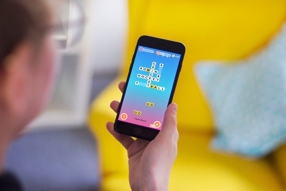
Playing games is not always pure entertainment. Today we have prepared a new case on design for a mobile game. What makes it different from the Real Racer game we showed before is the balance it had to find between fun and education. So, let’s review the creative path for Letter Bounce, a bright and simple crossword game.

Project
UI and graphic design for a mobile game based on crossword puzzles.
Process
The task our team got was creating a bright and funny interface of a crossword game for mobiles. It had to set the harmony of an educational game which is simple, funny but letting user’s brain get some load.
The functionality of the game lied in solving the crossword-style puzzles using pairs of letters to fill in the blanks — so, it’s a modernized version of a traditional approach to crosswords. Each level had sets of letter pairs that needed to be dragged into the blank spaces to complete the words and this way player solved the puzzle. Each level had a clue to help users work out the words.
The app also had an element of socializing which supported general gamification: a player could connect to Facebook and share the scores on the leaderboard as well as compete with friends. Beautiful design and animation were considered among the core features supporting user retention.
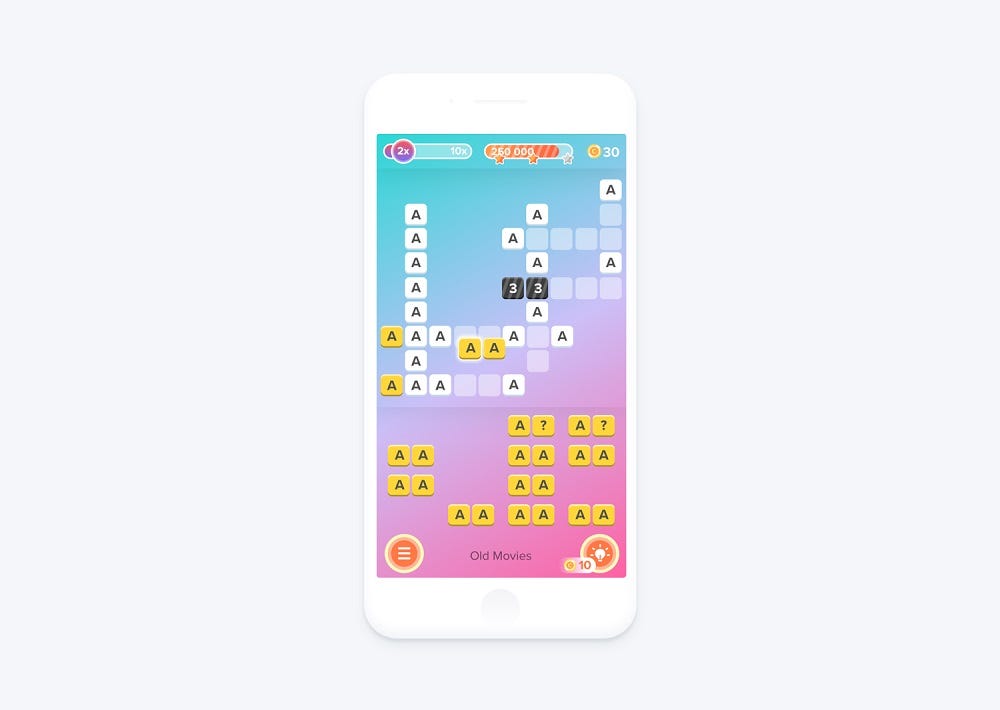
First, let’s check the main screen of the game. Below you can see the solution for interactions with the letters in the process of filling in the game grid. The top part of the screen showed key indicators: the multiscore coefficient, the level of achievements marking milestones with stars and the number of coins which a user had at the moment. The screen background used nice gradient which was not over-brightened and didn’t distract the user. The grid was placed in the upper part of the screen and applied white background under the letters while the interactive pairs of letters were placed in the lower part and colored yellow.
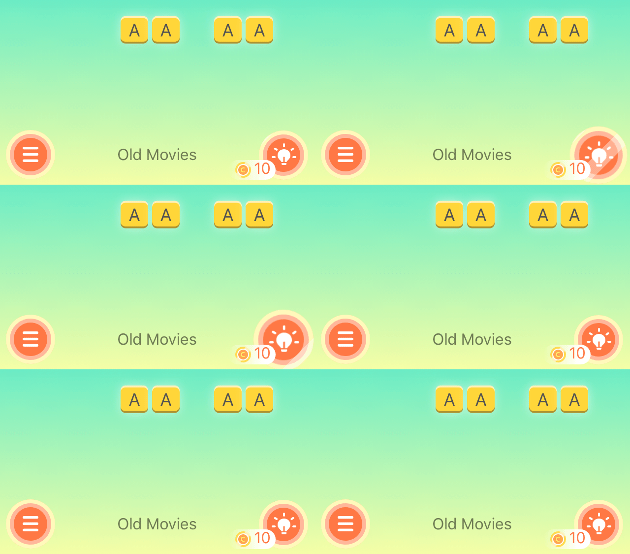
This way users could scan the screen and understand the difference of the layout elements due to color contrast. In the bottom part of the screen, there was a hamburger button hiding the menu, the theme of the current game and the hint button marked with a lamp bulb icon. All the elements in the layout are designed with smooth lines and rounded corners to make the interface look playful rather than strict.
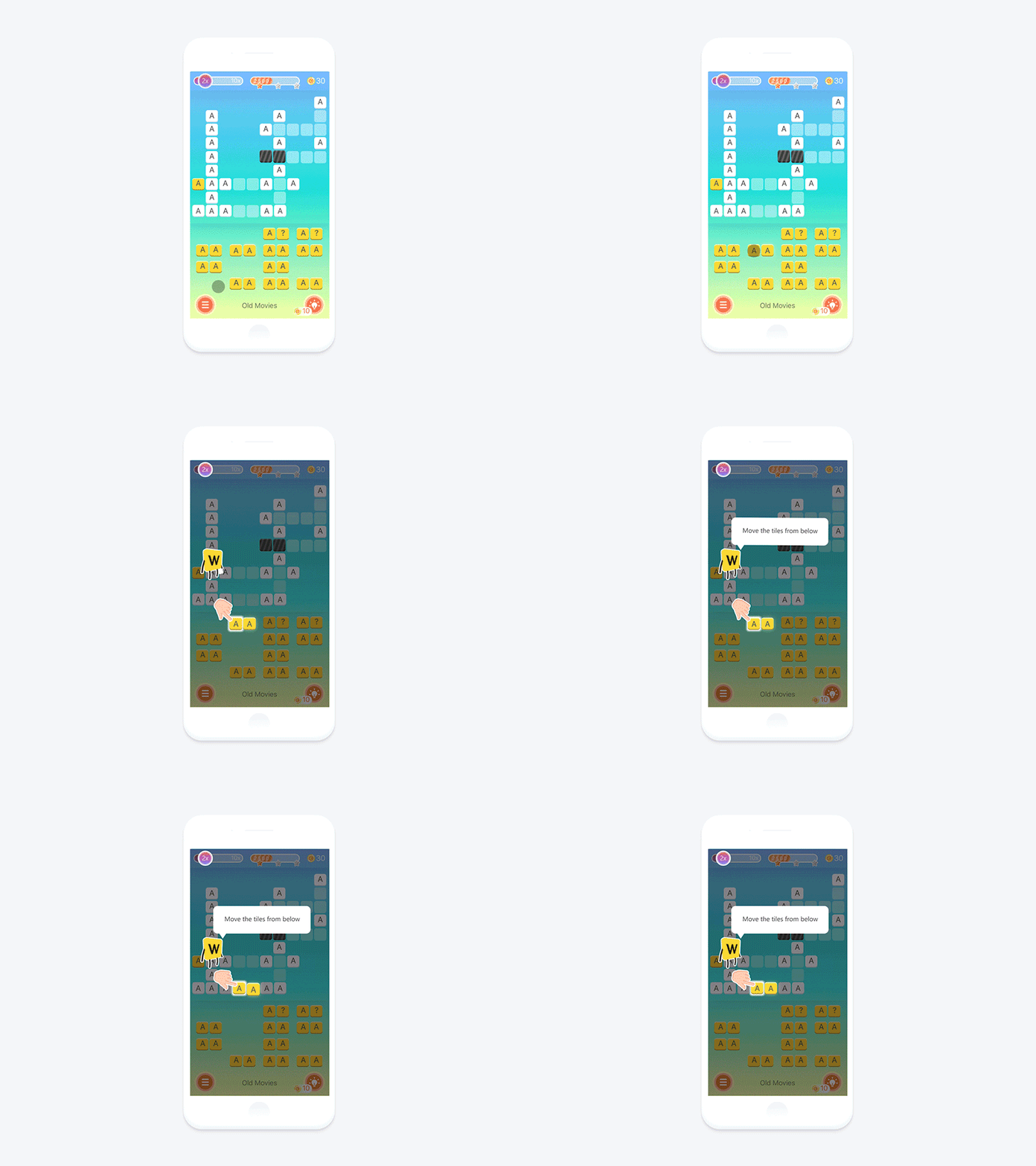
Another screen presents a tutorial showing users animated interaction to make the navigation clear. For this aim, the funny letter character was used as a mascot which communicated with a user and gave the needed hint. To avoid unnecessary taps and transitions, the tips appeared on the faded screen and showed the animation imitating interaction gestures together with a text prompt.
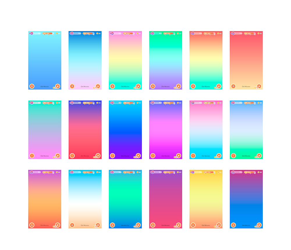
In the flow of the UI design process, the designer offered a variety of gradients to choose from. Bright and juicy colors played the big role in creating the playful atmosphere.
One more thing to mention was the animation of a hint button. It imitated the pulsation with lights and shadows playing on the surface to draw user’s attention to the updates. The number of coins near the hint icon shows how many coins are paid for one hint.
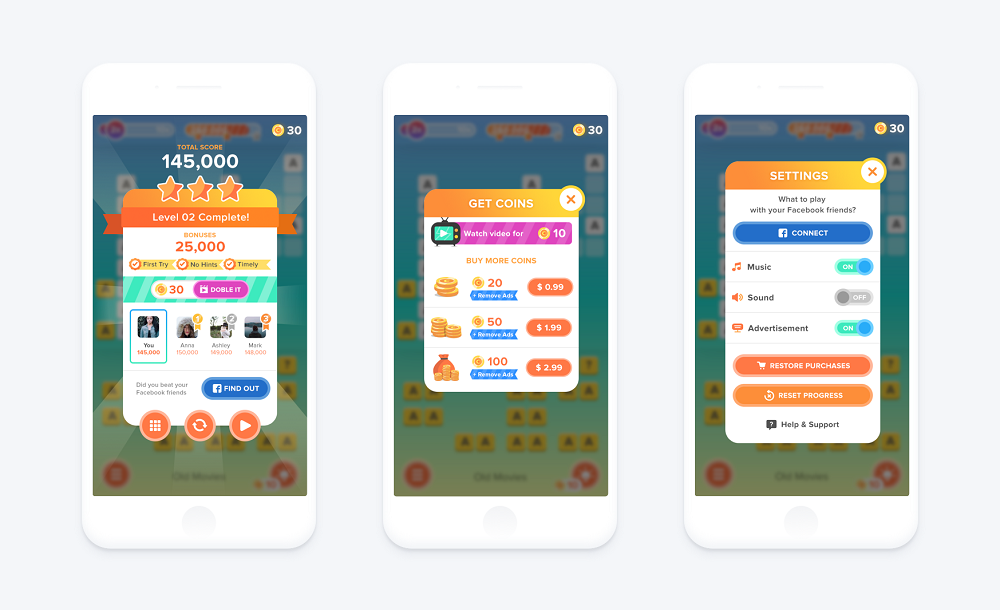
Various pop-up windows were created to inform users about achievements and updates, give access to settings and present some offers from the game. Below you can see the examples: the first screen shows the pop-up with information about a completed level, total score, bonuses, leaderboard, sharing to Facebook and options on continuing the game. The latter are presented with the round buttons in the same style as buttons on the game screen this way supporting the visual consistency. The next screen provides the information on the ways to get coins. And the third app screen shows the settings.
One more important element of a mobile game UI is a map of levels. In Letter Bounce it was performed as a long path through a variety of beautiful landscapes from the snowy mountains to the hot volcano. Graphic designer Denys Boldyriev created unique flat illustrations for the map, vivid, lively and full of color.

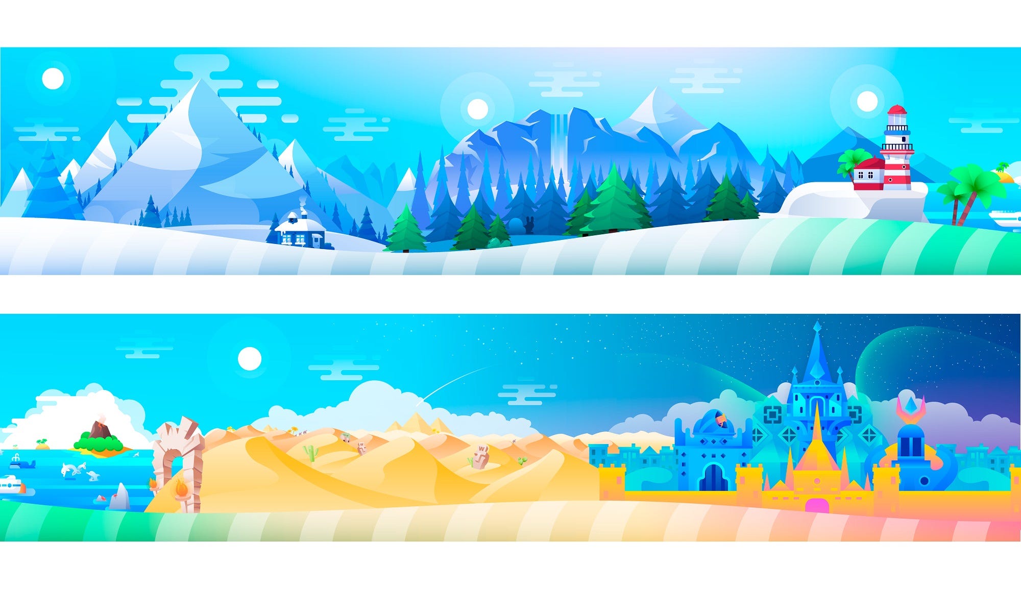
Here’s the animated flow of the illustration on the game map.
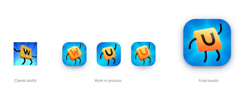
One more point to care about was an app mascot. We got the great reference of what the client wanted to see: the image had to present a recognizable letter key from the keyboard. To make it look active, it was given the visual elements of a live creature — legs and arms. They could be used for imitating universal gestures with well-known meanings like «Hi!» or «Success!» So, the mascot became another playful element of the interface with an obvious emotional appeal to add positive mood to interactions.
Here you may check the app video featuring the interactions and design solutions.
The game is live on both AppStore and PlayMarket, so if you want to add a bit of fun, brightness, and brain-tickling to your day, that’s a good reason to try it.
Useful Case Studies
If you are interested to see more practical case studies with creative flows for mobile UI design, here is the set of them from Tubik.
Real Racing. UX and UI Design for Mobile Game
Real Racing. Graphic Design for Mobile Game
Manuva. UI/UX Design for Gym Fitness App
Cuteen. UI/UX Design for Mobile Photo Editor
Tasty Burger.UI Design for Food Ordering App
Originally written for tubikstudio.com

