Case Study UX — Kindle Redesign — Settings Screen
The inception of this project began nearly a month ago when my cousin (a book blogger) and I started discussing things we’d like to change on our kindle. This made me realize that the current UX did require some alterations and could be improved. I took this up as a challenge to myself and also as learning project.
Once I started this task, I realized just how massive this task is. I decided to dissect the model into smaller components and attack those individual components first.
This study focuses on the settings panel and how I tackled the problems currently present in the existing model.
What was my approach?

The method that I employed to tackle this challenge was simple. I first conducted a user survey, which helped me identify the pain points. I outlined the current information architecture, and mapped out what the flaws and drawbacks of the existing model via a heuristic evaluation. Using these points, I designed a new architecture that addresses the concerns. Finally, I sketched out prototype (this isn’t included in this study) and then converted them into hi-fidelity prototypes.
User Research
- I listed out a few questions that could help me identify what users felt was lacking in the current experience of the Kindle.
2. I sent out a survey to several book bloggers (these people are on the kindle for over 4–5 hours a day), in my opinion, a very good target audience.
3. With the results of the survey, I identified pain points
I will soon upload the results of my survey as a separate story along with a detailed user persona.
When asked how frequently do you go to the settings panel (1- never, 5- very frequent)
41.7% of the users said that they go to the panel occasionally (Rating: 2)
33% of the users said they go to the panel sometimes (Rating : 3 )
When asked if there were issues that they faced with the current experience this was a response :
The options can be categorised better. It’s hard to keep in mind which setting comes within what option, oftentimes I’m left searching.
Although the settings panel isn’t a principal feature of the kindle, I believe that in order to enhance the entire UX, this screen is important. As an avid reader, I myself find the settings panel confusing and cumbersome.
My key take away at this point was that the settings panel needed some reorganization
Information Architecture
Based on my take away from the user survey, I decided that the best way to go about this would be listing out the current flow and identifying the drawbacks of this model.

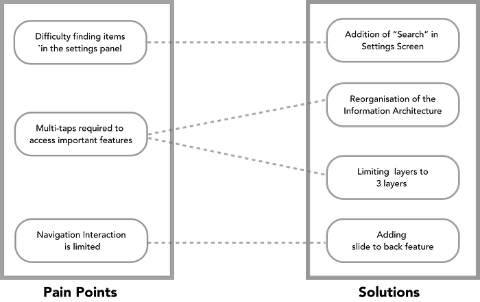
A few problems popped up immediately :
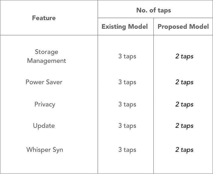
- In order to reach certain tasks (eg: storage organization) the user would have to tap >3 times
- Many exciting features get hidden by this nesting method
- There exists no method to search for a particular setting
- The interactivity is low, most users are accustomed to high interactions because of using smartphones intensively and this interface lacks those interactions.
Prototyping
This approach focuses on enhancing visibility and discoverability of otherwise nested features while retaining the familiarity of the UI.
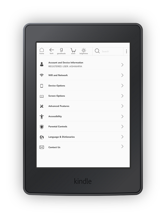
In the menu bar, I removed the “Settings” tab. As we are already inside the settings panel, this becomes redundant. Further, I added a brightness option as this seemed vital.
I’ve added the option of an advanced feature which directly leads users to these features, earlier this was hidden within another option. This improves visibility.
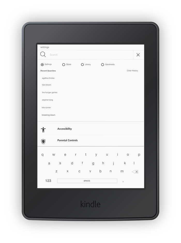
The new search feature allows users to select a category within which they would like to search.
When the settings mode is selected, users can search for features directly by entering an input.
This solves the problem of searching for certain features and having to tap multiple times to reach a certain feature.

Account and Device Information: By clubbing the two sections together, I have created one consolidated page that contains all the device and account information that the user would require. The two go hand-in-hand and hence seem a good fit.
Advanced features: The main purpose of this tab was to make sure that certain features do not get hidden due to nesting and that users become more aware of its existence. Personally, I was not aware of nearly 80% of the features the kindle possessed until I did this study. By showcasing these features in a separate tab, I bring them to the attention of the user. Further I have combined several reading options along with other options under one big umbrella category.
Device Options: Similar to advance features, this tab aims to unhide some integral features. I believe features such as storage management, power saver and update are integral and need to be easy to access. The current model has hidden these features under 3 layers of nesting. By bringing these features together, I have undone one entire level of nesting.
Screen Settings: These basic screen features that earlier were part of the reading options. The creation of this section is because I am to create a single hand reading mode, which will be discussed in the reading section of this series.
What I have accomplished?
- Simplification of the overly nested model
- Introduction of a few new features that enhance interactivity and usability
- Easier access to certain settings with the introduction of the search feature
As this was my first ever UX Case Study, I may have overlooked certain pain points or failed to solve them efficiently. I would love to hear some feedback on the points mentioned and the points I have missed. Please comment and let me know what you guys think about the case study.