Perhaps, everyone, who once tried to organize any public event, knows that this sort of job is no joke. Remember Mary Fiore, the main character of the well-known romantic comedy «The Wedding Planner»? She had to plan a great deal of things and organize a crowd of people to make everything work like a clock and result in a perfect wedding. No wonder, people pay so much attention to this sacramental day: it marks one of the most important life decisions and events. Still, organization of this event is surely a big pain, especially for those who don’t know what to expect and how many aspects should be considered.
Obviously, technology taking over at least a part of effort could be a good help. After organizing her own wedding and moving through all the path, Tubik designer Olga Popova decided to think over the interface solutions for the Wedding Planner app, a virtual assistant for those who would like to have the perfectly organized wedding. Having felt all the problems and wishes of the target audience for this sort of a digital product, she didn’t want to waste the experience and transformed it into a simple and functional UI concept.

Task
UI/UX design for a simple and multifunctional wedding planner and task manager.
Process
Organizing such a big and important event as a wedding, the participants of the process know that they should be ruled by cold and focused mind instead of romantic flare and butterflies in the stomach. Forgetting little details or planning the time wrongly can spoil all the celebration. That is the core idea behind the app user interface: its main aim is enabling users to plan the tasks and mark them easily and quickly. Moreover, the designer had to consider that the app could be used by people of different age, physical abilities and tech literacy, so the functionality and operability had to be based on simple and clear solutions.

As the content of the app is mostly presented with short copy blocks and readability is the core factor, the light background was chosen as a basis. Colored sections also were accomplished in a color palette using tender pastel colors and hues as well as applying gradients. This choice of color combinations set the appropriate mood of the general wedding theme usually associated with delicacy, softness and sophistication. Moreover, such a general palette enabled the designer to add prominent and easily visible contrast for call-to-action elements: this is particularly important as the approach supporting the fast visual perception of the core elements for the apps which are often used on-the-go.
The aspect of readability also determined the choice of clear and simple font instead of highly decorated and complex fonts that present a huge seduction for adding more romance. Still, looking proper and stylish on wedding cards or invitations, it could serve a dirty trick with the users of the app: the screens would perhaps look stylish and romantic, but copy blocks would transform into the unreadable mess which is intolerable for a task manager. This was the case when simplicity had the edge over sophistication and decoration.
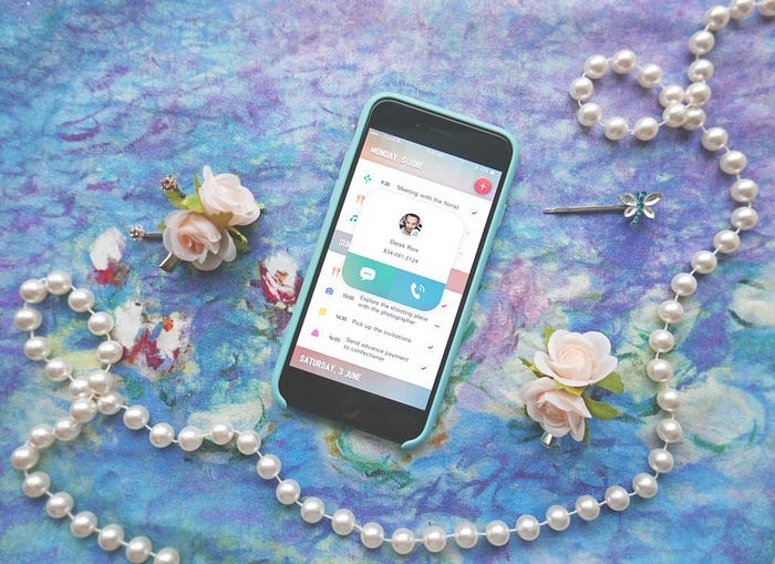
Let’s check out the basic screens of the app. Here you see the main screen of the task manager. It presents the tasks and plans organized by days in chronological order. Having finished the task users can mark them as complete with the tick or put a negative mark if the task wasn’t accomplished. If the date already passed, the app marks the undone tasks by itself so that the user could easily see them scrolling the list. In the top right corner of the screen, users can see the easily recognized button that allows adding a new task to the list.
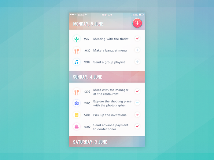
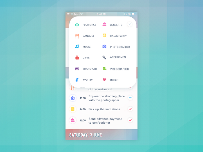
As you can see, time and date are not the only markers to organize the tasks along. Another important feature that makes this app different from general to-do lists and sets its link to the specific nature of planning weddings is the set of categories to classify the tasks and plans. Tapping the plus button to add a new position, the user is offered to choose the category to which it sticks. Every category is marked with an icon, so reviewing the main screen with the list of tasks, a user can quickly scan what aspects they have to deal with that day, be it meeting a photographer, ordering flowers, making a menu etc. This approach enhances usability and sets the basis for positive user experience.
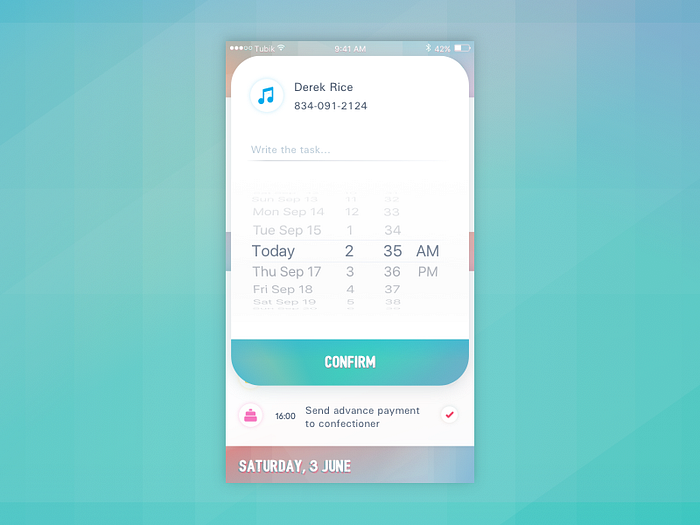
Setting the new task, users can add all the necessary details: locations, telephone numbers, special notes and simple memos. Then, reviewing the tasks, they can tap the icons and see the chronological schedule of all the positions planned for this particular category.
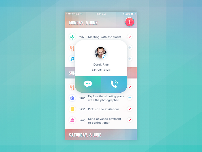
If the task includes involving responsible people, adding the contact, the user gets the ability to call or text this contact right from the task position in the planner. It helps to speed up the experience making all the needed operation without the necessity to move to other apps or contact list of the mobile phone.
Therefore, this clear and simple app can be a real cure and reliable helping hand for wedding organizers. Its usability is based on the non-distracting color palette, readable copy blocks, quick classification of the tasks and instant access to contacting people responsible for their accomplishment.
Don’t miss new case studies on UI/UX design, development, animation and branding from Tubik team: lots of projects and processes are prepared to be unveiled for our readers very soon.
Originally written for tubikstudio.com
Welcome to see designs by Tubik Studio on Dribbble and Behance
Welcome to Tubik Blog