If you are a first-time visitor Welcome! 🤩 First and foremost, let’s begin this with a small introduction to today’s article.👇
As some of you might know, three weeks back, I took a pivot to UI development and started to do challenges using HTML and CSS. Therefore we started, Challenge No 001 with a challenge called NFT Card Component, then move to Challenge No 002 with a challenge called Single Price Grid Component, and last week we have done our Challenge No 003 with a challenge called Huddle Landing Page with a single introductory section. Now that being said, we have reached out to our final Challenge using HTML and CSS.🤩
As for today’s challenge, we will be doing a bit intermediate challenge from Front End Mentor. 👉 Challenge 004 — Clipboard landing page.

As always, let’s begin the challenge with a motivation quote.👇 (This is one of the quotes that helps me to keep moving, I am sharing this with you with the hope that it’ll help you all as well to keep on moving forward)
Never say Never, Because Limits Like Feras Are Often Just An Illusion.
— Michael Jordan
With that head start, let us move to our last challenge (Challenge 04) with the belief and the purpose of learning something new, shall we??💪

Before beginning, let me highlight a small note:-
For some of you, this might be a challenge that you can do with your eyes closed, for some of you this might be a challenge that you learn a new thing and for some of you this might be the beginner step for UI Dev. So this article is for anyone from pro to beginner who loves to learn and sharpen their skills.🤓 With that…..
LET THE CHALLENGE BEGIN💣

🔸 Challenge Name:-
🔸 Description:-
Your challenge is to build out this landing page from the designs provided in the starter code. Your users should be able to:
- View the optimal layout for the page depending on their device’s screen size
🔸 Tools:-
HTML, CSS & Figma
STEP 01 — Begin With the blueprint (HTML)🚀
First and Foremost, we will do a sketch/blueprint of the card component using HTML. Afterwards, we’ll make the look and feel of the Clipboard landing page with a single introductory section according to the Design.
🔴 STEP 1.1 ➡ Basic structure of HTML
<!DOCTYPE html>
<html lang="en"><!-- Head Section-->
    <head>
      <meta charset="UTF-8">
      <meta http-equiv="X-UA-Compatible" content="IE=edge">
      <meta name="viewport" content="width=device-width, initial-
       scale=1.0">
      <title> Clipboard Landing Page </title>
    </head><!-- Body Section-->
    <body>
    </body>
</html>
🔴 STEP 1.2 ➡ Create the main structure of the Clipboard Landing Page
Let us start by dividing the main structure into seven sections, as mentioned in the following snap.
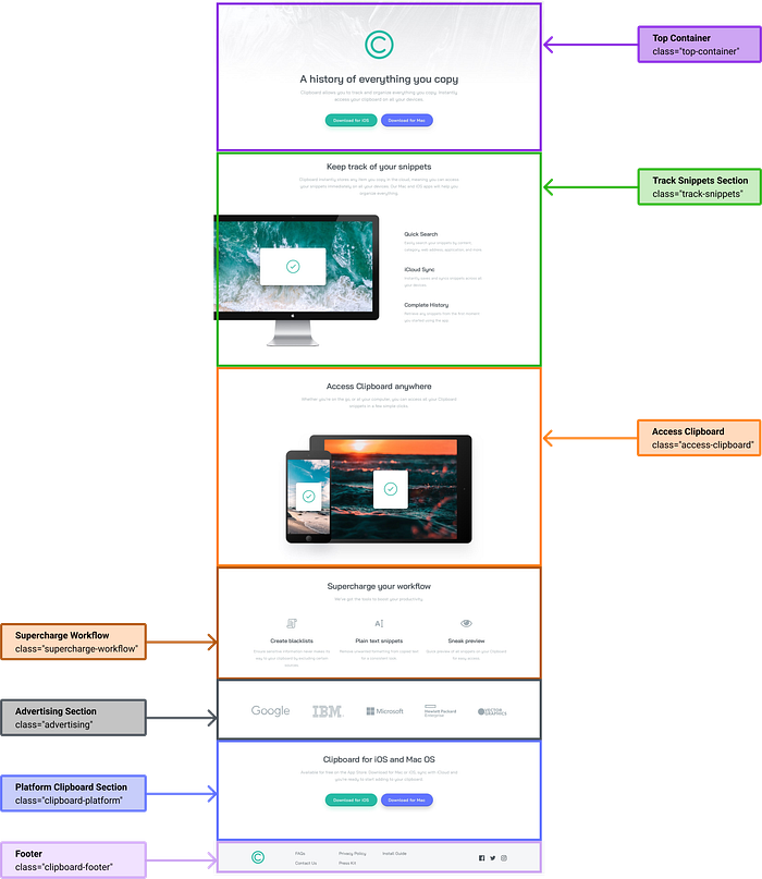
<body>  <!-- Top Section -->
  <div class="top-container">
  </div>  <!-- Track Snippets Section -->
  <div class="track-snippets">
  </div>  <!-- Access Clipboard -->
  <div class="access-clipboard">
  </div>  <!-- Supercharge Workflow -->
  <div class="supercharge-workflow">
  </div>  <!-- Advertising Section -->
  <div class="advertising">
  </div>  <!-- Platform Clipboard Section -->
  <div class="clipboard-platform">
  </div>  <!-- Footer -->
  <footer class="clipboard-footer">
  </footer></body>
Hmmm. There is a small thing I’ll highlight from the above code snippet👆. As you can see in the above code snippet, we have used a <footer> tag for the bottom section instead of a <div> tag.
<!-- bottom section -->
    <footer class="clipboard-footer">
    </footer>
If you want to learn more about HTML semantics elements, check out my article Beginners Guide to HTML. It will help you dig deep into HTML elements and concepts.
🔴 STEP 1.3➡ Let’s dig deep into creating the blueprint for the Page.
Now we are done with the basic structure. It’s time for us to dig deep into each container and do the layout for each section for our headstart.
01) Layouting Top Container
As you can see in the Design, there is a logo and a description with two action buttons at the top of the page

(1.1) As for the first step, we take the main top container class as the parent class of the top section and add two more child classes inside that parent class for the logo and the description.
<!-- Top container - parent -->
  <div class="top-container">    <!-- top container - child 01 -->
    <div class="logo">
    </div>    <!-- top container - child 02 -->
    <div class="top-container-description">
    </div>  </div>
(1.2) Now we are done with the basic layout of the top section. It’s time to dig deep into each section. Let us start with the logo.
<!-- Top container - child 01 -->
<div class="logo">
<svg viewBox="0 0 126 126" fill="none"   xmlns="http://www.w3.org/2000/svg"><path d="M62.5371 120.534C94.2935 120.534 120.037 94.7906 120.037 63.0342C120.037 31.2778 94.2935 5.53418 62.5371 5.53418C30.7807 5.53418 5.03711 31.2778 5.03711 63.0342C5.03711 94.7906 30.7807 120.534 62.5371 120.534Z" /><path d="M85.5181 86.0152C72.8261 98.7072 52.2481 98.7072 39.5561 86.0152C26.8641 73.3232 26.8641 52.7452 39.5561 40.0532C52.2481 27.3612 72.8261 27.3612 85.5181 40.0532" stroke-linecap="round"/></svg>
</div>
Now you might be questioning instead of <img/> why have we used <svg>🤔 Let me tell you why➡ Here we have taken our logo in white colour. But according to the Design you can see the logo is in green colour is it? Therefore to change the colour of the logo we have used <SVG>.
(2.3) With that being complete, let us move to the description section in the top container. Here you can see the main heading, a paragraph and two action buttons. So what we are going to do is
- First, we put a <h1> to define the main heading
- Then, we put <p> to define the paragraph
- Last but not least, we use a <button> to define the action buttons.
<!-- Top container - child 02-->
<!-- Here we use as the parent class for description section-->
<div class="top-container-description">  <!-- Child 01 - Main Heading -->
  <h1 class="top-heading">
    A history of everything you copy
  </h1>  <!-- Child 02 - Paragraph -->
  <p class="top-content">
     Clipboard allows you to track and organize everything you
     copy. Instantly access your clipboard on all your devices.
  </p>  <!-- Child 03 - Buttons-->
  <div class="buttons">
     <button class="ios">
        <a href="#" class="button-text">
            Download for iOS
        </a>
     </button>     <button class="mac">
        <a href="#" class="button-text">
            Download for iOS
        </a>
     </button>
  </div></div>
02) Layouting Track Snippets Section
So when we go back to the Design, you can see there are three sections.
- Section 01, description with the heading
- Section 02, Image
- Section 03, Snippet categories
But there is a slight difference between the mobile view and the Desktop View. As you can see in mobile view you get the image at the top and underneath that, the categories. But on the desktop, you get to see the image and the description parallel to each other. Therefore let us walk through the layout of the track snippet section in a descriptive format.
(2.1) As for the first step, we take the class=”track-snippets” as the parent class of the track snippet section and add two more child classes inside that parent class for the top section and bottom section.
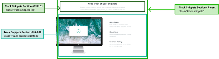
<!-- Track Snippet Section - parent -->
<div class="track-snippets"><!-- Track Snippet Section - child 01 -->
 <div class="track-snippets-top">
 </div><!-- Track Snippet Section - child 02 -->
  <div class="track-snippets-bottom">
  </div></div>
(2.2) Now we are done with the basic layout of the track snippet section. It’s time to dig deep into each section. Let us start with the top section.
<!-- Track Snippet Section - child 01 -->
<div class="track-snippets-top">

    <h1 class="section-heading">
       Keep track of your snippets
    </h1>    <p class="section-content">
       Clipboard instantly stores any item you copy in the cloud,
       meaning you can access your snippets immediately on all your
       devices. Our Mac and iOS apps will help you organize
       everything.
    </p></div>
(2.3) With that being complete, let us move to the bottom section in the tracking snippet. So what we are going to do is
- First, we take the class=”track-snippets-bottom” as the parent class of the track snippet bottom section
- Then, we include two child classes inside that for the image and the snippet categories.
- Last but not least, we include three <div> classes inside the class=”track-snippets-side-content” as child classes, for the three types.
<!-- Track Snippet Section - child 02 -->
<!-- Here we use as the parent class for bottom section-->
<div class="track-snippets-bottom">  <!-- Child 01 - Image-->
  <div class="track-snippet-image">
     <img src="./images/image-computer.png" alt="image computer">
  </div>  <!-- Child 02 - Categories-->
  <div class="track-snippets-side-content">    <div class="quick-search">
      <h2 class="bottom-heading">
          Quick Search
      </h2>
      <p class="bottom-content">
       Easily search your snippets by content,
       category, web address, application, and more.
      </p>
    </div>    <div class="icloud-sync">
      <h2 class="bottom-heading">
          iCloud Sync
      </h2>
      <p class="bottom-content">
          Instantly saves and syncs snippets across all your
          devices.
      </p>
    </div>    <div class="complete-history">
      <h2 class="bottom-heading">
          Complete History
      </h2>
      <p class="bottom-content">
          Retrieve any snippets from the first moment you started
          using the app.
      </p>
    </div>  </div></div>
03) Layouting Access Clipboard Section
According to the Design, you can see there are two sections.
- Section 01, description with the heading
- Section 02, Image
As you can see the image goes under the description in both mobile view and desktop view. With that brief idea let us walk through the layout of the access clipboard section in a descriptive format.
(3.1) As for the first step, we take the class=”access-clipboard” as the parent class of the track snippet section and add two more child classes inside that parent class for the top section and bottom section.
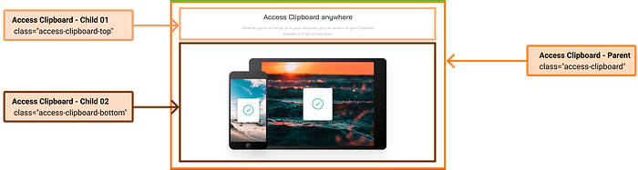
<!-- Access Clipboard Section - parent -->
<div class="access-clipboard"><!-- Access Clipboard Section - child 01 -->
 <div class="access-clipboard-top">
 </div><!-- Access Clipboard Section - child 02 -->
  <div class="access-clipboard-bottom">
  </div></div>
(3.2) Now we are done with the basic layout of the access clipboard section. It’s time to dig deep into each section. Let us start with the top section.
<!-- Acess Clipboard Section - child 01 -->
<div class="access-clipboard-top">

    <h1 class="section-heading">
       Access Clipboard anywhere
    </h1>    <p class="section-content">
       Whether you’re on the go, or at your computer,
       you can access all your Clipboard
       snippets in a few simple clicks.
   </p></div>
(3.3) With that being complete, let us move to the bottom section in the tracking snippet. So what we are going to do is
- First, we take the class=”access-clipboard-bottom” as the parent class of the access clipboard bottom section
- Then, we include one child class inside that for the image.
<!-- Acess Clipboard Section - child 02 -->
<!-- Here we use as the parent class for bottom section-->
  <div class="access-clipboard-bottom">      <!-- Child 01 - Image-->
      <div class="access-clipboard-image">
         <img src="./images/image-devices.png" alt="image devices"
      </div>  </div>
04) Layouting SuperCharge Workflow Section
According to the design, you can see there are two sections.
- Section 01, description with the heading
- Section 02, Tools
As you can see same as the above three sections in this also there is the main heading and a description at the top. But underneath that, there are three different tools which have an image, a sub-heading and a paragraph. When you compare the design with the mobile view you’ll be able to see the tools are in one under the other, but in the desktop view, they are parallel to each other. With that brief description let us walk through the layout of the supercharge workflow section in a descriptive format.
(4.1) As for the first step, we take the class="supercharge-workflow" as the parent class of the supercharge workflow section and add two more child classes inside that parent class for the top section and bottom section.
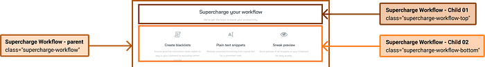
<!-- SuperCharge Workflow Section - parent -->
<div class="supercharge-workflow"><!-- SuperCharge Workflow Section - child 01 -->
 <div class="supercharge-workflow-top">
 </div><!-- SuperCharge Workflow Section - child 02 -->
  <div class="supercharge-workflow-bottom">
  </div></div>
(4.2) Now we are done with the basic layout of the supercharge workflow section. It’s time to dig deep into each section. Let us start with the top section.
<!-- Supercharge Workflow Section - child 01 -->
<div class="supercharge-workflow-top">

    <h1 class="section-heading">
       Supercharge your workflow
    </h1>    <p class="section-content">
       We’ve got the tools to boost your productivity.
    </p></div>
(4.3) With that being complete, let us move to the bottom section in the tracking snippet. So what we are going to do is
- First, we take the class="supercharge-workflow-bottom" as the parent class of the supercharge workflow bottom section
- Then, we include one child classes inside that for the tools called class=”workflow-tools”
- Afterwards, by making the class=”workflow-tools” as the parent class of the tools we’ll include three more child classes for the tools.
<!-- Supercharge workflow Section - child 02 -->
<!-- Here we use as the parent class for bottom section-->
  <div class="supercharge-workflow-bottom"><!-- Child 01 - Worflow Tool-->
<!-- Then as mentioned we use this class as the parent class for the three tools-->
   <div class="workflow-tools">    <!-- Child 01- Worflow Tool No 01-->
    <div class="tool-one">
       <img src="./images//icon-blacklist.png" alt="create
       blacklist">
       <h1 class="tool-heading">
         Create blacklists
       </h1>
       <p class="tool-description">
          Ensure sensitive information never makes its way to your
          clipboard by excluding certain sources.
       </p>
    </div>    <!-- Child 02- Worflow Tool No 02-->
    <div class="tool-two">
      <img src="./images/icon-text.png" alt="plain text"
      <h1 class="tool-heading">
        Plain text snippets
      </h1>
      <p class="tool-description">
        Remove unwanted formatting from copied text for a consistent
        look.
      </p>
   </div>   <!-- Child 03- Worflow Tool No 03-->
  <div class="tool-three">
      <img src="./images/eye-icon.png" alt="sneak preview">
      <h1 class="tool-heading">
        Sneak preview
      </h1>
      <p class="tool-description">
        Quick preview of all snippets on your Clipboard for easy
        access.
      </p>
   </div> </div></div>
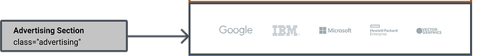
05) Layouting Adverting Section
According to the Design, you can see there is only one section for the logos.
(5.1) As for the first and final step of this section, we take the class="advertising" as the parent class of the advertising section and add five child classes for each logo.
<!-- Advertising Section - Parent-->
<div class="advertising">  <!-- Advertising Section - Child 01-->
   <div class="advertising-one">
     <img src="./images/logo-google.png" alt="google">
   </div>  <!-- Advertising Section - Child 02-->
   <div class="advertising-two">
     <img src="./images/logo-ibm.png" alt="ibm">
   </div>  <!-- Advertising Section - Child 03-->
   <div class="advertising-three">
     <img src="./images/logo-microsoft.png" alt="microsoft">
   </div>  <!-- Advertising Section - Child 04-->
  <div class="advertising-four">
     <img src="./images/logo-hp.png" alt="hp">
   </div>  <!-- Advertising Section - Child 05-->
   <div class="advertising-five">
     <img src="./images/logo-vector-graphics.png" alt="vector
     graphics">
   </div></div>
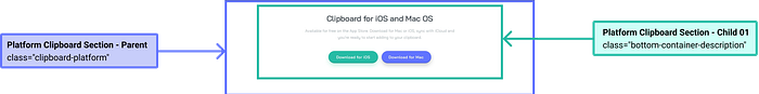
06) Layouting Platform Clipboard Section
As you can see in the Figma File, there is a heading and a description with two action buttons.
(6.1) As for the first step, we take the main bottom container class as the parent class of the bottom section and add one child class inside that parent class for the description.
<!-- Top container - parent -->
  <div class="clipboard-platform"><!-- top container - child 01 -->
    <div class="bottom-container-description">
    </div></div>
(6.2) With that being complete, let us move to the description section in the bottom container. Here you can see the main heading, a paragraph and two action buttons. So what we are going to do is
- First, we put a <h1> to define the main heading
- Then, we put <p> to define the paragraph
- Last but not least, we use a <button> to define the action buttons.
<!-- Top container - child 02-->
<!-- Here we use as the parent class for description section-->
<div class="bottom-container-description"><!-- Child 01 - Main Heading -->
  <h1 class="top-heading">
    A history of everything you copy
  </h1><!-- Child 02 - Paragraph -->
  <p class="top-content">
     Clipboard allows you to track and organize everything you
     copy. Instantly access your clipboard on all your devices.
  </p><!-- Child 03 - Buttons-->
  <div class="buttons">
     <button class="ios">
        <a href="#" class="button-text">
            Download for iOS
        </a>
     </button><button class="mac">
        <a href="#" class="button-text">
            Download for iOS
        </a>
     </button>
  </div></div>
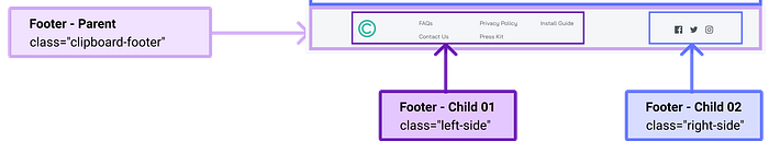
07) Layouting Footer Container
So as you can see in Design the logo and the links are bit into the left side of the page while the social media links are on the right side of the page. Due to that, we have included two sections inside the footer section.
- Section 01➡ Left Side ( Which includes the logo and the links )
- Section 02 ➡ Right Side ( Which includes the social media links)
(7.1) As for the first step, we take the main footer container class as the parent class of the footer section and add two child classes inside that parent class for the two sides.
<!-- Footer Section - parent -->
<div class="clipboard-footer"> <!-- Footer Section - child 01 -->
 <div class="left-side">
 </div>  <!-- Footer Section - child 02 -->
  <div class="right-side">
  </div></div>
(7.2) With the basic layout being done, let us move to the left side of the footer.
- First, we divide the section into two the logo and the links
- Then, inside the logo, we include the logo image
- And in the other child class called class=”footer-three-sections”, we include the links.
<!-- Footer Section - child 01-->
<!-- Here we use as the parent class for Left-->
<div class="left-side">   <!-- Footer Section - child 001-->
   <div class="footer-logo">
     <img src="./images/Group.png" alt="logo">
   </div>   <!-- Footer Section - child 002-->
   <div class="footer-three-sections">

      <div class="section-one">
        <a href="#" class="faq">
          FAQs
        </a>        <a href="#" class="contactus">
          Contact Us
        </a>
      </div>      <div class="section-two">
        <a href="#" class="privacypolicy">
          Privacy Policy
        </a>        <a href="#" class="presskit">
          Press Kit
        </a>
     </div>     <div class="section-three">
       <a href="#" class="installguide">
         Install Guide
       </a>
    </div>  </div></div>
(7.3) with that all being done let us complete our blueprint by adding the social media links to the footer.
<!-- Footer Section - child 02-->
<div class="right-side">    <div class="facebook">
      <img src="./images/icon-facebook.png" alt="facebook">
    </div>    <div class="twitter">
      <img src="./images/twitter-icon.png" alt="twitter">
    </div>   <div class="instagram">
      <img src="./images/icon-instagram.png" alt="instagram">
   </div></div>
— — And with that, we have done with the blueprint. It’s time for us to check the output of our blueprint.👀👇 — —
— — HMMM, I am not a fan of this. It looks ugly and messy.🤮 But rather than complaining, shall we get into work and make it more appealing — —
STEP 02 — Time to make it more appealing (CSS)🚀
Alrighty! Now we have reached the best part. It is time to get our hands dirty by doing the styling. So same as we have done in our Challenge No 001, we are doing this challenge in the desktop-first approach. This means we start the styling for the desktop view first, and then we’ll adjust the styling for the smaller screens using media queries.

🔴 Step 2.1 ➡ First and foremost as we have done in all our Challenges, Link The External Style Sheet to the HTML file
<head><meta charset="UTF-8">
  <meta http-equiv="X-UA-Compatible" content="IE=edge">
  <meta name="viewport" content="width=device-width, initial
  scale=1.0">

  <link rel="stylesheet" href="styles.css"><title>Single Introductory Page</title></head>
🔴Step 2.2 ➡ Import fonts to the external style sheet
As you can see in the Design, we have used a font called ‘Bai Jamjuree’ throughout the design. Therefore what we can first do is, go to google font, search for ‘Bai Jamjuree’ font, click on the relevant font weights we needed, and then get the import link.
@import url('https://fonts.googleapis.com/css2?family=Bai+Jamjuree:wght@200;300;400;500;600;700&display=swap');🔴Step 2.3 ➡ Use root: to declare the colours we are using
:root {
  --white:#ffffff;
  --lightgrey:#9FABB2;
  --darkgrey:#4C545D;
  --greyishwhite:#F5F6F8;
  --green:#26BAA4;
  --purple:#6173FF;
 }
For a thorough explanation of :root check out Challenge No 002, where I descriptively walked you through why and what we use:root.
🔴Step 2.4 ➡ Include the Styling for the Universal Selector
Now let me begin with a small note🔊:- Since I have descriptively walked you through the universal selector in challenge 001, 002, and 003 as well as in the CSS article, I won’t be explaining the universal selector, and why we use it again.
*, a {
  font-family: 'Bai Jamjuree', sans-serif;
  font-size: 19px;
  font-weight: 400;
  color:var(--lightgrey);
  margin: 0px 0px 0px 0px;
  text-decoration: none;
}
As the mentioned in the above code snippet 👆 instead of just Asterix, we have put ‘a’ as well, hmm so what does that mean?🤔
*, a{}= It means that the styling we include will act as a default style throughout the page. Therefore, no need for separate stying.
<!-- eg:- Remove the underline in the links -->
*,a{
  font-family: 'Bai Jamjuree', sans-serif;
  font-size: 19px;
  font-weight: 400;
  color:var(--lightgrey);
  margin: 0px 0px 0px 0px;
  text-decoration: none;
}
<!-- 👆Since we have put text-decoration as none we do not have to call a style seperately for <a> tag, Since we have include the style in the universal selector it will affect in all the <a> tags throughout the page -->
🔴Step 2.3 ➡ Include the Common Styling
As you can see in the HTML code snippet we have to use a common class for the headings, buttons, descriptions etc. It’s time to put our common styling.
/* COMMON */.top-container-description,
.bottom-container-description{
  align-items: center;
  display: flex;
  flex-direction: column;
  text-align: center;
}.top-heading{
  color: var(--darkgrey);
  font-size: 42px;
  font-weight: 600;
  padding-top: 35px;
  padding-bottom: 24px;
}.top-content {
  color: var(--lightgrey);
  font-size: 19px;
  font-weight: 400;
  line-height: 30px;
  max-width: 682px;
  padding-top: 24px;
  padding-bottom: 35px;
}.buttons {
  display: flex;
  flex-direction: row;
  padding-top: 35px;
}.buttons .ios,
.buttons .mac {
  align-items: center;
  border-radius: 30px;
  border: none;
  display: flex;
  justify-content: center;
  height: 55px;
  margin-left: 8px;
  margin-right: 8px;
  width: 226px;
}.buttons .ios {
  background-color: var(--green);
}.buttons .mac {
  background-color: var(--purple);
}.buttons .ios .button-text,
.buttons .mac .button-text {
  color: var(--white);
  font-size: 16px;
  font-weight: 600;
}.section-heading {
  color: var(--darkgrey);
  font-size: 33px;
  font-weight: 600;
  line-height: 30px;
  padding-bottom: 15px;
  text-align: center;
}.section-content {
  font-size: 20px;
  font-weight: 400;
  line-height: 30px;
  max-width: 769px;
  padding-top: 15px;
  text-align: center;
}.track-snippets-top,
.access-clipboard-top,
.top-container-description,
.bottom-container-description {
  margin-left: 0px;
  margin-right: 0px;
}.track-snippets,
.access-clipboard {
   margin-top: 160px;
}.track-snippets .track-snippets-top,
.access-clipboard .access-clipboard-top,
.supercharge-workflow .supercharge-workflow-top {
   display: flex;
   flex-direction: column;
   align-items: center;
   justify-content: center;
   padding-bottom: 40px;
}
NOW WE ARE DONE WITH THE COMMON STYLING FOR THE PAGE🎯. NOW COMES THE BEST PART…
Now we have done with the common styling, let's start doing the specific styling for each section.
🔴Step 2.4 ➡ Include the Styling for the Top Container of the Page
As you can see in Design at first we are going to add the background image for the top container.
.top-container {
  background-image: url("./images/bg-header-desktop.png");
  background-position: top center;
  background-repeat: no-repeat;
  background-size: cover;
}
If you want to dig deep into the background image checkout Challenge No 003.
Now Let’s dig into designing the rest of the top container.
.top-container .logo {
  display: flex;
  align-items: center;
  justify-content: center;
  padding-top: 136px;
  padding-bottom: 35px;
}<!-- 👇Checkout styling the SVG, Here we are converting whitecolor svg logo to green -->.top-container .logo svg {
  stroke: var(--green);
  stroke-width: 10px;
  height: 126px;
  width: 126px;
}
🔴Step 2.5 ➡ Include Styling for the Track Snippet Section
.track-snippets .track-snippets-bottom {
   align-items: center;
   display: flex;
   flex-direction: row;
   justify-content: space-between;
   padding-right: 273px;
   padding-top: 40px;
}<!-- 👇Checkout follow styling for the image positioning in the track snippet in desktop view -->.track-snippets-bottom .track-snippet-image {
   position: relative;
   right: 50px;
}.track-snippets-bottom .track-snippet-image img {
   height: 572px;
   width: 752px;
}.track-snippets-bottom .track-snippets-side-content {
   max-width: 333px;
}.quick-search,
.icloud-sync,
.complete-history {
  padding-top: 35px;
  padding-bottom: 35px;
}.quick-search {
  padding-top: 0px;
}.quick-search .bottom-heading,
.icloud-sync .bottom-heading,
.complete-history .bottom-heading {
  color: var(--darkgrey);
  font-size: 20px;
  font-weight: 600;
}.quick-search .bottom-content,
.icloud-sync .bottom-content,
.complete-history .bottom-content {
  color: var(--lightgrey);
  font-size: 16px;
  font-weight: 400;
  line-height: 30px;
}
🔴Step 2.6 ➡ Include Styling for the Access Clipboard Section
.access-clipboard .access-clipboard-image {
  display: flex;
  justify-content: center;
  padding-top: 60px;
}.access-clipboard .access-clipboard-image img {
  width: 905px;
  height: 575px;
}
🔴Step 2.7 ➡ Include styling for the Supercharge Workflow Section
.supercharge-workflow .supercharge-workflow-bottom .workflow-tools {
   align-items: baseline;
   display: flex;
   flex-direction: row;
   justify-content: space-between;
   padding-left: 182px;
   padding-right: 182px;
}.workflow-tools .tool-one,
.workflow-tools  .tool-two,
.workflow-tools .tool-three {
   display: flex;
   flex-direction: column;
   align-items: center;
   max-width: 331px;
}.tool-heading {
   color: var(--darkgrey);
   font-size: 18px;
   font-weight: 600;
   padding-top: 45px;
}.tool-description {
   color: var(--lightgrey);
   font-size: 15px;
   font-weight: 400;
   line-height: 30px;
   padding-top: 20px;
   text-align: center;
}
🔴Step 2.8 ➡ Include Styling for the Advertising Section
.advertising {
   align-items: center;
   display: flex;
   flex-direction: row;
   justify-content: space-between;
   padding: 162px 182px 165px 182px;
}.advertising .advertising-one,
.advertising .advertising-two,
.advertising .advertising-three,
.advertising .advertising-four,
.advertising .advertising-five {
   padding-top: 0px;
   padding-bottom: 0px;}
🔴Step 2.9 ➡ Include Styling for the Footer Section
.clipboard-footer {
   align-items: center;
   background-color: var(--greyishwhite);
   display: flex;
   flex-direction: row;
   justify-content: space-between;
   padding: 38px 182px;
   margin-top: 145px;
}.clipboard-footer .left-side,
.clipboard-footer .right-side {
   display: flex;
   flex-direction: row;
}.clipboard-footer .left-side .footer-logo {
   padding-right: 20px;
}.clipboard-footer .left-side .footer-logo img {
   height: 56px;
   width: 56px;
}.clipboard-footer .footer-three-sections {
   display: flex;
   flex-direction: row;
}.clipboard-footer .footer-three-sections .section-one,
.clipboard-footer .footer-three-sections .section-two,
.clipboard-footer .footer-three-sections .section-three {
   padding-left: 80px;
   padding-right: 80px;
   display: flex;
   flex-direction: column;
}.clipboard-footer .footer-three-sections .section-one a,
.clipboard-footer .footer-three-sections .section-two a,
.clipboard-footer .footer-three-sections .section-three a {
   color: var(--darkgrey);
   font-size: 15px;
   font-weight: 600;
   line-height: 30px;
}.clipboard-footer .right-side .facebook,
.clipboard-footer .right-side .twitter,
.clipboard-footer .right-side .instagram {
   padding-left: 25px;
}
— — Now let’s see the outcome of our basic styling — —

— — Surprise…, The outcome of the basic styling looks amazing, isn’t it?🤩 — —
STEP 03 — Time to make responsive for all the screens (Media Query)🚀
Since we have done in a desktop-first approach, we have done our basic styling for the desktop view. Now it’s time to use the media query and make it responsive for the smaller size screens.
Once you include the styles for the media query, those styles will override the basic style accordingly for smaller screens.
🟡Step 3.1 ➡ let us Complete the challenge by adjusting the styles for screens which are less than or equal to 764px
@media screen and (max-width:768px){.top-container {
   background-image: url("./images/bg-header-mobile.png");
}.top-heading {
   font-size: 24px;
}.top-content {
   font-size: 13px;
}.buttons {
   flex-direction: column;
}.buttons .ios,
.buttons .mac {
   margin-top: 5px;
   margin-bottom: 5px;
}.buttons .ios .button-text,
.buttons .mac .button-text {
   font-size: 12px;
}.section-heading {
   font-size: 24px;
}.section-content {
   font-size: 13px;
   line-height: 22px;
}.track-snippets-top,
.access-clipboard-top,
.top-container-description,
.bottom-container-description {
   margin-left: 50px;
   margin-right: 50px;
}.track-snippets-bottom .track-snippets-side-content {
   text-align: center;
}.track-snippets-bottom .track-snippet-image img {
   height: 143px;
   width: 188px;
}.access-clipboard .access-clipboard-image img {
    width: 227px;
    height: 144px;
}.track-snippets-bottom .track-snippet-image {
    right: 0px;
}.track-snippets .track-snippets-bottom {
    flex-direction: column;
    justify-content: center;
    padding-right: 0px;
}.supercharge-workflow .supercharge-workflow-bottom .workflow-tools {
    align-items: center;
    flex-direction: column;
    justify-content: center;
    padding-left: 50px;
    padding-right: 50px;
}.advertising {
   flex-direction: column;
   justify-content: center;
   padding: 162px 50px 165px 50px;
}.advertising .advertising-one,
.advertising .advertising-two,
.advertising .advertising-three,
.advertising .advertising-four,
.advertising .advertising-five {
   padding-top: 20px;
   padding-bottom: 20px;
}.clipboard-footer {
   flex-direction: column;
   justify-content: center;
   text-align: center;
   padding: 38px 50px;
}.clipboard-footer .left-side,
.clipboard-footer .right-side {
   flex-direction: column;
}.clipboard-footer .right-side {
   flex-direction: row;
}.clipboard-footer .footer-three-sections {
   flex-direction: column;
}.clipboard-footer .footer-three-sections .section-one a,
.clipboard-footer .footer-three-sections .section-two a,
.clipboard-footer .footer-three-sections .section-three a {
   padding-top: 5px;
   padding-bottom: 5px;
}.clipboard-footer .left-side .footer-logo {
   padding-right: 0px;
}.clipboard-footer .right-side .facebook,
.clipboard-footer .right-side .twitter,
.clipboard-footer .right-side .instagram {
   padding-top: 10px;
}}
— — LET’S SEE THE FINAL OUTCOME AND COMPLETE OUR CHALLENGE 💣. TADAAA..🤩 — —

Final Thought
As we have done with the challenge, I’ll end this article with the hope that you have gained and learned something. Thank You for checking this out.
Now your time has arrived to give a try to this challenge. Trust me you would love the process.
If you are interested in gaining more knowledge, sharpening your skillset or need a small reminder, check out the following articles.👇🧠
Understanding flexbox to make things easy:- https://levelup.gitconnected.com/understanding-flexbox-to-make-things-easy-adf90891ff25
Learn the fundamentals of CSS within a few minutes:- https://bootcamp.uxdesign.cc/beginners-guide-to-css-9bc8298985c0
Beginner’s guide to HTML:-https://uxplanet.org/beginners-guide-to-html-and-css-letss-start-off-with-html-3d7ffd035182
If you like this give one or more claps and feel free to leave your thoughts and feedback in the comment section.
Thank you for checking this out and feel free to checkout my other articles by clicking the following link 👇
🔸Follow me on Twitter👀: @NathashaR97🔸
Refer to the following link for the Code Repository 🧠👇
01) Code Repository:-https://github.com/NathashaR97/Clipboard-Landing-Page.git
03) Challenge Link:- https://www.frontendmentor.io/challenges/clipboard-landing-page-5cc9bccd6c4c91111378ecb9

