
UX Design: Checkbox and Toggle in Forms
by Nick Babich
Checkbox and toggles are two common UI controls that we can use to allow users to make selection. Each of them can be great when used correctly. In this article we’ll focus on checkboxes and toggles.
Checkboxes
Checkboxes are used when there is a list of options and the user may select any number of choices, including zero. Each checkbox is independent of all other checkboxes in the list, and checking one box doesn’t uncheck the others.

Toggles
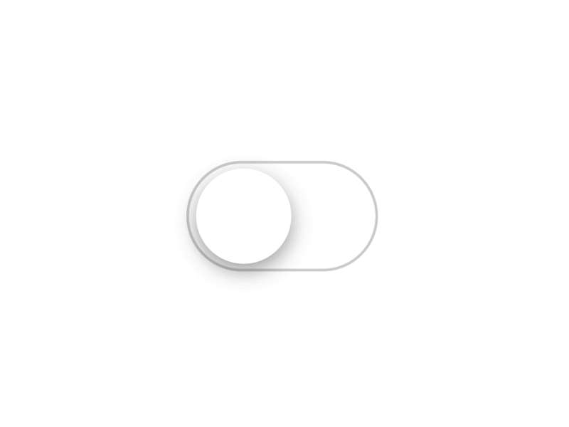
The toggle switch represents a physical switch that allows users to turn things on or off.

It has the analogy of a light switch:

Best Practices for Checkboxes and Toggles
Use standard visual representations
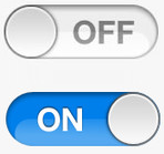
A checkbox should be a small square that has a checkmark or an X when selected.

A toggle should look like ON/OFF switch.

You should provide a clear visual feedback for user interaction with control. Subtle animation makes the experience feel crafted — it’s especially important for mobile apps which UI controls should appear tangible.
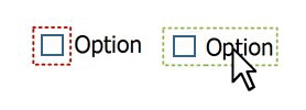
Lay out your lists vertically
Try to present your lists vertically, with one choice per line. This rule works both for toggles and checkboxes. If you must lay your options in a horizontal layout with multiple options per line, make sure to space the buttons and ensure that labels connected which choices. Below is an example of set with elements located too close to each other:

Current state for toggle state should be outside the control
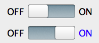
When design toggles you should avoid state-action ambiguity. Take a look at the iOS 6 switch design in the example below and think about the states.
Can you tell if the switch is ON, or if it turn go ON if you move/click/tap the slider? Is “ON” here a state(adjective) or action(verb)? Unclear.
You shouldn’t confuse users and it’s important to have a distinction between an action and a state. In fact, the design could be further enhanced for user friendliness by highlighting the current state:
Use positive wording for checkbox label
Use positive and active wording for checkbox labels, so that it’s clear what will happen if the user turns on the checkbox. Avoid negations such as “Don’t send me more email,” which would mean that the user would have to check the box in order for something not to happen.
Use label tags as click targets for checkbox
Checkboxes are tiny in nature, and, thus, according to Fitts’ law, they can be hard to click or tap. To enlarge the target area, let users select an option by clicking or tapping not just that small square, but also the label or associated words.
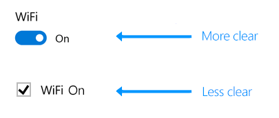
Use checkboxes only to change settings, not as action buttons
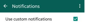
For a binary choice, the main difference between a check box and a toggle switch is that the check box is for status and the toggle switch is for action. If a physical switch would work for the action, a toggle switch is probably the best control to use.
In the example below, it’s clear with the toggle switch that the wireless is set to “On.” But with the checkbox, the user needs to think about whether the wireless is on now or whether they need to check the box to turn wireless on.
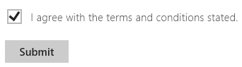
Delay commitment using checkboxs
Use a checkbox when the user has to stop before performing an action. Checkbox will introduce a little bit of friction and make them stop and think about the action.
References
- Selection controls (Material Design)
- Checkboxes vs. Radio Buttons (Jakob Nielsen)
Follow UX Planet: Twitter | Facebook
Originally published at babich.biz
Learn how to design better products
Interactions between computers and humans should be as intuitive as conversations between two humans. Interaction Design Foundation will help you to learn how to design for efficiency and persuasion.

