Colour psychology to
empower and inspire you
Studying the influence of colours on human mood and behaviour. The things are that our mind reacts to colour while we usually do not notice it.
The moment our eyes perceive colour, they connect with the brain, which signals the endocrine system to release hormones responsible for the shifts in mood and emotions.
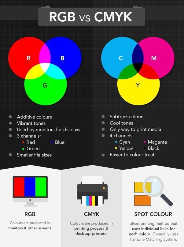
Difference between CMYK and RGB?
Colour Harmony
The word “Harmony” is usually associated with something orderly and pleasing. Colour harmony is about arranging colours in design most attractively and effectively for the users' perception.
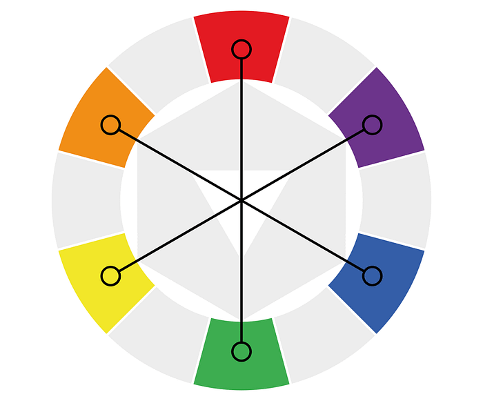
Colour Wheel
The colour wheel was created in the 17th century by Issac Newton.
1. Hue
Hue is the easiest one it's just another word for colour.
2. Saturation
Saturation refers to intensity whether the colour looks more subtle or vibrant.
3. Value
Value is how dark or light the colour is ranging from black to white, which gives us many different shades.
The formula for colour harmony
1. Monochromatic Colours
Which uses only one colour on the colour wheel and uses your knowledge to give saturation and value to create variations.

2. Analogous Colours
Uses colours that are next to each other on the colour wheel.
3. Complementary Colours
Uses colours that are opposite to each other on the colour wheel.
4. Split Complementary Colours
Uses colours that are on either side of the complement on the colour wheel.
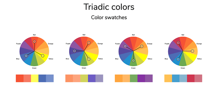
5. Triadic Colours
Uses three colours on either side of the wheel forming the perfect triangle shape.
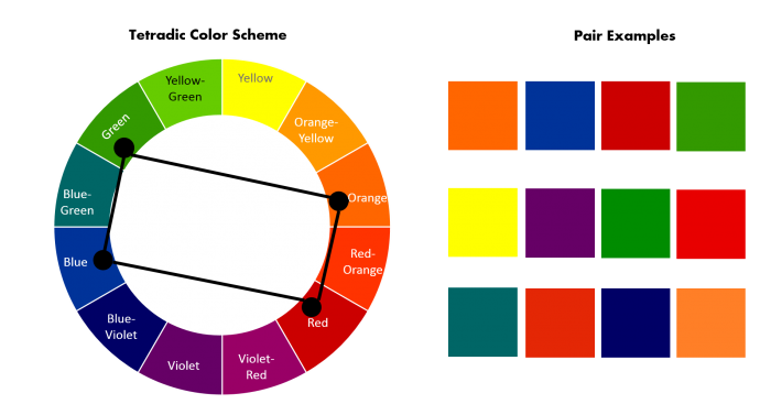
6. Tetradic Colours
Which forms the rectangle on the colour wheel, using not one but two complimentary colours.
The Colour Red
Positive Keywords: Action, energy, speed, attention-getting, confidence, energizing, passion, powerful, courageous and strong.
Negative Keywords: Aggressive, over-bearing, angry, quick-tempered, ruthless, fearful, violent and brutal.
Red Represents
- Energy: It boosts our physical energy levels, I ncres=ases our heart rate and blood pressure, and prompts the release of adrenalin.
- Action: It is fast-moving and promotes a need for action and movements.
- Desire: It relates to physical desire in all forms- sexual, appetite, cravings.
- Passion: It means a passionate belief in an issue or undertaking, including passionate love or passionate hate, anger, and negative passion.
Variation of Red
- Burgundy: A dark purplish-red is more sophisticated, serious, and less energetic than true red. It indicates controlled power, determined ambition and dignified action and is often favoured by the wealthy.
- Crimson: Has a little blue in it. It indicates a determination to succeed but without upsetting anyone else. It emits sensuality rather than sexuality.
- Scarlet: Has a little orange mixed with it, giving it richness and brightness. It indicates enthusiasm and a love of life. It is a little less intense and more fun-loving than true red, tempered with a degree of defiance.
The Colour Orange
Positive Keywords: Enthusiastic, cheerful, self-confident, independent, extraverted and adventurous, risk-taker, creative, warm-hearted, agreeable, informal, spiritual, happiness and lose weight.
Negative Keywords: Superficial, over-bearing, self-indulgent, inexpensive and overly-proud.
Orange Represents
- Adventure and risk-taking: Orange promotes physical confidence and either enthusiasm-sportsmen or adventure-seekers relate well to orange.
- Social Communication and Interaction: Orange stimulates two-way conversation between people.
- Friendly: Group socializing, parties, community-whenever people get together to have fun orange is a good choice.
- Divorce: The colour orange helps people move on, it is forward-thinking and outward thinking.
Effects of Orange
- Enthusiasm: Orange is optimistic and extroverted.
- Stimulation: Orange is not as passionate or as excitable as red, but the worst colour to have in the kitchen if you want to lose weight.
- Courage: Orange helps us to take account of our lives to face the consequences.
- Vitality: Orange has more balanced energy than red, not as passionate and aggressive but full of vitality.
Variations of Orange
- Peach: Peach encourages great communication and conversation. It inspires good manners and puts people at ease. It has all the attributes of orange but in a much softer, gentler and more cautious form.
- Golden Orange: This version of orange encourages vitality and self-control.
- Burnt Orange: This colour emits a negative vibration indicating pride, tension and aggressive self-assertion.
- Dark Orange: Dark orange indicates over-confidence and over-ambition. It tries too hard to prove its worth and boost its self-esteem, but it often develops a chip on its shoulder when it fails. It is the colour of the opportunist, taking selfish advantage of every situation.
The Colour Yellow
Positive Keywords: Cheerfulness, enthusiasm, fun, good-humoured, confidence, originality, creativity, challenging, academic and analytical, wisdom and logic.
Negative Keywords: Judgmental, impatient and impulsive, being egotistical, cowardly, non-emotional and lacking compassion.
Yellow Represents
- Mind and intellect: Colour psychology perspective, yellow stimulates our mental faculties; it activates the left or analytical brain.
- Happiness and fun: Yellow is uplifting to the spirits; yellow helps create enthusiasm for life and can awaken greater confidence.
- Communication of new ideas: Yellow is related to the expression and integration of new ideas and thoughts.
Effects of Yellow
- Creative: The colour of new ideas, yellow helps us find new ways of doing things.
- Quick Decision: Yellow helps with clear thinking and quick decision-making but it can also be impulsive.
- Non-emotional: Yellow relates to the head, not the heart.
Variations of Yellow
- Light Yellow: This colour helps to clear the mind, making it open and alert.
- Lemon Yellow: Lemon yellow promotes self-reliance and a need for an orderly life. This yellow increases our sensitivity to criticism.
- Citrine Yellow: It encourages the serial relationship hopper, the teaser, with unstable emotions.
- Golden Yellow: the loner with an intense curiosity and interest in investigating the finer details.
- Cream: tinted with a hint of yellow, encourages new ideas and indicates a lack of confidence.
- Dark Yellow: darker shades of yellow indicate an inclination toward depression, lack of love and low self-worth.
The Colour Green
Positive Keywords: growth and vitality, renewal and restoration, self-reliance, reliability and dependability, being tactful, emotionally balanced and calm, nature lover and family-oriented, practical and down to earth.
Negative Keywords: being possessive and materialistic, selfish, devious with money.
Green Represents
- Harmony and balance: Green is the great balancer of our mental, emotional,l and physical energy, so there is so much green on our planet.
- Growth: As in nature, green leaves are an indication the plant is still growing.
- Hope: Green is the anticipation of things to come.
Effects of Green
- Rejuvenating: The colour green revitalizes us when we are physically, mentally or emotionally exhausted.
- Dependable, agreeable and diplomatic: The colour green helps us to see situations clearly from all sides.
- Possessiveness: Green is a colour that encourages us to want to own things and people, to collect and possess. Green encourages materialism.
Variations of Green
- Pale green: The colour of new growth on plants, indicates immaturity, youthfulness and inexperience. It allows us to see things from a new perspective, to make a fresh start.
- Emerald green: This is an inspiring and uplifting colour suggesting abundance and wealth in all its forms, from material well-being to emotional wellbeing to creative ideas.
- Lime green: Lime green inspires youthfulness, naivety and playfulness; it is liked the most by younger people. It creates a feeling of anticipation and helps to clear the mind of negativity.
- Aqua: Aqua calms the spirit, offering protection and healing for the emotions.
- Yellow-green: Colour green suggests cowardice, conflict and fear.
- Grass green: Grass green is the colour of money. It is self-confident and secure, natural and healthy.
The Colour Blue
Positive Keywords: Loyalty, trust, reliability and responsibility.
Negative Keywords: Being rigid, depressed, predictable, weak and unforgiving.
Blue Represents
- Communication: Blue relates to one-to-one verbal communication and self-expression.
- Peace and calm: Colour blue induces calm and peace within us, particularly in the deeper shades.
- Honesty: Blue is the colour of the truth.
- Wisdom: Blue enhances the wisdom of the intellect.
Effects of Blue
- Conservative: Colour blue is a safe colour — the most universally liked colour of all.
- Rigid: Blue likes familiarity. It doesn’t like change and will stubbornly do things its way, even if there is a better way.
Variations of Blue
- Pale Blue: Pale blue inspires creativity and the freedom to break free.
- Sky Blue: One of the calmest colours, sky blue inspires selfless love and fidelity.
- Azure Blue: Colour of true contentment and ambition to achieve great things, a sense of purpose in striving for goals.
- Dark Blue: The colour of responsibility and is a serious masculine colour representing knowledge, power, and integrity, and is used quite often in the corporate world.
The Colour Indigo
Positive Keywords: Include integrity, sincerity, structure, regulations and highly responsible.
Negative Keywords: Judgmental, impractical, intolerant, inconsiderate, depressed and fearful.
Indigo Represents
- Structure and Order: A good colour to use in restructuring aspects of your life or business.
- Wisdom: An inner knowingness and awareness — spiritual wisdom rather than the wisdom of the intellect.
Effects of Indigo
- Idealistic: An ability to plan for the future.
- Conformity: A love of ritual — conformity to the things that have worked in the past, not just for the sake of conforming.
The Colour Purple
Positive Keywords: Unusual and individual, creative and inventive, psychic and intuitive, humanitarian, selfless and unlimited, mystery, fantasy and the future.
Negative Keywords: immaturity, being an impractical, and social climber.
Purple Represents
- Inspiration: Original and sound ideas are created with violet — use it when looking for inspiration during brainstorming sessions.
- Imagination: Violet inspires creativity with intellect — it is also stimulating to dream activity.
- Individuality: Violet is unconventional, individual and original. It hates to copy anyone else and likes to do its own thing.
- Spirituality: Violet assists us during prayer and meditation, helping us to get in touch with our deeper subconscious thoughts.
Effects of Purple
- Empathy: Compassion, kindness and a love of humanity are positive qualities of Violet.
- Controlled emotion: Violet is passionate, like red, but inclined to display it in private only.
- Impractical: Head in the clouds rather than having its feet on the ground. It tends to see life as it imagines it, rather than how it is.
- Immature: Violet can be immature, encouraging fantasy and idealism that is often difficult to achieve in real life.
- Dignity: Violet exudes a quiet modest form of dignity which is often appealing to others.
Variations of Purple
- Lavender: Lavender is a light purple colour with a bluish hue, a light violet colour.
- Lilac: Lilac is a pale muted violet colour with a slightly pinkish hue.
- Mauve: Mauve fits somewhere between lavender and lilac. helps us make the best choices and decisions; it is concerned with justice and always does the right thing.
- Plum: Plum is a reddish-purple. An old-fashioned colour, plum is honourable and linked to family traditions.
- Deep Purple: Dark purple is related to higher spiritual attainment. A powerful colour can also indicate arrogance and ruthlessness.
The Colour Turquoise
Positive Keywords: Include communication, clarity of thought, balance and harmony, idealism, calmness, creativity, compassion, healing and self-sufficiency.
Negative Keywords: Include boastfulness, secrecy, unreliability and off-handedness.
Turquoise Represents
- Communication: This colour represents open communication from and between the heart and the spoken word. It relates to the electronic age and the world of computers, and communication on a large scale.
- Emotional Control: Being the mid colour between the extremes of red and violet, turquoise is the colour of balance, for emotions, thoughts and speech.
- Self-Sufficiency: It can tune into its own needs and find the way to success.
Effects of Turquoise
- Clarity of Thought: It enhances the ability to focus and concentrate, assisting with clear thinking and decision-making
- Non-emotional: A negative effect of turquoise is that it can cause people to be too aloof and hide their emotional reactions.
Variations of Turquoise
- Aqua: Closer to green than blue, aqua is refreshing and uplifting. It is creative and light-hearted, yet strong and individual.
- Aquamarine: Enhancing creativity and inspiration, the colour aquamarine calms and balances the mind and the emotions.
- Teal: A more sophisticated version of turquoise, teal signifies trustworthiness and reliability. It promotes spiritual advancement and commitment.
The Colour Pink
Positive Keywords: Unconditional and romantic love, compassion and understanding, romance, hope, calming and sweetness.
Negative Keywords: Physically weak, over-emotional and over-cautious, having emotional neediness or unrealistic expectations.
Pink Represents
- Unconditional love: Pink relates to both unconditional love and romantic love.
- Compassion: Empathy and understanding are the fuel for pink nurturing.
- Nurturing: Pink is both the giving and the receiving of love, understanding and respect.
- Hope: Pink inspires the possibility of a positive outcome.
Effects of Pink
- Calming: Pink calms our emotional energies.
- Non-threatening: Pink lacks any aggression or anger, although the deeper pinks can be more assertive and confident.
- Immature: Pink is the colour of the sweet young girl, before life’s experiences take over.
Variations of Pink
- Blush: Similar to skin colour, this very pale pink has sensual and sexual connotations. It is non-threatening but lacks passion and energy.
- Rose Pink: This is the pink of universal love and unity. It is mature, feminine and intuitive.
- Salmon Pink: There is a touch of orange in salmon pink. It encourages the flirt and can be a sign of the timid lover, all talk and no play.
- Hot Pink: Hot pink inspires a more passionate, playful and sensual love. It exudes warmth and happiness and a love of life.
The Colour Brown
Positive Keywords: Down-to-earth, practical, approachable, friendly, sensitive, warm, reassured, honest.
Negative Keywords: Dull, boring, frugal, materialistic and lack of humour.
Brown Represents
- Stability: Reassuring and comforting, earthy and contained.
- Structure: It encourages orderliness and organization.
- Natural and wholesome: related to the earth, nutrition, health and goodness.
Effects of Brown
- Comforting: Sensual and warm, friendly and approachable.
- Protective: Creates a haven of support for family and friends.
- Materialistic: It encourages material security and the accumulation of possessions.
Variations of Brown
- Light Brown: Is friendly and approachable, sincere, honest and genuine.
- Dark brown: Is strong yet sad and depressive.
- Tan: Is ageless and timeless, straightforward, uncomplicated and natural.
- Ivory: Is calming, yet encouraging, with a reserved style of simple sophistication.
- Beige: Is practical and reliable, conservative, constant, unchanging and loyal.
The Colour Gray
Positive keywords: reliable, conservative, dignified, neutral, professional, mature, intelligent, classic, solid, stable, reserved, elegant, formal and dependable.
Negative keywords: Non-emotional, indifferent, boring, sad, depressed, lifeless, lonely, isolated.
Gray Represents
- Neutrality: Gray is impartial and dispassionate, it doesn’t take sides.
- Compromise: it is the transition between two non-colours, neither black nor white. It takes the middle ground, neither one way nor the other.
- Control: Gray is reserved, quiet and conservative.
Effects of Gray
- Indecision: Gray prefers to sit in the middle, not making a decision, either way, sitting on the fence.
- Unemotional: Gray can appear neutral, disinterested, objective or impartial.
Variations of Gray
- Light Gray: Is soothing. It enlightens, saves and rescues those in difficult life situations.
- Dark Gray: Is conventional and constrained. It is serious, inflexible and strict. It relates to self-denial and self-discipline.
The Colour Silver
Positive Keywords: Reflection, feminine power, balancing, calming, soothing, dignity, glamour, self-control, responsibility, organization, insight, wisdom, modern, sleek, hi-tech and scientific.
Negative Keywords: Dull, lonely, lifeless and colourless, rigid, negative, neutral.
Silver Represents
- Illumination: Silver opens the mind and lights the way forward.
- Reflection: It reflects the energy sent out, whether that energy is positive or negative.
- Feminine Power: it is related to the femininity of the moon’s energy, sensitivity, emotions and fluidity.
Effects of Silver
- Calming and soothing: Its gentle and comforting qualities relate to the sensitivity of the moon’s cycle of ebb and flow.
- Lifeless: The colourless energy of silver can lead to negative feelings of coldness, indecision and being non-committal.
- Dignified and responsible: Silver is respectable and courteous, mature and determined, wise and organized.
The Colour Gold
Positive Keywords: Success, abundance, wealth, understanding, self-worth, wisdom, compassion, love, passion, charisma, winning, optimism, positive.
Negative Keywords: Fear of success, fear of wealth, self-centred, demanding, mean spirited, lack of trust, falseness.
Gold Represents
- Success: Gold relates to achievement and victory, the winner.
- Wealth: Gold implies affluence and material wealth.
- Prestige and luxury: Gold is associated with sophistication, elegance, value, quality and status.
Effects of Gold
- Enlightenment: Inspires knowledge, spirituality and a deep understanding of the self and the soul.
- Compassion: Caring, loving, generous and giving, gold is the benefactor or patron.
- Generosity: Loves to share their wisdom, knowledge and wealth with others.
The Colour White
Positive keywords: Innocence, purity, cleanliness, equality, complete and whole, simplicity, neat, self-sufficient, pristine and open, new beginnings.
Negative keywords: Empty, isolated, cautious, plain, distant, unimaginative, critical and boring.
White Represents
- Innocence and purity: White is the beginning of everything before anything is muddied or thinking is ‘coloured’.
- New beginnings: White represents the clean slate, helping us through times of stress, allowing us to put the past behind us and preparing us to move on.
- Equality and unity: White represents the positive as well as the negative aspects of all colours. It contains an equal balance of all the colours of the spectrum.
Effects of White
- Impartial: White suggests fairness and neutrality because of the balance and equality of all the colours contained within it.
- Futuristic: Symbolizing a clean slate, we can envisage anything with white.
- Efficient: White is clean and clinical, giving an impression of efficiency and organization.
The Colour Black
Positive keywords: Protection and comfort, strong, contained, formal, sophisticated, seductive, mysterious, endings & beginnings.
Negative keywords: Depressing and pessimistic, secretive and withholding, conservative and serious, power & control, sadness and negativity.
Black Represents
- Mystery: Black is the unknown. It is secretive, keeping a lot buried inside, unwilling to show its real feelings.
- Power and Control: Black is power and control of the self and others. It creates fear and intimidation.
Effects of Black
- Formal, dignified and sophisticated: As in the little black dress and the formal dinner suit.
- Depressing: Black can close us to the positive aspects of life, forcing us to look at our disappointments and the black or negative aspects of our life. It can create a fear of the future.
- Pessimistic: Too much black encourages us to look at the negative side of life.
Metrics To Consider
- Red: Urgency — Often used in sales and impulse sales.
- Green: Easy, calm — Used to relax people.
- Blue: Create trust — Used by financial institutes (Banks and hospitals).
- Navy Blue: Cheaper — Selling to price-sensitive.
- Royal Blue: Urgency — Selling to impulsive buyers.
- Pink: Romantic — Selling to women and girls.
- Yellow: Grabbing attention — Used in display and windows.
- Orange: Energizing — Used to Bush for action.
- Purple: Calm — Used in anti-ageing products.
- Black: Power — Selling luxury, aggressive products, or impulse buyers.
Thank you for reading till the end! Did you know? You can hold the clap button for a few seconds to give a maximum of 50 claps. I would appreciate it.

I love talking UI/UX. If you have any feedback or just want to have a casual conversation, reach out to me on LinkedIn.
Here is the link to my Portfolio.