Member-only story
Comparing iOS UI and Custom UI Design
I decided to research the things that need attention in mobile design. I will detail the items based on ‘Human Interface Guidelines’ as Apple suggests on the iPhone. I’ll divide it into sections, here is the first part. Let’s continue with the second part:

Let’s briefly define the iPhone interface as follows:
When you get a phone in your hand the visual elements that will make you say ‘yes this is an iPhone’ are the basics of the iOS UI. This includes everything from the status bar to alerts. In other words, the design style used in iPhone apps and recommended by us is the basis of the iOS UI.
Although there are a lot of points to note, Apple has divided it into 3 parts; bars, views, and controls.
Let’s take a look at the ‘system default UI design’ proposed by Apple and the ‘custom UI design’ used by some applications.

Bars
What do you do first when you download an app and want to discover how it works? (Suppose we skipped the intro) Navigating!
What is on this page? What is it? How do I use it? You are asking questions like this. The first thing you interact with is the bars. You navigate between the pages with the tab bar and show where the user is with the navigation bar.
Now let’s compare custom UI design with Apple system default UI design.
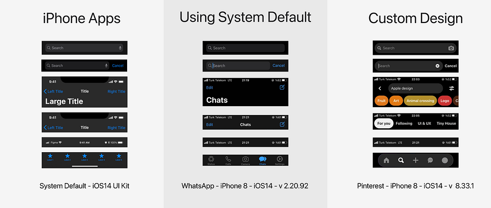
Although we see similar designs, there are obvious differences. Even applications with millions of users like WhatsApp have preferred to use system default instead of custom design. There may be many reasons for this. But this is a good way to keep WhatsApp’s user habit.
Views
As I said at the beginning, the biggest design factor that will allow you to understand that the phone is an iPhone is views. This is all about visuals. There are…


