Composition and its rules in the design of interfaces.
Introduction.
The rules of composition are used by people in many spheres, the most basic of them — painting, music, literature, architecture, and as you can guess from the name of article, we will speak about composition and its rules for design of interfaces.
For all the time I’ve read lots of information on this subject, but quite long time I still could not explicitly answer the range of questions which are important as it seems to me.
⦁ Why to use any rules of composition?
⦁ At which stage of designing interfaces it’s necessary to focus on composition rules?
⦁ In which cases it’s allowed to disregard them? Because composition rules — are not dogma.
⦁ How to use them correctly in the interface designing?
At which stage of designing interfaces it’s necessary to focus on composition rules? — In which cases it’s allowed to disregard them? Because composition rules — are not dogma. -How to use them correctly in the interface designing? In the early stage I caught myself thinking that the majority of examples — are simple sites, close to typography. The idea there usually fits the following format: “Look, these are line and 2 circles, if to assume that these are the set of scales, then the circle, which is more distant from centre, outweighs, and if to tilt the line then the circle starts sliding down, and it seems like the one on the right has already rolled off”.
Cool, it’s so interesting! This all is far from designing complicated interfaces.
Static and dynamic composition.
In some time, I’ve opened for myself the existence of static and dynamic composition. Static one — is about steadiness, balance, calm.
While projecting this onto interface designing, we can see that there is one key action in the static composition and we would like to draw user’s attention to this, because the complete composition is built up around this one key action.
Examples of static composition.


Dynamic composition — is about movement, of course. Here everything is complicated, it’s required to highlight the most important elements first and then the secondary ones afterwards and etc. It’s important to follow the hierarchy of interface elements, if not to do this then you are risking to unleash chaos and face negative experience of using your interface.
The examples of dynamic composition.

Why do we need composition rules in the interface designing?
Google says that composition — (lat. compositio — arrangement, combination, addition, union) is the formation of the whole from parts. Cooperation of parts with the target to convey the meaning.
Having interpreted the above said regarding our subject, we can try to answer the question: why do we need composition rules? Composition — is interaction of interface elements with a goal to convey the meaning of this very interface. To give user an opportunity to easily understand how with the help of interface he can meet his requirement.
Further I’ve formulated two basic tasks which composition helps to solve:
1. Controlling the attention of users. Using the composition rules, we design interface and we realize that first of all the user will pay attention to this block, then to another one and etc. In this case the user’s perception represents kind of path by which he is walking through interface and studying its visual components. The user will follow the route which has already been trodden for him there.
2. Keeping the user’s attention. The human being is made in such way that it will be easier for him to perceive structured information, because less efforts are spent to digest it, and as a result, the user is pleased with experience from trying your interface.
Attention vector.
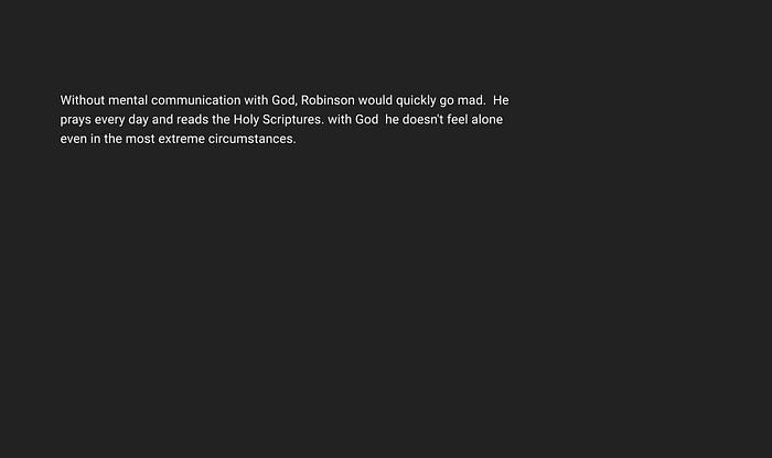
I will not speak about well-known F and Z patterns of content perception by users, instead of this I will share with you one interesting and at the same time simple thing, which impressed me greatly at some point. Look at the text below and answer the question: where does vector of your attention tend to?
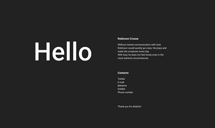
And how will the direction of your attention vector change if the same text will be slightly modified?

Interesting, right? The content is the same but the direction of your attention vector tends to the right — in one case, and tends down — in second case.
Human eye can be compared to the direction of vector which is defining nodal points within general content and moving linearly from one point to another.

Hierarchy of objects.
In the last example the word “Hello” stands out hierarchically from main text and our eye falls to this word first of all, because one more characteristic feature of people is that initially we pay attention to prominent objects i.e. to elements of design having big visual weight. There are several ways to highlight information and by means of this to add visual weight to this:
⦁ Size
⦁ Colour
⦁ Shape
⦁ Negative space.
But there is no use to try highlighting just all design elements, otherwise you will unleash chaos which I’ve already mentioned.

The example of wish to highlight everything at one time:
Size.
The bigger the element is, the higher the attention towards this element will be. The idea of hierarchy with the help of size lies in the intention to give focus point for starting visual journey. The headline of first level is bigger than the headline of second level and etc.

As you can see from example, firstly, the eye clings to the bigger headlines, but also, it’s necessary to remember that important design elements do not need to be too big, because this way unwanted disbalance can be created.
Colour.
Is an excellent way to highlight objects. In the design of interfaces, the brightest colour is often used for elements interacting with user. There exist 3 ways for creating hierarchy with the help of colour:
⦁ Contrast — some colours are highlighted over the other ones. Colour hue can create few types of conflicts for human eyesight, for example red against green.
⦁ Saturation — saturated colours are more noticeable than grey. Grey colours have the tendency to be dominated by colours with higher saturation.
⦁ Brightness — bright colours are highlighted over dark colours and vice versa. Play with bright elements on a dark background creates direct hierarchy, this is also applicable when we have white background and the range of dark elements.

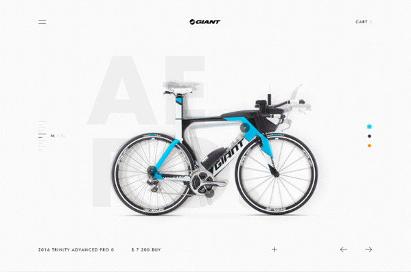
In application Cabify the violet colour is used as the basic colour. Travel itinerary and the button Continue — is the first hierarchy followed further by the map and car.
Shape.
The more complicated shape the interface element has, the higher its visual weight is in comparison to objects with correct shape. By shape, as well, you can guess which is the element in front of you: input, button and dropdown.

The button Next is highlighted due to its shape in comparison to other elements of interface.
Negative space.
The bigger the empty space around design element is, the more attention this element will attract. Negative space — is the area which can be compared with empty canvas. Negative space does not go along with one colour, but adopts the background colour so that to create the so-called effect of space.
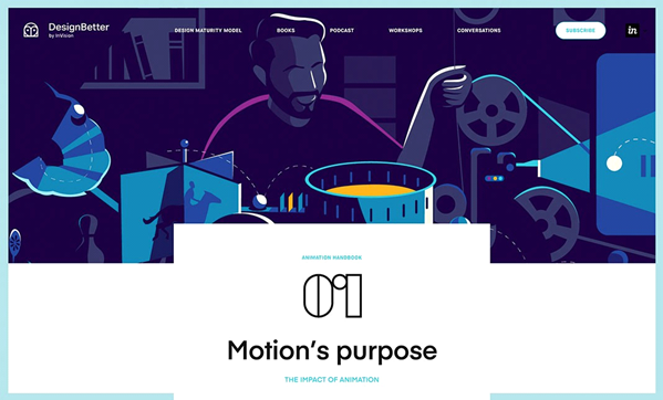
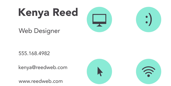
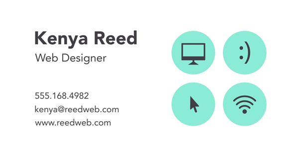
Combination 01 and headline Motion’s purpose are surrounded by negative space. Although the drawing has bigger visual weight, the well-used negative space creates the balance between these design elements, and this balance prevents shifting any of them into the lower category.
Balance.
The time came to speak about balance in composition — about something that creates a kind of harmony in design. I will show an example which probably will be useful for you while designing the interface.
The icon from the left seems balanced regardless the placement of triangle not directly in the centre of circle. This all because the left part of a triangle has much bigger visual weight, that is why this outweighs when we place the triangle strictly in centre. But when we shift the triangle to the right centre wise, then that very balance appears in a composition.
Anchor objects.
It’s possible to reach the balance in composition in few ways, and one of them — anchor objects. Anchor objects — are the most noticeable objects on the page. The rule says that any anchor object must weigh down and to be placed in one of the corners or in the visual centre of its rectangle. Also anchor object may be tied not to the point but to one of rectangle’s sides.
Rhythm.
There is one funny saying in the world of designers — let it be ugly but consistent. I think that no one would want to scroll down the Vc.ru timeline, if the size of headlines, spacing between headlines and main text were different. Also, no one would like the buttons of all rainbow colours in one product. Thanks to rhythm the interface becomes intuitive and comprehensible.
Proximity principle (gestalt).
The elements of design placed closely to each other are perceived connected. Human brain has a tendency to classify objects under observation, that is why the creation of such groups usually simplifies content perception by user.
If objects are placed far from each other, this has to mean that they cannot be connected. Proximity builds relationships and gives orderliness and hierarchy to the information.
Answers to the questions.
In conclusion I would like to share answers, which I’ve found out while studying this subject.
Composition — is a foundation in interface designing. You took a pencil and decided to make first sketches? At this stage you have to understand already which composition it will be, static or dynamic, which information user will have to see first and where he will have to come as a result. It is important to always keep focused on composition rules.
Is it allowed to break the rules of composition? If this keeps from interface conception — then yes, but better to think 7 more times if you are really following the right way. The correct usage of composition rules comes with experience. With experience the more exact identification of element’s visual weight also comes, for example. Here I will agree with the following statement:
There exist three stages of interface designer development.
1. Unawareness. When you did not realize all rules yet.
2. Compliance. When you understood all rules and follow them strictly.
3. Liberation. When you know how to get around rules when it is required and you do this excellently.
I am glad, that you have been patient to read this article till the end, I am thanking you for attention and wishing you to achieve the third level.
Success attend you!
Pavel Golyudov
Humane Interface Designer and User’s Advocate
Behance | Dribbble | LinkedIn | Instagram | Let’s talk!

