Contrast and font-weight — A modern design issue on non-retina displays
It is an obvious mistake. Yet, I am surprised how many designs and websites still have

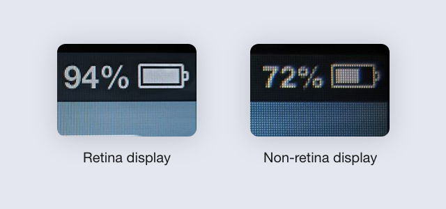
Retina screens show more details, with richer and deeper colors. Its pixel density is 4 times more compared with a regular screen. Which mean on a regular screen, 1-pixel square display exactly 1 pixel, but 4 on a retina display.
They also have a wide-gamut, which displays a wider range of colors. They can render a redder red, a bluer blue, and a greener green.
However, these advantages come in one problem. While they can display things better, many details won’t even be visible on a non-retina screen. Let’s look at the cover image above, the title background can’t be seen on a non-retina screen. And the font paragraph is too thin, make it harder to read.
Besides, the majority of us use non-retina display screens, especially our users. Thus, we need to ensure the design has high visibility across all screens.
Low contrast is invisible on non-retina screens
In 2017, when I was designing a blogging platform. I went to look for inspirations on dribbble.com and found many modern designs. I love those that have less contrast, with a smooth transition between sections.
Even though modern designs were trending, and I was eager to apply to our blogging platform. But the initial feedbacks were either “It’s hard to read’” or “Where is the x?”. For example, “x” was the loading indicator bar, located at the top of the page. It was blue and thin, but users wouldn’t notice.
Turn out, I was using a Macbook with a retina screen to design. When showing on a regular screen, the colors of our design didn’t have enough contrast. Which makes texts and elements less visible.
I have an LCD screen and a Macbook. I always shocked when I put my designs on the LCD screen. Everything changes so much that I can just swear that they are not the same design — u/NoFunnyMan
Thin fonts are hard to read

As I mentioned earlier, retina display has 4 times higher pixel density. Which means it can render small and thin details 4 times crispier. Plus its wider color range just pops everything a bit more.
That said, even though thin texts make the design look modern, it can be difficult to read on a regular screen. I still see this mistake on websites and designs showcase recently.
Take an example on a design show up on my dribbble.com popular page above. Its design and illustration are nice. Though, the description (below “Design Studio”) is hard to read on a non-retina display. Even with a proper zoom. The font was too thin, and it doesn’t show enough contrast to separate the text with its background.
How to improve visibility with color contrast and font-weight?
Since the numbers of people use retina and non-retina displays are both significant. To improve the design, you need to make sure all elements are visible for both types of users. There are a few simple techniques that help you to improve design visibility.
- Use proper font sizes. W3-Lab recommends to use at least 16px for normal text/paragraph.
- Use proper font-weight. While a default font-weight (or 400) is good enough for normal text or paragraph, make sure to test on real screens. Like this example on Google Font, Raleway or Open Sans Consended can be hard to read on font-weight 400.
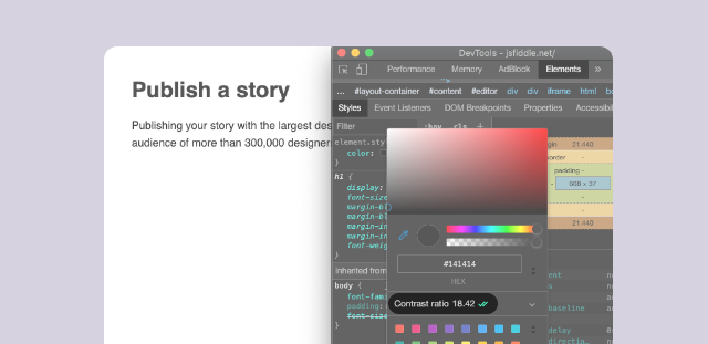
- The color contrast ratio should be 5.0+ between the element with its background. You can use Contrast Ratio, or Chrome Developer Tool feature to see the contrast ratio
To conclude, the retina display has a higher pixel density. It shows more details with better colors. In other words, some details will be poorly displayed on a non-retina display screen. Some details might even be invisible.
You can avoid this issue by using proper font weight, font size. Create more contrast colors to elements with the background to increase its visibility. Test on both retina and non-retina screens to make sure everything is visible and easy to read.

Feel free to comment and leave feedback and thanks for reading!

