Create your own Design system: Chapter Colors

Sangeeth kumar
UX Planet
Published in
6 min readSep 9, 2023

--

Hello fellow designers, I apologize for the delay in this article. I took a short break due to not feeling my best, but now I’m rejuvenated and ready to continue our journey. I’d like to express my gratitude to all the readers and supporters of this series — your encouragement means the world to me.

Today, let’s immerse ourselves in the realm of color and its significance within the design system. I’m aware that colors are an expansive subject with numerous subtopics, some of which will be explored in future articles. For now, this piece will focus on the fundamentals of color. In the coming days, I will also be sharing insights on creating color tokens and their practical application within a design system.

Color theory is the study of how colors interact, combine, and evoke certain emotions or responses. It’s widely used in various fields, including art, design, marketing, and psychology. Here are some basics of color theory:
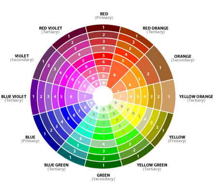
Color Wheel

The color wheel is a circular arrangement of colors that helps us understand their relationships. It’s divided into primary colors (red, blue, yellow), secondary colors (green, orange, purple), and tertiary colors (a mix of primary and secondary colors).

Color Harmony

Colors can be combined in various ways to create harmonious or contrasting effects. Some common color harmonies include complementary (opposite colors on the color wheel), analogous (adjacent colors), and triadic (equally spaced colors).

Color Properties

  1. Hue: Hue refers to the actual color of an object or light. It’s what we commonly refer to as the name of a color, such as red, blue, or green. The color wheel is a visual representation of different hues arranged in a circular order.
  2. Shade: A shade is created by adding black to a hue, resulting in a darker version of the original color. Shades are used to deepen the color and create a sense of contrast and depth. Adding black to a color decreases its lightness while maintaining its hue
  3. Tint: A tint is produced by adding white to a hue, resulting in a lighter version of the original color. Tints are often used to create pastel colors or to make a color appear softer and more delicate. Adding white to a color increases its lightness while preserving its hue.
  4. Tone: A tone is achieved by adding both black and white to a hue. This results in a color that is both desaturated (less vibrant) and shifted in lightness. Tones are often used to create muted, neutral colors that are more subdued than the original hue.
  5. Saturation: Saturation, also known as chroma or intensity, refers to the vividness or purity of a color. A highly saturated color is vibrant and pure, while a desaturated color is more muted and closer to a gray tone.
  6. Value: Value refers to the lightness or darkness of a color. It’s essentially how bright or dark a color appears. Adding black or white to a color changes its value.
  7. Chroma: Chroma refers to the vividness or brightness of a color in relation to its own intensity. In other words, it measures how far a color is from a gray of the same value. A high chroma color is intense and pure, while a low chroma color is more muted.
  8. Intensity: Intensity is a term often used interchangeably with saturation or chroma. It refers to how strong and vibrant a color appears.

Colors in design systems

Colors play a crucial role in design systems. They contribute to the overall visual identity, aesthetics, and user experience of a product or brand. A well-defined color palette in a design system ensures consistency, accessibility, and cohesiveness across various elements of a design, such as UI components, typography, icons, and more. Here are some key aspects to consider when incorporating colors into a design system:

Things to know about color palette

Creating a color palette for a design system involves careful consideration and planning to ensure consistency and versatility. Here are the steps to create a well-defined color palette for your design system:

1. Understand Brand Identity and Objectives

Start by understanding the brand’s identity, values, and objectives. Colors should align with the brand’s personality and message.

2. Identify Core Brand Colors

Determine the primary brand colors that represent the brand’s essence. These colors are typically used for key elements like logos and headings.

3. Select Secondary Colors

Choose a set of secondary colors that complement the primary colors. Secondary colors can be used for various design elements, providing flexibility and visual interest.

4. Consider Accessibility

Ensure that the selected colors meet accessibility standards. Check color contrast ratios to make sure text is readable against background colors. Use tools like the Web Content Accessibility Guidelines (WCAG) for guidance.

5. Create Color Variations

Develop variations of each color to ensure flexibility. These variations may include shades (darker versions), tints (lighter versions), and tones (desaturated versions).

My color palette

There is plugin so create a color variations in single click and this plugin is called Foundation : color generator

https://www.figma.com/community/plugin/1024452006068794933

On click on “Create styles” user will create a local styles in figma, so it will very easy in using a particular color reptitve in our designs

6. Define Color Codes

Assign specific color codes to each color in your palette. Common codes include HEX, RGB, and CMYK for digital and print applications.

7. Name Colors

Give each color a meaningful name that reflects its purpose or association. This helps designers and developers understand when and how to use each color.

8. Establish Usage Guidelines

Document guidelines for when and how to use each color. Define which colors are suitable for backgrounds, text, accents, buttons, links, and other interface elements.

9. Consider Color Harmony

Ensure that the colors in your palette harmonize well with each other. Use color theory principles to create pleasing combinations, such as complementary or analogous colors.

10. Test Across Platforms

Test your color palette on various devices and platforms to ensure consistency and readability. Colors may appear differently on different screens, so adjustments may be necessary.

11. Document the Palette

Create a comprehensive document or style guide that includes all the color codes, names, usage guidelines, and examples. This document should serve as a reference for all team members.

Example for documentation

12. Iterate and Refine

Design systems are not static; they evolve over time. Be prepared to revisit and refine your color palette as design needs change or new colors become relevant.

13. Educate the Team

Ensure that all team members are familiar with the color palette and its usage guidelines. Training and clear communication are essential to maintaining consistency.

14. Update as Needed

Regularly review and update the color palette to keep it aligned with the brand’s evolving goals and design trends.

Creating a well-thought-out color palette for your design system is essential for maintaining a consistent and visually appealing brand identity. It’s a foundational element that influences the overall look and feel of your brand across various mediums and platforms.

That marks the end of this particular narrative. In our upcoming segment, we’ll be delving deeper into the intricacies of color styles and color tokens, offering insights on how to craft them effectively with the aid of plugins. Furthermore, we’ll be sharing a Figma file for your reference. Until then, I take my leave. Best regards to all the designers out there!

Do follow in the medium for following stories in series🤠

And that’s a wrap! Piqued your interest? Just holler!

Twitter | LinkedIn | Let’s Chat

--

--