Creating a UX design style guide for your team

A design guideline is a document that lists all the choices and conventions taken in the company, in order to keep the design and development team aligned. Being connected to, for instance, the design guideline, allows a given prototype to be developed faster and without complications.
Here is an example of what we defined in our guideline with my previous UX Lead:
1. Base unit
A base unit is an 8x8 pixel square. To create margins and padding, the base unit is scaled by two.

2. Grid
A grid is built by multiplying or dividing in two, using percentages for flex grids and scaled base units for fixed grids. While 2x is the recommended method, dividing by thirds is also possible.

3. Spacings
Spacing is context-based. Use smaller increments in scaling for fine-tuning elements inside a component (eg. label and input field), and larger ones for elements on a page (eg. spacing between two sections, or between title, headers, and content).

4. Breakpoints
Defining breakpoints allows the designers and developers to uniform the design even if the screen sizes are different. With the pervasiveness and diversity of mobile devices, as designers, we need to cater to the variety of screen sizes. This is a challenge that every web and app designer currently faces.” (Adaptive vs. Responsive Design article)


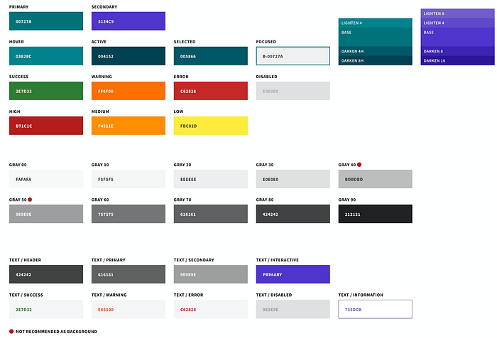
5. Color palette
Usually, the color palette is divided into groups:
- Primary/secondary
- Gray shades
- Status (success, warning…)
Be careful to:
- Use color sparingly
- Verify colors against WCAG for contrast
- Not use status colors as only indicators
6. Typography
The three main elements of typography are font style, appearance, and structure. It plays a much larger role than appearance. It’s a way to create a visual hierarchy on your site. It will also help balance graphics on a webpage page. You need to make sure it’s clear and easy to follow.
I advise you to take a look at Refactoring UI on the “Font” section.
7. Font size
There are three things you need to consider when you select the font size for your website, the size of type, line spacing, and the age of the reader. It’s not a big surprise that the older you get the worse your eyes get. So, smaller fonts are going to be more difficult to read for a lot of audiences.

8. Text values
Sentence case, unless defined by client internal branding guide:
- Only the first letter uppercase, the rest lowercase
- Common uses: titles, table headers, buttons, form field labels
Avoid all caps, with certain heading/title exceptions
Example:
- EN: “Date of claim” not “Date of Claim”
- FR: “Date du sinistre” not “Date du Sinistre”
Style guides:
9. Numerical values
- Regional standards take precedent
- In the case of ambiguity, use a style guide below
- EU standards
- US/International standards
- Date format by country
10. Rules for buttons
- Button text should be explicit
- The button should have default, hover, active, focus, selected, and disabled states
- One primary action per page/screen and the rest are secondary
- In my company, we use Cancel/OK in this exact order (read left to right), as well as Secondary/Primary
- Multiple buttons at the bottom of a modal align-right
- Align buttons to content when applicable
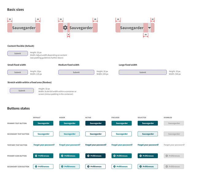
11. Rules for buttons and actions
- Avoid having multiple primary actions at a time. There can be multiple secondary actions with a weaker visual emphasis.
- The user should always get feedback on their actions, either through explicit changes in UI or with visual confirmation.
12. Rules for buttons and recommendations
- Labels on buttons should be explicit and inform the user about what will happen after it is pressed e.g. ‘Apply’, ‘Save’, ‘Send’ rather than ‘OK’.
- Buttons should have multiple stages to indicate when they are e.g. disabled, hovered, pressed.
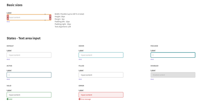
13. Rules for forms
- A label on top of the input field; in the case of an inline label and input field, right align label against an input field.
- Labels should always be present (not placed inside the input).
- Adjust the width/height of input fields accordingly to the content size, to
provide better visual cues (eg. shorter field for zip code, the taller field for textarea). - Input fields should have a state indicator for active/focused, disabled, and error.
- The error message should be in the same proximity as the field.
- When possible — and we should always aspire to do so — add cues in the input field to increase usability (eg. split phone numbers and add date separators automatically…).
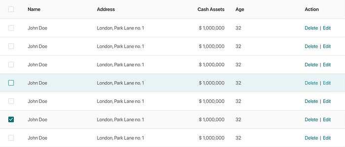
14. Rules for table(s)
- Text values align left
- Numerical values align-right
- Headers align with content
- No center alignment except in the case of buttons and icons
15. Jakob’s law
Follow standards and patterns. Users spend most of their time on other sites. This means that users prefer your site to work the same way as all the other sites they already know.

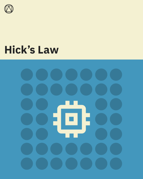
16. Hick’s law
The time it takes to make a decision increases with the number and complexity of choices.
17. Miller’s law
The average person can only keep 7 (plus or minus 2) items in their working memory.
Avoid 1) too many choices, 2) too much thought required, or 3) lack of clarity.

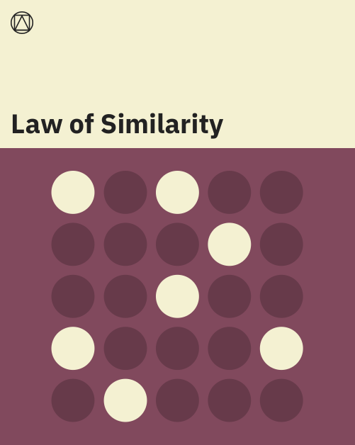
18. Law of similarity
The human eye tends to perceive similar elements in a design as a complete picture, shape, or group, even if those elements are separated.
If it looks like a button or link users expect to be able to click on it. Elements should be visually consistent throughout the application.
Having a design guideline will help you and your team to be consistent and structured in the interface.
My advice is to not be too complex in the principles to follow. Choose the most important one and teach your team to follow them.
Through my experiences, the guideline helped me to gain time during the design and the implementation phases. Why? Because we made fewer mistakes in the basic UX/UI design choices, and it helped the devs to be more autonomous during the implementation.
https://www.carbondesignsystem.com/guidelines/2x-grid/overview/
https://www.interaction-design.org/literature/article/adaptive-vs-responsive-design
https://en.wikipedia.org/wiki/Wikipedia:Manual_of_Style
http://publications.europa.eu/code/en/en-4100500en.htm
https://en.wikipedia.org/wiki/Wikipedia:Manual_of_Style/Dates_and_numbers#Numbers
https://en.wikipedia.org/wiki/Date_format_by_country#Listing


