
Life is constant motion, so we usually cannot imagine our routine without movement. Motion, applied in digital products which we use every day, adds its two cents to the general active and dynamic life of modern society. Yet, the crucial thing about interface animation is that it helps the user to feel the transitions and interactions more natural as well as navigation more intuitive. Applied thoughtfully, motion can make the web or mobile UI clear and easy to use: make no mistake, this is what users expect from the product.
In Tubik Blog, we often bring up the issue of UI animation as a method of boosting positive user experience via attractive and functional interfaces. Today’s post presents the set of animated interfaces created by studio designers for the variety of projects and concepts.
Jewelry E-Commerce Application

Here is the design concept for e-commerce — an app for the online jewelry shop. The presented screens show the animated interactions with items: you can see how users can choose a product from the catalog, check its details and rating. They can also share the product cards to their social network accounts and open check out. The center of the visual composition is focused on the images presenting the items, while icons are stroke and minimalist not to distract buyers’ attention. The color palette features pastel shades which look sophisticated on general layout full of light and air.
Book Swap App

This one is the interface of a social network for readers concentrated on book swapping. The designer chose the dark basic background as the application is image-driven and features a lot of diverse pictures including numerous book covers and users’ avatars, so the general style, which dark environment creates for all that stuff, looks classy. As data blocks like “Followers” and “Following” are standard and recognizable elements for many social networks and blogs, in this app the designer decided to experiment a bit and optimize the space and factor out the common denominator leaving only ‘ers and ‘ing.
To-Do List App
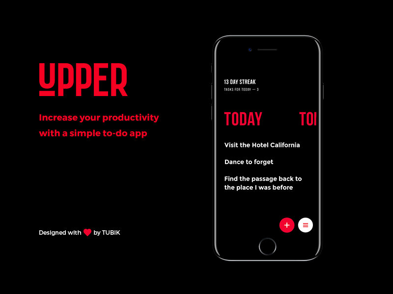
This set of animations presents Upper App, the simple and elegant to-do list for iPhones. The basic functionality of the app is built around user’s ability to create the list of tasks which can be saved for the particular date and time, easily deleted or marked complete. In addition, Upper analyzes task completion progress and shows stats to keep users updated and motivated. The absence of distractions, simple screen design and thought-out typography make the content highly readable and allow using the app easily in any environment and on-the-go.
Read more in the detailed case study
Events App
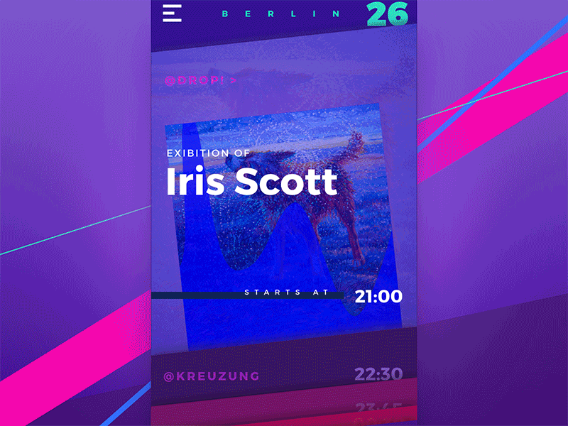
Another UI concept by Tubik designers is Night in Berlin, the simple app which enables active and sociable people to see the list of all the events taking place in Berlin on the current day. Here is the list of events in animated version showing the interactions. The data is organized along the cards for every event, which users can review scrolling vertically. Each card shows the key details about the event: its type, title and the time when it starts as well as the thematic image in the background. Being interested, the user can tap on the card and see more details about the event.
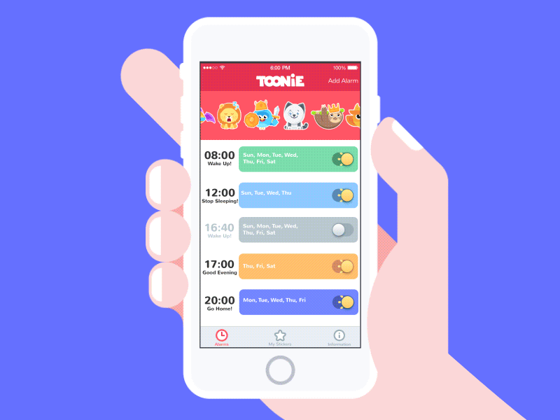
Alarm Application
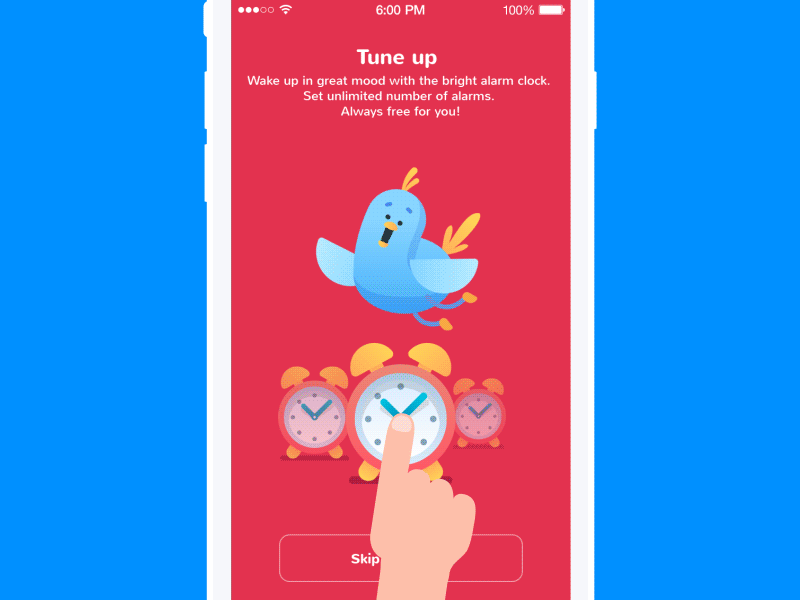
App tutorial is an important part of the interface which helps users to get informed on the basic interactions. In Toonie Alarm, it consists of three screens that tell the user about the functionality of the app. Small concise copy blocks are supported by the smooth and pleasant animation of transitions to create the feeling of integrity and cheerful mascot featured as the consistent element and the center of the screen graphic composition.
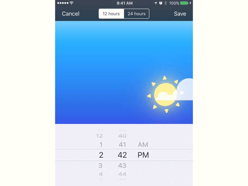
Time picker in the alarm application is actually the core part of interaction with the app and the primary element at which motion design and development play the vital role for establishing both usability and visual harmony. When the user sets the time, the upper part of the screen features the animation reflecting that time of the day.
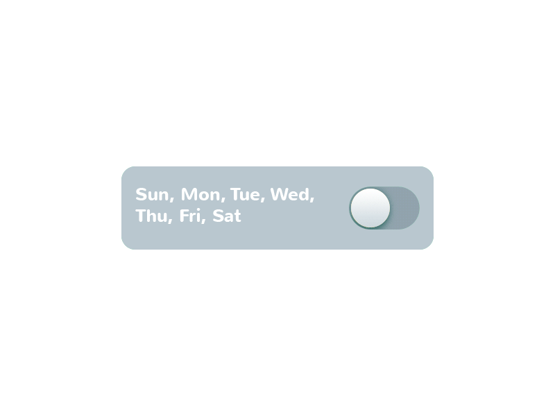
Another piece of animation that required attention and creativity was the switch on the Alarm Screen, the actual element of interaction showing that the alarm is set and active or not. Design solution supporting the general visual performance of the app was to make the toggle look like the animated sun when the alarm was in the active position.
Animated stickers make interaction even more lively and enjoyable and also enhance user experience making the interface attractive and playful.
This animation shows one more feature of the alarm interface: when user shakes the device, the stickers on the tab all jumble randomly. It looks funny and supports interaction with the interface by imitation of natural physical reactions. And this bit of fun will not let anyone get bored. which corresponds to the general image of the app as funny and entertaining.
Read more in detailed case studies on UI design and animation
Logo Animation for Real Estate Platform

Here’s the logo created for the project called Realli: it’s the branding sign for a website representing a multifunctional platform for diverse operations with real estate. It uses a mascot inscribed into the recognizable form of the pin mark, which is usually associated with the fixed location. Animated version is used in the web interface and helps to make the interaction more dynamic as well as strengthens the cheerful nature of the logo character.
Animated Illustration for Marketing Startup
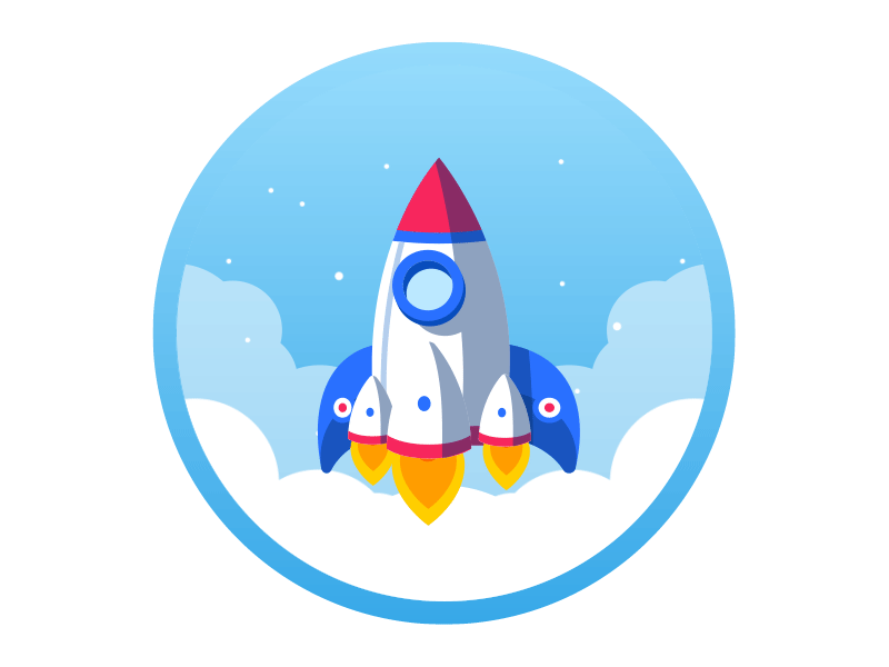
Here is the fresh animation accomplished for the project called Referanza. In general terms, it is a startup based on enhanced marketing that helps businesses to improve customer satisfaction and turn clients into referrals. One of design tasks was a creative pop-up which enabled the user to launch a campaign. The animated illustration presented in the shot was an element of symbolic meaning applied on this screen: rockets are often associated with effective and fast business progress while animation featuring upward movement set the feeling of dynamic growth.
Animated Interaction for the Weather App
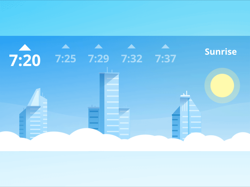
This example shows the animated interaction designed for a simple and attractive weather application. One of the features it provided to users was the ability to see the time of sunset or sunrise for the current day and several days ahead. Actually, this part of functionality was supported with the presented screen beautified with cityscape illustration and livened up with motion.
Tutorial for Social Network

Here’s the piece of motion design accomplished for the project on UI/UX for a social network. Presented interactions play the role of tutorial for users and have the objective to show functionality and nature of the app in pleasant-looking and entertaining way which would correspond to the general style of UI design.
HealthCare App
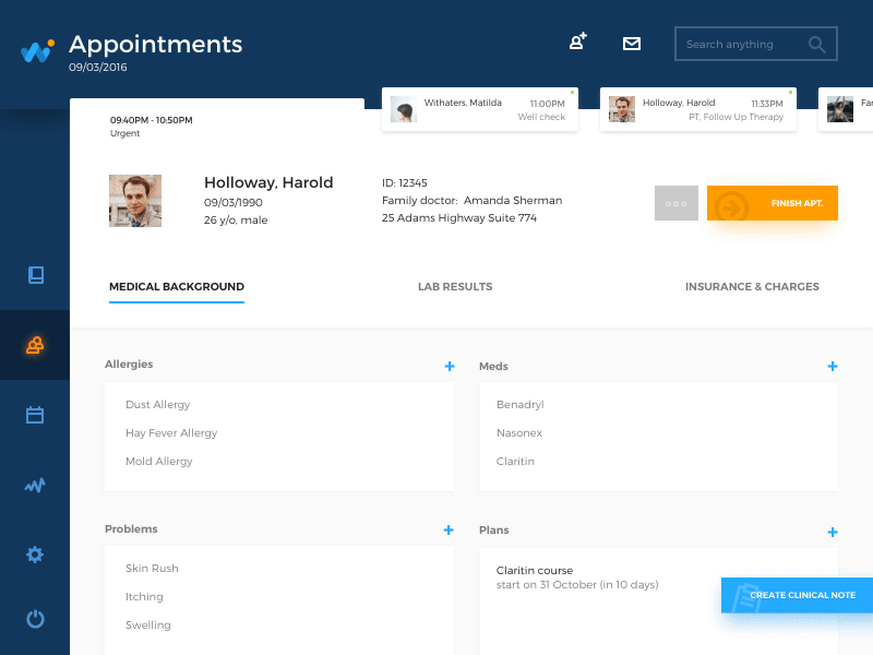
This is a piece of UI design of HealthCare App, an application for doctors with the key objective in the optimization of the huge amount of data which doctors regularly deal with. Every single piece of information about every patient is vital for making a right decision, so creating the interface designer was focused on making it organized, clear and easy-to-use. Intuitive navigation was set as the biggest priority to make the app applicable even for people with low or medium level of tech literacy. This time we added animated transitions featuring some basic interactions with the app: inputting data, operating with pricing and completing the reception.
Read more in the detailed case study
Social App Tutorial
Here is the practical case of applying motion in the illustrated tutorial which was designed for a mobile application WaykeApp presenting a social network of broad functionality. Bright graphic details supported with lively and dynamic animation not only provide information to users but also add positive vibes from the first seconds of interaction.
Calculator App
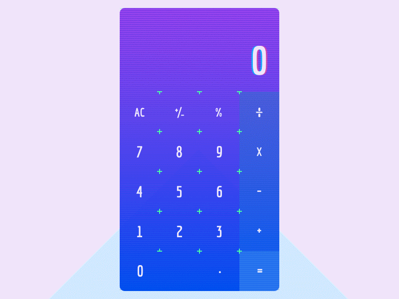
Life is not only work and serious issues, isn’t it? Sometimes, we want things just giving us entertainment and fun. This case is the one of that kind: a funny design concept of a haywire calculator that plays a game with users. It checks their attention sometimes giving wrong answers and expecting additional interactions, like shaking, for example, if users want to know the correct answer. That’s definitely not the fastest calculator to use, still, it’s cool for those who want to add some refreshment to basic everyday operations.
Today’s list is over but studio practice is full of many other interesting examples of design concepts for different purposes and needs of modern users. Don’t miss new presentations in our future posts.
Originally written for tubikstudio.com

