Dark Pattern Design — It’s Downright Unethical & Irresponsible

The Norwegian Consumer Council (Forburkerrådet) recently has released a report, Deceived by Design —it reveals some tech companies are using dark patterns to discourage us to exercise our rights to privacy. Dark pattern design appears to be innocent but are they ethical? Are you using dark pattern design in the name of offering a great user experience?
What is dark pattern design?
Dark patterns are tricks on a website or application that mislead the users so they do something they have no intention to do. For instance, sharing their data and upgrading their account. Apart from these, tech companies design their product in a way that its users easily become addicted to it. Businesses that are using dark pattern design only have their own interest in mind. They treat their users as fishes at the sea and their dark pattern design serves as the bait. Profit is their only concern when designing their product.
Dark pattern design examples
Dark pattern design can be found everywhere. It’s so common that you might not even be aware of its existence. Below are some examples.
1. Credit card-required free trial

Let’s assume that you are looking for a project management app online. After you have checked out a few options, you’ve found what you like and decided to start a trial. During the account setup process, you’re asked to provide your credit card info. You don’t think it’s a problem as the sign-up form has a big text saying “FREE TRIAL”. Finally you willingly offered your credit card details and created a trial account.
After the 14 days free trial, the company secretly converted your trial account to a regular paid account and deducts a fee every month from your bank account. You didn’t find out until you received your bank statement.
Does the above example sound familiar to you? Perhaps it has happened to you or your friends before?
Some tech companies are using the above trick to convert their leads to paying customers. They make it so easy to sign up for an account, make the fine prints unnoticeable. Everything is aligned to the laws. The worst part is — they make it difficult for their users to terminate the subscription.
2. Automatically sign you up to promotion emails
The new European GDPR requires that businesses must obtain their users’ explicit consent before sending them any marketing material. However, it’s still common to see a checkout step on an E-Commerce site like the following:

Even though the customers can uncheck the box, since the text is so small, most customers would not notice their option and once they click on Check Out, the company would get one more email on their ever-growing mailing list.
3. Misleading Popup
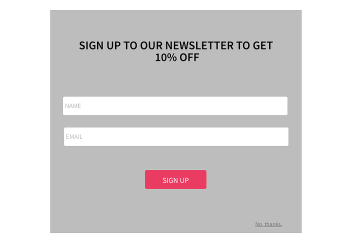
Misleading pop up is another trick that businesses usually use to collect email addresses. A popup like above has an obvious call to action button, Sign Up but the No, thanks button is barely noticeable. Most visitors would just offer their email address directly to get rid of the popup message. A better design should have the No, thanks button right next to the Sign Up button so both are equally dominant and obvious.
4. Sneak an extra item into your shopping cart
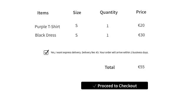
Some E-Commerce sites would secretly add an extra item during the checkout process, most of the times, the price of the extra item is so small that their customers would not notice it, especially when there are many items in their order. The extra item could be the express delivery fee, extra insurance when you purchase a flight ticket and so on. Their trick usually is adding the extra item by default, like the screenshot above or making the call to action button with the extra item more obvious than the one without it:

5. Gaining access to your contacts with unclear consent request
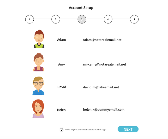
This trick usually can be found in apps. After you have created an account, the app would prompt you if you would like to invite your contacts on your phone to use the app as well. Since it’s a part of the profile setup process, the users would just keep clicking on Next (it implies Yes) and the app easily gains access to your contacts and spam them with automated emails.
A famous social media app, Linkedin collect contacts from its users using dark pattern design and sent automated emails to the contacts they harvested without gaining prior consent. Linkedin was sued because of this and they lost in the lawsuit in 2015, the settlement was heavy — $13 million.
6. Bundle extra services into the product

Selling multiple products in a bundle doesn’t sound like unethical, actually it’s a smart business strategy. Think about McDonald’s meals — you can buy a burger, french fries and a drink at a lower price than buying all three items separately. If you wish, McDonald’s gives you the option to buy them separately. Some businesses sell their products in a bundle without offering the separate purchase option. Their customers are forced to buy the extra items or services because they are part of the deal. This doesn’t seem to be a design problem but let’s look at the example below.
Android is an open source operating system. It works perfectly fine without any Google service. However, Google has bundled Google Search and Chrome browser into Android and forced the manufacturers to preinstall Google Search and Chrome browser, as a condition of licensing Google Play. They also blocked the manufacturers from offering the forked version of Android. In 2018, Google was fined with about $5 billion by European antitrust regulators.
When designing your product, think about if the extra features or functions are really creating a better user experience or are they simply business decisions that drive up the revenue. The extra features or functions could be good but give an option to your users to purchase them separately. Google bundled its services into Android and these services can collect personal data that is beneficial to its Google Ads business and much more — it’s a smart business decision indeed but do you think it’s ethical?
7. Overuse persuasive messages
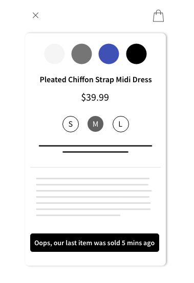
Some travel booking sites overuse persuasive message in its interface design, for instance, “5 other people are looking at this property now”, “This property has been sold out 10 minutes ago”, “20% off today only”, “Last seat at this price” and so on. When users see this kind of messages, normally they would think if they don’t book the room or ticket now, they would lose the bargain. This sort of design seems to be helping their users save money but messages like “This property has been sold out 10 minutes ago” — do the users even need to know? Isn’t it better to simply remove this listing in the search result? The website or app displays such a message, is it trying to manipulate its users?
8. Non-stop notifications

Social media apps, fitness apps and many others on the market has a feature called “push notification”. The intention of it is good: the app notifies you instantly whenever you receive a new message, reminder or update. However, do you realise that this sort of notifications makes you totally addicted to the app? Do you notice that you check your phone all the time, no matter you are at work or in the gym? You may think that’s what normal people do nowadays but is this true?
Businesses are manipulating their users as they know exactly how we behave. We feel special when our social media posts receive lots of likes, more notifications mean more likes, more messages and more attention. We all love attention and that’s normal. What’s not normal is we check our phone 150 times a day = 6.25 times per hour = once in about 10 minutes. What do the business gain from our “addiction”? Engagement. Better user engagement means more advertising income. You may think that it’s our fault that we check for notifications every 10 mins but if you think a bit deeper — Did your grandma and grandpa check their postbox that often when apps and mobile phone did not exist?
How to practise ethical design
Now you have read some of the examples of dark pattern design, apart from not repeating the above design, what else can you do to ensure that your design is ethical? The answer is simple — ask yourself why you design the product or feature in that way, why do you need this information, etc. If your true answer is something like, giving your users a better user experience — you are a designer with great ethic. What makes a designer good is not about how much money a designer brings to a business, it’s about how much a designer cares about the users. If your product truly has the users’ value in mind, the users would enjoy using it and they would spread the words and in the end, your business will grow, in an honest way.
Final words
In day-to-day life, you have stimulus to behave unethically, but in the long term, it always pays off to be ethical. — Jorge Paulo Lemann
It seems that unethical design can make a business successful, more users are using your product, the money keeps on rolling in but in the long run, your users would realise that they have been fooled or misled and when there is a better product on the market, they would not think twice before leaving your product for good. You want to create a product that truly helps people, always keep that in mind no matter how big your business has become.