Data Visualisation for UX/UI Design
A picture is worth a thousand words — Fred R. Barnard
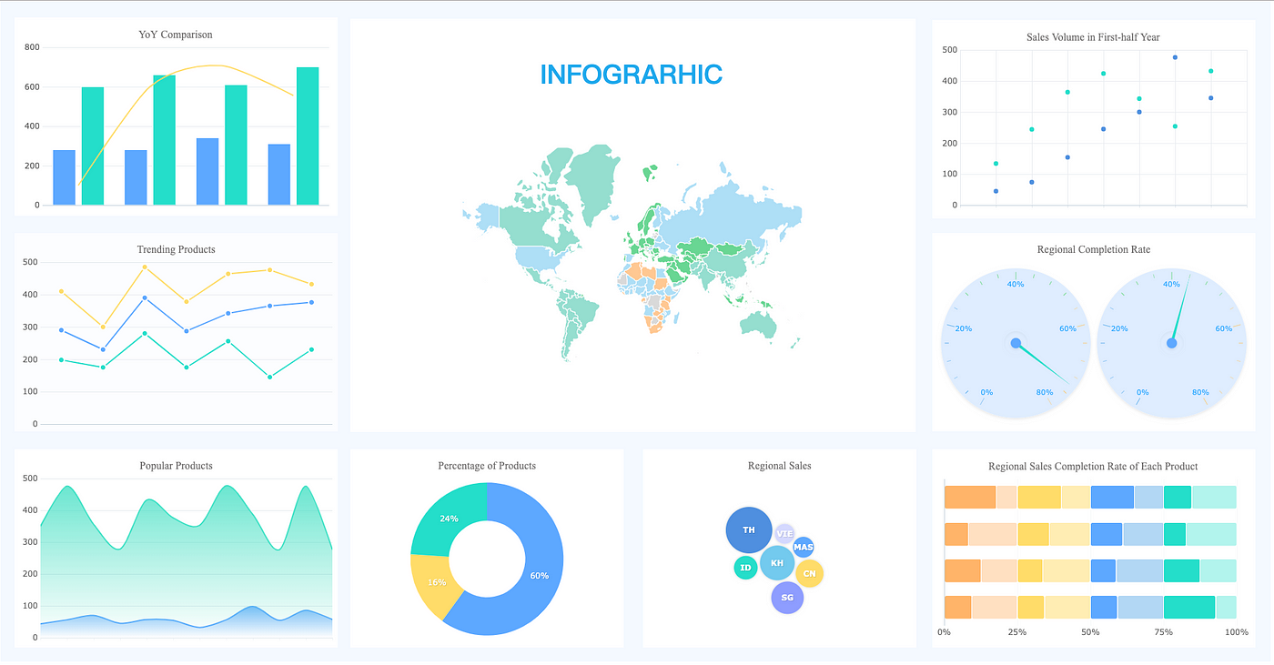
What is Data Visualisations?
Put simply, data visualisation is the use of common graphics in order to present complex data to the user. There are many forms of data visualisation but some of the most common fall into one of the following categories (IBM, N.D)
When to Use Data Visualisations
If you have ever attempted to design a UI or an experience for data-heavy products such as financial, sports, betting, or even a dashboard, you will know just how true this quote is. One of the primary objectives for a UX/UI designer should be to eliminate frustration and barriers from the user’s experience while providing them with the tools they need to achieve their goals. After years of designing betting and sports apps with huge amounts of data, I can tell you that this is no easy task!
Take a football (soccer game, if you are American) as an example. There are statistics for almost every element of the game, including attempted shots, shots on target, possession, tackles, completed tackles, interceptions, saves, meters run by the team and players, and the list goes on. Data teams provide companies with vast amounts of data, and it’s a UX/UI designer’s job to assess what information is needed by the user at various points in their journey, as well as how best to present the data to the user.


Forms of Data Visualisations
Types of Data Visualisations Data visualisations come in various formats, and IBM (n.d.) offers a comprehensive list of the most commonly used ones:
- Bar Charts: These are highly effective for comparing different categories within a single measurement. Bar charts are one of the most prevalent forms of data visualisation and are particularly useful when your data can be categorised into multiple groups.
- Bullet Charts: Designed to replace dashboard gauges, meters, and thermometers, bullet charts help display progress toward a goal by comparing various measurements.
- Line Graphs: Line graphs connect multiple distinct data points, presenting them as a continuous evolution. They provide a simple and straightforward way to visualise changes in one value relative to another.
- Histograms and Box Plots: These visualisations reveal how data is clustered and can be used to compare categories.
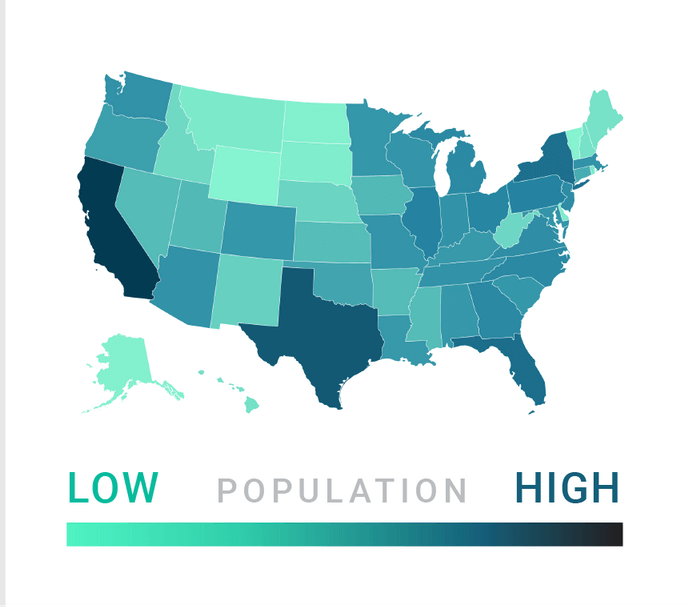
- Maps: Maps are an obvious choice when you need to visualise location-specific information or support geographical exploration.
- Pie Charts: While pie charts can add detail to other visualisations, they are less effective on their own. Notably, every year on Pi Day (March 14), data scientist Kaiser Fung and his colleague take a pie chart and transform it into a more suitable version as a form of protest against their excessive use.
You Don’t Always Have to Create From Scratch
In some cases, as a designer, your company can collaborate with a third-party provider for data visualisation graphics, as we did when designing the Betway app. Instead of creating the graphics from scratch, we were provided with a suite of potential graphics that we could use. It was then our job to test and identify which graphics were most useful to the user, depending on where they were in their journey. We then worked with the third-party company to align the brand colours.
Creating From Scratch
There have, of course, been various occasions where I needed to create graphics from scratch to represent data that might otherwise be challenging to scan through. While it may seem like a daunting task to begin with, there are a few basic steps you can follow to make the process simpler:
- Collect the data to be used within the data visualisation.
- Conduct research on the style of the visualisation that will work best. If you are not inclined to design from scratch, you can find a reusable template on platforms like Figma or Canva.
- Create the basic layout for the data visualisation.
- Incorporate your brand’s style.
Best Practices
There are several best practices to consider when incorporating data visualisations into your UX/UI:
Simplicity
This is a fundamental concept in UX design, and you should strive to keep each user experience as simple as possible. This is even more critical when integrating graphics. It’s easy to overload your designs with too much information or colour. You should be very selective about the information you include and ensure it is necessary for the user. Ask yourself if your chart truly needs data labels and 15 different colours (IBM, n.d). Tableau (n.d) provides an excellent example of how easy it is to overcomplicate your data visualisations.

Colours
As mentioned earlier, the overuse of colours can have a negative impact. However, when used appropriately, colours can effectively differentiate between various data points. They possess the power to convey information sometimes without the need for text (Midway, 2020).
Use Effective Labels:
Labels are a crucial component of any data visualisation. They should be clear and concise, accurately describing the represented data (Hammond, 2023).
Choose the Right Visual:
As explained in an article by Tableau (n.d), there are numerous forms of data visualisation available, and there is no one-size-fits-all solution. You must select the appropriate form of data visualisation to represent the type of data and convey the story to the user, providing them with all the necessary information at a glance. For example, scatter plots effectively display the relationship between two variables, while line graphs excel at presenting time series data. Ensure that the chosen visualisation truly aids the audience in understanding your main takeaway (IBM, n.d).
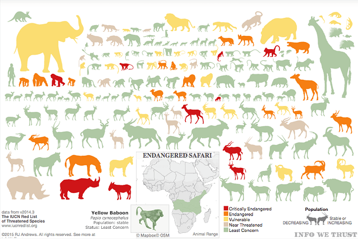
Check out the example below, which effectively illustrates the endangered animal species in Africa. Notice how the visualisation relies on the use of colour and shape to convey information to the user. It also provides a small key at the bottom to offer the user additional essential information.
A Practical Example
An interesting example from my past work comes to mind: the creation of a donut chart to display users’ various balances on the betting site Betway.
The Task:
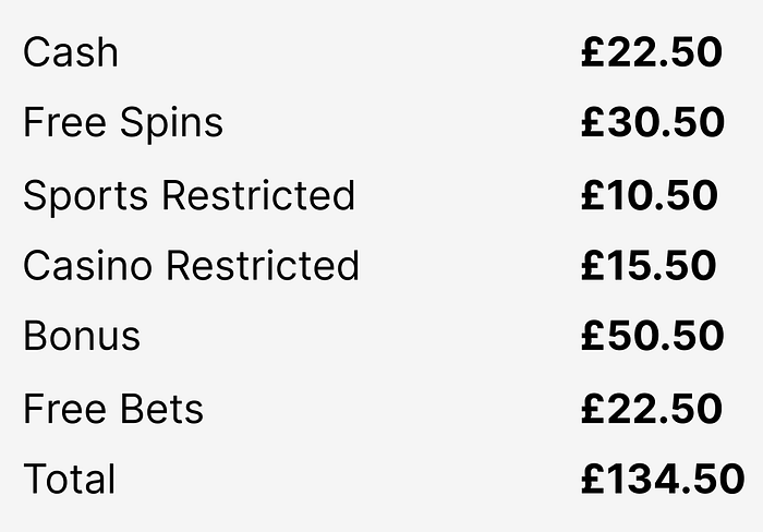
Create an engaging UI that allows users to quickly view all of their various balances, including cash, casino, and free bets. This solution should be scalable and accommodate additional balance types if needed. Also, consider that only a portion of each balance may be available at the time of viewing. Below is a quick example of the difficulties users face when using a sportsbook app with multiple balances. The example is zoomed in, but imagine trying to quickly locate your bonus balance.
Research
With the problem identified, it was time to follow the above process, starting with research. We began by conducting competitor research on other sportsbooks to assess how they present balance data to the user. However, all the direct competitors we examined were facing the same issues as us: multiple balances displayed in a dull, challenging-to-scan list.
This brings me to the most important point of this article. When searching for inspiration for your data visualisation, don’t be afraid to explore other industries. After struggling with competitors in the same sector, one member of our team suggested we look at banking and trading apps for inspiration. This was a brilliant idea because, essentially, we were trying to achieve the same goal as a banking app: presenting financial data to the user.
The Discovery
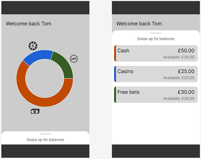
The first significant use of data visualisation that we identified was in the Starling banking app:
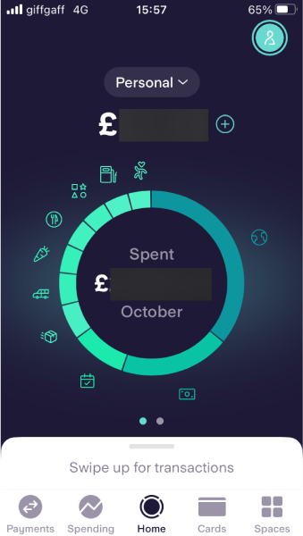
The app utilises an intriguing implementation of a donut chart, with identifiable icons for each balance. Additionally, it features a bottom sheet at the bottom of the screen that opens to display the user’s transactions. We found this mechanism interesting and adapted it in a slightly different way.
The next source of inspiration for our data visualisation came from the Nationwide banking app. It was a simple UI element commonly found in many banking apps. Note that the images have been edited to conceal personal information.
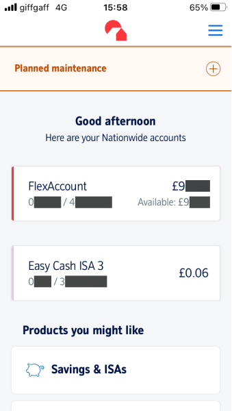
In this design, the various accounts were separated onto different cards, each identifiable by different coloured tabs on the left side of each card. Notably, the user is presented with both an overall balance and an available balance. We believed that this approach would work exceptionally well for handling restricted balances!
The Wireframe
This left us with a variety of options to experiment with, and ultimately, we settled on a wireframe that presented users with their various balances using a donut chart. We then provided users with a bottom sheet that opened up to reveal each of the separated balances. The UI was simple but significantly more effective than any of our competitors. Additionally, it incorporated design patterns familiar to most users, thanks to banking apps.
Of course, this is a very rough first wireframe, but it illustrates how we leveraged simple data visalisation techniques used in other industries to effectively represent balance data. This solution was not only easier for the users to scan through but also follows design patterns they are already familiar with after using banking apps. After this we went on to style the design and to follow brand guidelines.
After reading this article I hope you see the value of data visualisations not only to add visual interest but also improve the user experience. As mentioned above, there are options to use templates or third party providers for graphics or you can create them yourself. If you do choose to create them in house then don’t forget to conduct in depth research and definitely don’t be afraid to research outside of your industry for inspiration!