How To Decide Color Schemes For Websites And Brand?
The color plays an enormous role when it comes to branding and designing.

Starting with the first impression, you know that first impression is everything. We have to choose the perfect color scheme for our website or brand by keeping the real audience, and what we offer to them in mind; This matters the most to make the impression trustworthy, profitable, and attractive.
When building a site, you should carefully choose colors for your color scheme. Different colors will send a variety of messages to your visitors, as each color is attached to specific human emotions, that changes their understanding of your website, even it is not your intention.
That raises the question, what do I need to learn or do? To create a website color scheme and avoid making the most prominent design mistakes.
Well, before getting to the answer, these facts, you need to have in mind to choose more precisely.
- As per research, people make up their minds in 90 seconds of their initial interactions with either people or products. About 60–90 percent of the assessment is on colors alone.
- The 15 seconds rule: That’s how long you have to capture someone’s attention on your website.
- Color Image is more memorable than Black and White.
- Men and Women do see things differently: Across most of the visible spectrums, males require a slightly longer wavelength than do females to experience the same hue.
- Blue is the world’s favorite color.
Now back to the question, what do you need to learn or do? To create a perfect color scheme for your brand or website that makes a significant impact.
Primary Color
The primary color is a color that dominates your design means the great stuff will use your primary color, including logo. Your primary color is the color associated with your brand.
To decide what will be your primary color, you can take the quiz What Color Should Your Branding Be? to find what will be the color for your idea. Carry competitive market research, use sites like Behance or Dribbble for inspiration. While researching, you may find a shade that appeals, grab that color using any color picker tool like Eye Dropper, and create a favorite list that will give you a wide range of options.
Browse through the list of brand’s color palettes used by the world’s famous brands and study their palettes.
Number of Colors in Scheme: Three Recommended
You’ve got the primary color; now it is time to seize other colors in the color scheme. Before that, you need to decide how many colors do I need to complete a color scheme.
For the palette, three colors recommended. Based on a Triad Color Scheme of the color theory. Which traditionally uses three Hues that evenly spaced around the Color Wheel.
The 60–30–10 rule is an old designer’s rule on how you can use colors in your design. Which describes as you should use primary color 60% referred to as slack & jacket, 30% usage of secondary color, which may include two secondary colors 15% each, which is the shirt and 10% for the accent color as a tie, all in a business suit.
Secondary Color(s) and Accent Color
The color you will be using less often than the primary color is secondary. The color that you will use at least 10% is the accent color.
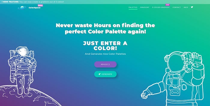
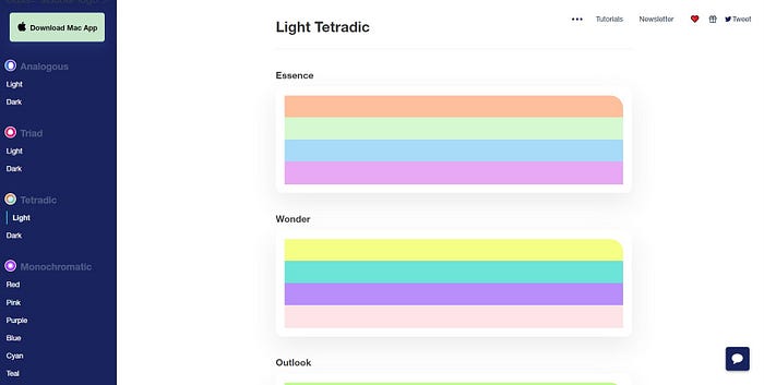
Secondary and Accent colors you can select by trying different color theories using tools that allow you to create a color palette using color theories like a Color wheel or Color Space or Culrs.
You can browse through the color palette list that uses your selected primary color in a palette as a primary color. You can find Color palettes from Colorsinspo, Culrs, etc.
Neutral Colors: White, Black, Gray
Neutral means without color, which includes beige, ivory, taupe, black, gray, and shades of white. Be careful using these colors, White, Black, and Gray you will be using for Text, to create contrast for elements or as background-color.
These days you have heard of Dark mode and Light mode in design; most popular websites and apps now support the dark mode. If you are thinking of using dark mode and light mode, you should choose light and dark neutral color to use in different cases. Again for the ideas of how you can use dark and light neutrals, search for inspirations on Dribbble.
Places where you use a particular color
How do you apply the selected color palette on your website, which color to use where, and why?
- Primary Color utilized on the “hot spot/important space” on the website, for CTA buttons, headlines, benefits icons, download forms, and to highlight other relevant information using primary colors.
- Secondary Color used to highlight the less critical information, such as subheadings, supporting contents, testimonials, secondary buttons, and FAQs.
- Neutral Color will most likely use for text and background but particularly in colorful sections of the site to help tone it down and refocus the eye.
Mentioned Color Tools