Demystifying UX Flowcharts & Visual Vocabulary

You have the project ideia, have defined the users' needs, project requirements, bussiness objectives, have done research with your target audience e now you're finally ready to get your hands dirty. Before, start creating wireframes, how about defining which paths your users will take?
User flowcharts are a great way to align paths and actions the users can take on your product. By creating diagrams at the beginning of the project, it is possible to reduce the risks of problems and misunderstandings about design specifications, avoiding rework. And still have the preview of which screens and features will need to be designed in the future.
Quick tips on how to draw good flowcharts:
#1 First of all, do a preview
First make a preview with paper and pen. After you have created a well structured flowchart, make a clean copy on digital diagrams tools, such as: Lucidchart, Draw.io, Justmind, or even specific wireframing tools (there are several kits to help you assemble your flow).
#2 Maintain design principles
- Create meaningful labels, so that everyone can understand the flowchart. When in doubt, ask your friends to read your labels, so you will know if the diagram can be understood by other people.
- Use consistent colors that help readers to understand the meaning of actions and draw attention to important parts. If you have doubts when choosing colors, consult books and posts on Color Psychology.
- Keep a visual standard for your elements and symbologies, there are some conventions ready for you to use as Visual Vocabulary. And never forget to create subtitles! Thus, everyone will be able to understand the meaning of each symbol.
# 3 Keep everything on the same page
Try to draw your flowchart in the same place, avoiding creating it on several pages, this make it hard to visualize the whole thing. In case your flow is too large, try to simplify it as much as possible.
Now, everything you need to know about Visual Vocabulary:

This symbol guide was developed by Jesse James Garrett, author of the book and methodology “The Elements of User Experience”. The vocabulary can be used by information architects and interaction designers. The purpose of the guide is to create a macrostructure that shows how, in general, the product will work, using a standardization for its elements. The minute details or microstructure, must be carried out in others documents.
Knowing the elements of Visual Vocabulary:
1. Simple elements: pages, files, and stacks thereof

The basic unit of user experience is the page, represented by a rectangle. The files, represented by a sheet, are parcels of data without navigation properties, usually delivered to the user outside a browser environment.
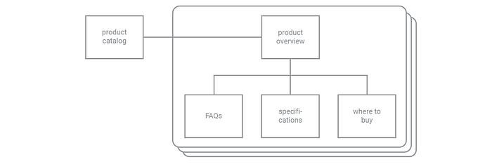
Stacks of pages or files can also be represented when it is necessary to indicate a group of pages or files with identical properties.
2. Creating relationships: connectors and arrows

The relationship between elements is demonstrated as lines or connectors. To indicate the direction the user will go, just use arrows at the end of the connectors.
*Note that the arrows don't prohibit the user from taking the opposite path, they only show the most likely direction of the route.*

The terms downstream and upstream are also used to indicate the position of the elements in relation to the next movement.
If it is necessary to show that the user cannot make an upstream movement (return to the previous element) the crossbar is used to indicate this.

Elements such as footnote or appendix references are used when the actions the user need to take along the diagram need further explanations.
3. All at once: concurrent sets

A concurrent set is used when user's action generates multiple simultaneous results. For example, when a page is opened and at the same time a file starts to download.
4. Breaking it up: continuation points

In cases that the diagram becomes complex and difficult to insert all elements, continuation points are used to fill the gaps between pages.
*The orientation of the brackets (horizontal or vertical) are the choice of the architect who is assembling the diagram.*
5. Commonalities: areas and iterative areas

The area element is used to identify a group of pages that share the same attributes or aesthetic treatments (for example, a pop-window).
*Use labels or footnotes to identify such attributes.*

When the same basic structure is repeatedly applied to features or information elements, interactive areas are used. For example, if you have a product catalog and each product has a number of pages associated with it, you have two options: 1) Design each product's structure 2) Use the interactive area.
6. Reusable components: flow areas and references

Some interactions require a sequence of steps, which can appear repeatedly at different moments in the flow. The reusable sequences are called flow, that is represented in diagram with two elements: flow area, which represents the diagram itself and the flow reference, that serves as an orientation space for the flow in any contexts in to repeat. Both elements have the same shape (distorted octagon).
The flow area needs two special type of continuation points: entry point and exit point.
*The flow area works very similar as the continuation points, the only difference is that in this case two points are necessary: entry AND exit, while in the continuation points only entry OR exit is used.*
Basic concepts for conditional elements
1. Making choices: decision points

When a user action can generate a result among several options, the system needs to make a decision of which result is presented. This is called a decision point.
*Note that the decision is made by the system AFTER the user has performed the action. *
2. Pathfinding: conditional connectors and arrows

The conditional connectors are used when a path may or may not be shown to the user, depending on one or more conditions are met. For example, a page can contain sensitive informations that only company employees can have access. Thus, if the user type fulfills the condition (employee), the path existis, if the condition is not met, the path does not exist.
3. Multiple choice: conditional branches

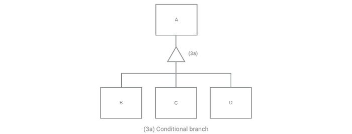
When the system needs to choose a path among several exclusive options, conditional branches are used. For example, on the image above, paths B, C and D are mutually exclusive, so, if path B exists for the user, paths C and D do not appear.
*Note that the decision is made by the system BEFORE the user takes an action.*
4. Choose one or more: conditional selectors

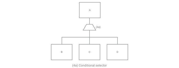
Conditional selectors work much like conditional branches, however with one difference: the downstream paths are not mutually exclusive. Therefore, all the possible paths which meet the conditions, will appear to the user.
*This element usually appears in search mechanisms, and in that case is common for null results to be generated, unlike conditional branches, in which this does not happen.*
5. One decision, many paths: clusters

Some conditional structures require the system to present more than one path based on certain conditions, for that clusters are used.
For example, the structure above functions pretty much like a normal conditional branch, but for one condition we are presenting more than one path to the user. So if the attribute being evaluated has value x, the user sees a path to page B; but if the attribute has value y, the user sees paths to both page C and page D.
6. Some restrictions may apply: conditional areas

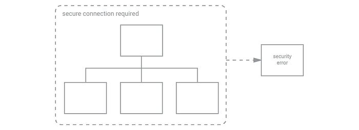
When one or more conditions can be applied to a group of pages, they are grouped by a conditional area. They are usually used in situation involving access permissions, when a valid login is required.

