Member-only story
Design better Forms and Log-In access

How many time do you think an average person logs in per day ? At least 15 times! Seems a lot right? However, registering on a website is still painful and frustrating for the user and can represent a business loss for companies.
Having recently moved in another country, I found myself having to fill a huge amount of forms and I’m not going to lie to you, it was painful. That’s why I wanted to think about how can we make registration easier and more focused on the user.
Here is some advice to improve registers forms.
1/ Sign In Forms
Best Practices
“Making passwords doesn’t even increase security, but it does cost you business, due to login failures.” Nielsen Norman Group
About 82% person forget their passwords on an average website. It’s impossible to remember every password we use. Our needs changes endlessly, websites/app we are using today will shortly not be useful anymore to us, and when we will need them again we will have completely forgotten our login and passwords.
But more than being user friendly, improving log-in forms will definitely help business to save their actual loss. Indeed, according to an NNG study, 75% of people who try to recover their passwords won’t complete their purchase after all.
Therefore, it’s not surprising to see new actors on this market like “1Password”. But some solutions exist to improve log-in forms. On mobile, it’s now common for the users to simply use Touch ID/Fingerprint to access their accounts. Many companies also allow to sign-in through social media forms, making the registration faster. Others go further, offering their customers the option to checkout without registration.
Design Optimizations
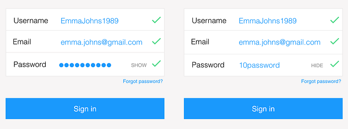
- Passwords : To help your customers to register, you should allow them to see the password they are typing.

- Errors : Show the error and provide a reason to the user. You can avoid errors using helper texts.


