From the Desk: Revamp Screenshots for App/Play Store
👩🏻💻 This project highlights my design process of designing screenshots that increased user acquisition for a startup

Overview
Recently I interned at a startup, wherein I designed one of their product named Seekho.ai
Seekho.ai is a video-first platform where learners can ask questions, seek resources, and book 1–1 mentor sessions, the platform also serves as a medium for content creators and mentors to find their audience.
The Task
Redesigning and establishing a trustworthy brand representation of the company through screenshots for AppStore and PlayStore.
My Role
Product Designer and Researcher with Product Manager Aman Pandya and Ashima Tiwary
Constraints and KPIs
This task was achieved and implemented in 6–8 days and KPI or success measure was to increase user acquisition by at least 10%
Understanding the problem
What is the current situation?
- The app download rate has decreased
- Users directed from the web to Android/iOS — don’t seem to download, and no trigger present
- User feedback on differences in screenshots and the actual app
Why needs attention?
So, why do we bother? And do we need to care? — Yes, we do!
According to Dave McClure's Pirate Metrics, the growth of a Startup depends on these fundamental blocks:
- Acquisition — How can customers find you?
- Activation — How quickly can you get your customers to the 'Aha moment’?
- Retention — How many of your customers are you retaining and why are you losing the others?
- Referral — How can you turn your customers into your advocate?
- Revenue — How can you increase revenue?
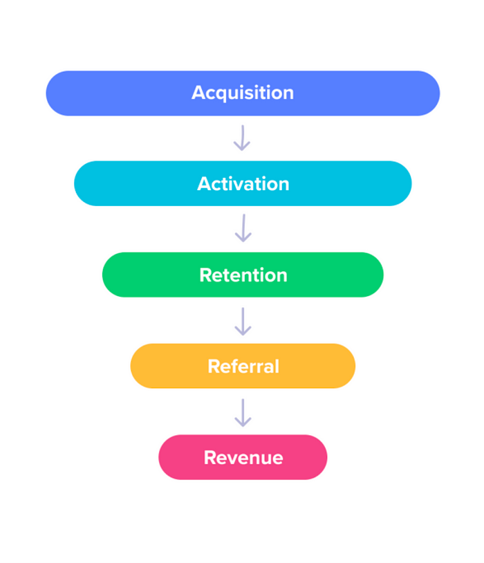
The issues being in the acquisition part of the model, it was required to focus on the how to make our product standout from competitors which could eventually lead to increase in views and then downloads.
How Might We?
- Align our customers with the evolving strategy, features, and upgrades
- Strongly establish our value and brand
- Get user commitment by hooking them to our services
- Establish trustworthy relationships with the audience
What are Screenshots?
App Store or Play Store Screenshots are the first impressions user gets from your app before the actual download. Almost, 80% of the app listings are now using screenshots to lure in their unfamiliar users because for many reasons, of which I’ll point out the most primal one —
- Provides a foundation — A sense of trust and responsibility
- Every other product are updating its screenshot including Google, Apple, and other leading startups as well
- They provide a comparative edge over other competitor apps in the same area
- Help users onboard the app, redirected from external platforms and links
Existing Design

Issues in Approach taken
- Journey not thought through both our stakeholders perspective
- Isn’t aligned with the current services and UI model of the app
- Journey not fluent or defined
- Neither app features not functionality visible through the same
Issues in Visual Design
- The current theme doesn’t go with the visuals defined in the screenshots
- All caps — not readable, increases cognitive load
- Color palette — White text on a dark background(no thickness) results in high contrast, not adaptable to eyes
- Unnecessary elements used as graphics
- Inconsistent margin and imbalanced aligning of images
- No brand identity (important for a startup)
Ideation
Defining Personas

New approach
- Hook users at first sight — users need to get the gist and basic idea of your app in a single scroll
- Brand and trust — Strongly establish our value and communicate our brand to the customers
- Journey for all — A fluent journey that influences all our target users both mentors/creators and learners/seekers
Affinity Mapping
Before defining what services should/shouldn’t be visible to the users, I jotted down all the features and services the app provides — be it big or small and mapped them according to the purpose they were defined for.

Mood Board
I’ve never designed for PlayStore/Appstore screenshots before! So being unfamiliar with the concept I took inspiration from other trending startups and licked several articles(attached in the end) to get a good grasp on how to design for this stuff.

Defining template structure
I also listed some key fundamentals to draft the basis for screenshot visuals —
- Use feature highlighting images or large captions
- Show Off Your Brand
- Combined strength is more
- Highlight key features
- Use Reviews/ Gain trust
- Motion media Preview
- Number of Screenshots
Final solutions


I tried 100 different iterations for screenshots to perfectly match our Product Spirit, an instance of which can be noticed below

Deciding the Screenshot Flow
We weren’t sure enough of the flow, in which these screenshots should be aligned. So we did A/B tests on PlayStore to find out which order works out the best and use it as the final uploads.

Business Impact
The final designs were tested with variations in order and in the end, the revamped screenshots which resulted in the best performance were published which increased user acquisition by 21%. The designs were then published entirely on iOS and Android as well.
and that’s a wrap 🎉

