A practical guide to improving your design
In the beginning sometimes the most popular and beautiful websites seems to be so simple and easy to design, But when it comes to actions the first sites you design, They will probably be a disaster and you will have no clue what is wrong (if you don’t identify you’re disgustingly lucky, But if you do, check my method to practice).
I do believe the human being learn everything like a monkey, first you copy, then you understand. A few weeks ago when I started to work on a task to submit for internship program at Wix I found out copy a webpage is the best practice for understanding why a specific one has a good UI.
The task was to choose any site you like and develop a copy of this website based on their new platform “Editor X”.

Inspect Element
I chose the website saymine.com because I love the strong typography and illustrations, and also it looks like a pretty easy site to copy.
I tried to think what will be the most effective and easy way to copy the exact same design. So the answer is of course taking all the information from “Inspect Element”.
for those who doesn’t know inspect element, It’s a gold mine.
Right-click on any website and click Inspect, and you’ll see its source code, the fonts, colors, layout and anything you want.
I worked really hard! hours and days to copy the exact design, because I really wanted to be accepted into the internship program of WIX, I thought it might be fun and good for my resume, It was fun, I noticed that it’s very instructive and training your designer’s eye.
In the end, The last day for submission has arrived and I couldn't apply Because I had too much pressure and I also got married.
The good news are that I learned a lot! and since then I always look at the inspect element when I ran into a site I like.
I do not recommend to copy Designs for client projects and not even for your portfolio, But I do recommend to copy for practice, then criticize it, And then Do it your way!


For example, take the site upqode.com it’s website of a digital marketing that I really like their design, they have a nice trendy illustrations and strong typography that gives a pleasant feeling.
I like the typography, The combination of the Headline and the small title above, After you opened the inspect element you can choose any object and get all the information at the right side, the filter styles.
So the headline is a Manrope 35px size, 800 font weight and the red/pink small title is Manrope 12px size and 600 font weight

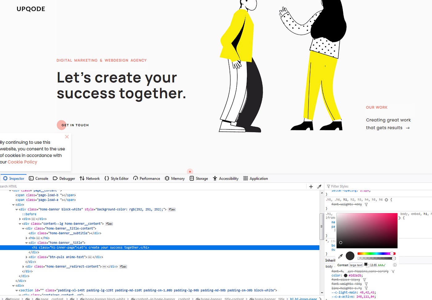
You can get the color code, which is #2d2a2 and even change the color by click on the circle next to the color code and see the results
Try to change the design and see the live results.
Now go to your figma / XD / Sketch or other design app you like and try to copy any page you like, something for sure you will find interesting, if it’s the typography, the layout or the composition and the way how components sit together.
Don’t forget to criticize it, try to understand what you like, what you like less and what whould you do different.
Hope you found it helpful, feel free to write a comment and tell me what you think…

