Design System: Icons
Preparing icons for use in the design system

Hi there, my name is Andrey Nasonov and I am a UX/UI designer at Elonsoft — a company that creates software products and helps businesses from different industries scale their digital transformation. In this series of articles, I would like to share my experience of building a design system and suggest some ideas for automating various design processes. In the first article, we are going to talk about quite a simple yet important topic — icons. Let’s go!
Place Icons In Frames
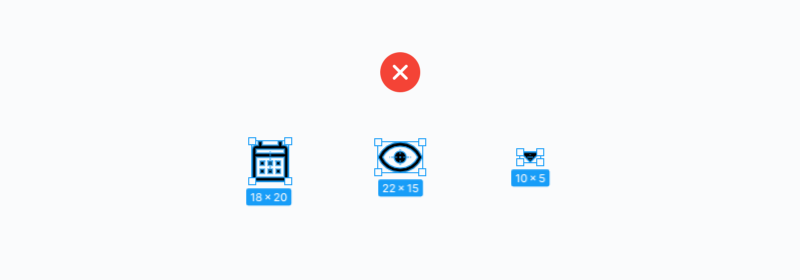
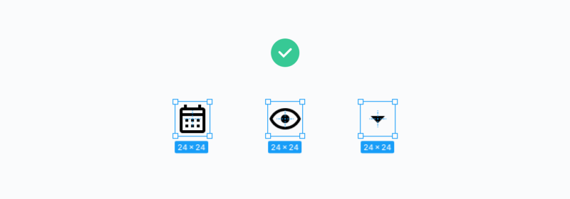
Since all icons are of different sizes due to their geometric features, they should all be placed in frames of the same size.
Let’s say we have three icons: 22x15px, 18x20px, and 10x5px. Each of them must be in a 24x24px frame.
You also need to export icons in a frame.
Important! It is the icon in the frame that needs to be exported, not the icon layer. After that place the icon in a 24x24px container.
Moreover, it is important to do it in this sequence, because the designer often adjusts the icon from the inside of the frame according to the visual center, and not according to the actual one. The developer often adjusts the icon according to the actual center without noticing the difference.


Component From A Frame With An Icon
Create a component from a frame with an icon.

This will help you quickly replace one icon with another using the “Instance” function.
For the replacement through instance to work, the icon components must be in the same frame (more on that later).
Icons are best labeled in English. If you downloaded an icon, and it also has a name in English, do not rename it.
This way you will quickly remember the name of the icons and will easily find them on the resources where you take the icons.
At the same time, you will learn new words in English if you have trouble with it, like me. 😄
Storing Icons
One project can contain icons of different sizes. For example, the standard 24x24px, 16x16px, or 20x20px for items of the smaller size.
We store the main 24x24px icons in the “Icons 24” artboard. The rest of the icons, the size of which is larger or smaller than 24px, are stored in “Other Icons”. Usually there are not so many of them.
The “Trash Icons” artboard is necessary for storing different versions of icons in it. For example, you picked or drew three chat icons, chose one of them and placed it on the “Icons 24” artboard, and then you move the other two versions of the icon to the “Trash Icons” artboard. In case you decide to change your choice, you don’t have to look for them again.

Background And Colour
To prevent unnecessary colors from being displayed in the Fill settings when selecting components with an icon, remove the white background from the component, even if it is disabled.
I also recommend to immediately apply the color style to the icon, so that during further work it will be more convenient to change the icon color.

The color style is needed so that when replacing through an instance, you do not forget to repaint the icon in the desired color.
I advise you to choose a catchy color that you rarely use on a project. Leaving an icon black or gray will likely make you forget to recolour it. I chose brown.

Constraints
Adjust the vertical and horizontal centers of the layer with the constraints icon. This is necessary in case you want to reduce or increase the icon component, but so that the icon itself does not change its size.
Important! Сonstraints have to be adjusted specifically by the layer with the icon, and not for the entire component.

Mass Actions With Icons
All the above-described actions can be done with several icons at once.

In order to select layers with an icon in all icon components at once — select all icon components and press Enter.
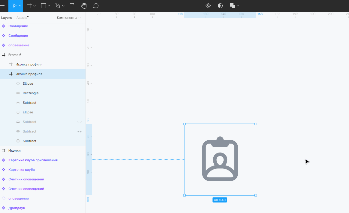
Redundant Layers In The Icon Frame
There should be nothing in the component frame, except for the icon. Don’t forget to remove all hidden layers from the icon frame.
For example, Material Design icons have a white background layer.

As a result, the icon component should contain only one layer (the layer with the icon). But there may be exceptions, for example, two-color icons.
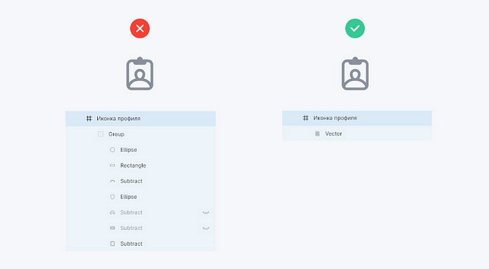
In the case of a one-color icon, all the elements must be combined into one layer.
After you have merged the layers, don’t forget to apply the “Outline Storke” to the merged shape.
All this is necessary for the icons to weigh less, to make the SVG code much smaller and more understandable, and for the developers not to have problems with recolouring the icons.
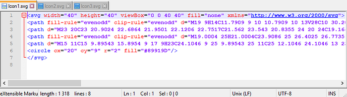
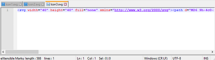
This is how the SVG code of the icon looks like when the icon component has several layers and they are not combined into one. The code turned out to be very long and has as many as 7 “Fill” parameters for different icon elements. It can’t be done like that.
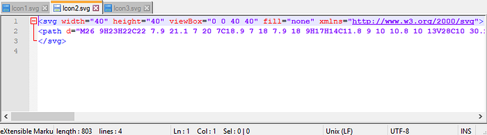
And this is how the SVG icon code looks like when all layers are merged. The code is much smaller and has only 2 “Fill” parameters. One for the background of the container, the other for the color of the icon. You can do it like that.
After exporting the icon, you can further compress it using this website.
After compression, the icon code got even smaller, but the appearance of the icon did not change.
Resources With Icons
And finally, a few resources where you can take icons.
Material Design Icons Community
A huge set of icons that contains official Material Design icons as well as icons created by the community on Material Design guides. In my opinion, this is the best set at the moment. It covers 90% of my needs. Figma has a dedicated plugin.
Material Design Icons
Official Material Design icons. Unfortunately, the icons on this site have quite strange tags. Because of this, some icons cannot be found through a search. And the icon file contains an extra layer with a white background, which in my opinion is not needed. Plugin in Figma.
Boxicons
There are good alternatives to the icons from previous resources. But not all icons are pixel perfect. There is also a plugin in Figma.
Feathericon
A nice set of quality outline icons. The icons are made with a stroke, which allows you to scale and change the line thickness of the icons themselves. Figma plugin
IBM icons
IBM icons created by the company itself and by the community.
Thank You!
If you learned something new or the article was useful to you, press the claps 👏 (several times possible).
And if you want to know more tricks — subscribe so that you do not miss new articles.


