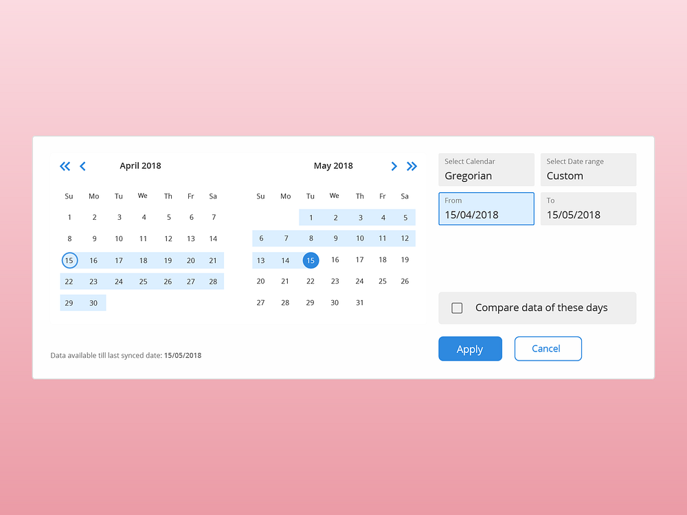
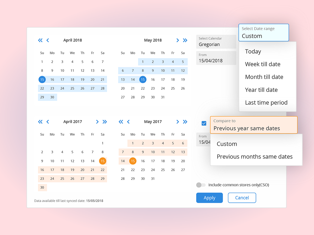
Design thinking: A guide to design better UX components
A thorough process of designing UX components or a product. Explained through an example of a date range filter.

If you are facing difficulties in building or executing a design process, and understanding the purpose behind each of its steps, this blog is meant for you.
Design is a cohesive process, all the interactions a user makes collectively defines the User Experience of a product.
Thus, paying attention to small UX components is of paramount importance while building a product.
Redesigning of the existing component “Date range filter” was the first task assigned to me at my product design internship at Capillary Technologies, Bangalore(Summers 2018).
The Problem statement being: Users were facing difficulty in using the existing date range filter. This difficulty was found in the Testing phase of the component through Fullstory.
As this was the first task assigned to me, I decided to get evaluated at each and every step I was about to take in redesigning this date range filter. This led me to discover the joy of documentation of my design process.
As expected, documentation compelled me to be absolutely sure in what I was writing, even what I was thinking of.
Is this the correct approach?
Am I doing all the right things?
Am I missing something?
These set of choices were going to make my own design process. I had to define the series of tiny steps that converges to a robust solution.
Generally, as designers grow, we get to know what’s important to ask to understand the product better, the questions get refined from these
Who are the target audience?
What colours do the client want?
When is it due?
to
Why the product is important?
How are things working without this product?
This helps to understand the need of the product, to find its purpose (and if we think, every component is a product in itself).
This is my version of what Chris do - founder, CEO of BLIND tells in one of his youtube videos.
The process
The steps involved in the redesign of this UX component fit in the Design stages methodology recognized by the Interaction Design Foundation and defines a process with key objectives to design a UX component.

1. Understanding the purpose of the component
Why, What & When do you use a Date range filter?
Collecting the answers to why, what, when questions help us understand the purpose of a design component.

Purpose: A filter which allows selection of a time interval for any analytics report. It also allows choosing two time intervals for comparison purposes.
2. Understanding our Users
This part includes the persona hypothesis which involves defining the kind of users using this component & understanding the circumstances of usage. This is done in order to assess the mental model of the users.
Persona building can either be descriptive or compact & precise depending on the working methodology you are using.
In redesigning phase, personas are generally provided since they were already made during the initial design of the product.
Here are a few examples of User personas if you wish to understand how User Personas are defined.
3. Assessment of existing design
This part of redesigning requires patience, time & empathy to understand the underlying motive of a user. To find answers to questions like,
What are the problems that a user is facing with the current design of the component?
What is stopping the user from achieving her goal?
Why is the current design of the date range filter not effective enough?
Assessment of existing design requires micro level analysis for which you need to document your observations & problems inferred for each crucial element of the existing design.

For the date range filter, I assessed the Till date, Last time period, Custom tabular buttons and compare feature, as:
Till date tabular button
Observation: Provides with 3 different tabular buttons-
- Till Date, Last time period & Custom
- Each tab is a separate way to select a date range.
- User selects a tab to go through a discrete set of steps to select a date range.
Inference:
- Every tab is a feature through which the user can select a date range. But since each of it has different ways to select the date range, the user is required to learn 3 different ways of selecting a date range.
- ‘Till date’ term didn’t specify its meaning. Today’s date is inferred as ‘Till Date’ but in actuality, it is the last synced date of the database.
- Similarly WTD, MTD and YTD end up not defining themselves which are Week to date, Month till date and Year till date respectively.
- Result: Dead clicks and User switches to use the ‘Custom’ tab.
And, similarly for the Last time period, Custom tabular button & Compare feature.
Inferences from the assessment give an idea of the problems a user might be facing and will provide us valuable insights during User goal assessment.
4. User assessment: Understanding motive & difficulties of a User
If you are redesigning a product, it is also required to find why the existing design is failing to communicate with users. For this user, behaviours are assessed, conventionally through user interviews.
Alternatively, products like Fullstory which provide recorded video sessions of Users on our product can also be used for assessing user behaviours.
Based on the observation of 25 distinct Fullstory session of our users. I derived a qualitative look on the user behaviour.
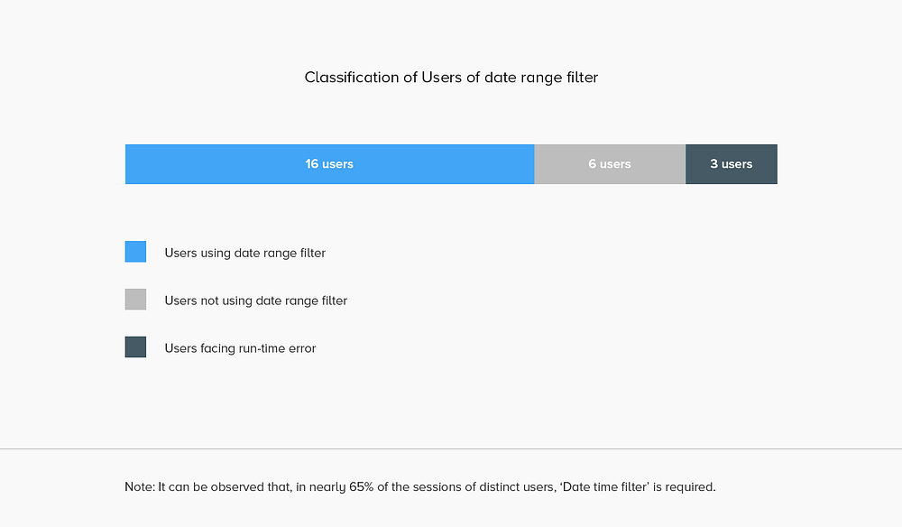

With these observations, we can conclude that most of the users which are using date time filter use ‘Custom’ for selecting a date range.
But why most of the customers are using ‘Custom’?
In one way, it could be explained and understood by understanding mental model of the user.
In a nutshell, User’s mental model is
What a user perceives the functionality of a product before using it.
And thus, it defines the User’s natural way of using a product, an obvious perception of how the product is going to work.
And, there is a significant difference in User’s mental model & Implementation model.

So, putting in simple words, what could be the mental model for a date range filter? Or how a user would perceive a date range filter to be?
Answer- User perceives the date range filter as a tool to select a ‘From’ and a ‘To’ date, and the app would be showing the analytics for the selected time interval.
Simple.
To which ‘Custom’ turns out to be the closest layout to the user’s mental model.
This doesn’t imply that ‘Till date’ and ‘Last time period’ should be removed, because users are quite used to them and use them to quickly/easily select a time interval.
That means, these are utility features for the date range filter. And should be displayed as feature to a simple date range filter.
5. Insights of Product and User assessment
Once you assess the existing design & User behaviour for the existing design you can sum up and write down the points which will shape your redesign:
- The mental perception of a simple date range filter(with a few features) collapses as soon as the date range filter opens up. This causes the user to have a sudden belief that he/she’s incompetent.
- Difficulty in understanding the flow of interactions for selecting a date range.
- Data/Analytics and comparisons are available till last synced date. The difference between the current date and till date is undisclosed to users, leading to dead clicks and bounce offs.
- Similar to selecting a date range, compare feature has a confusing and anharmonic flow.
- The existing design was not giving any warning to the User for clicks outside the date range filter dialogue box that they need to click on “Apply” otherwise the data filled won’t be saved.
6. User Goal assessment
User goals are what a user is trying to achieve. It is simple as the user’s mental model.
For example, User goals for Date range filter would be:
- To filter a report for a specific date range.
- To compare data for two date ranges.
7. Competitive analysis

Competitive analysis is understanding how other products show a similar component to their user.
Through this, we learn about other unobserved problems which may possibly occur(after we finish redesigning the whole component) and how competing products had solved them.
For example, in case of date range filter, I studied the analytics products available in the market in contrast to our analytics application. Specifically:
- Use of their product and their users’ perspective.
- Use cases of the date range filter present in this product.
- Similarities and differences in the date range filter they have.
- Solutions to our unique problems (if available).
A few analytics tools took into consideration were Domo, Google Analytics, Power BI & Tableau.
This lead to the conclusion that the date filter should be designed keeping the mental perception of their user in mind
- A simple date picker with a calendar interface allowing the user to select ‘From’ and ‘To’ date, labelled distinctly.
- Presets which makes date range selection efficient like: ’today’, ‘till date’, ‘last time period’ etc should be included as our user base is used to it.
- Use of simpler(obvious) terminologies. Terminologies can also be explained to the user via inductive text.
- Harmony in the flow of interactions.
8. Solution Hypothesis
With all the information gathered from the previous procedures, many solutions can be structured solving the same root problems.
Since we are solving for a simple date range filter, this step may seem to be unimportant, as the solution would again be a component allowing the user to select date ranges. But this step has a vital role when you design larger products.
Why?
Because, you decide the specific way the problems should be solved, the technology, the platform(mobile device or smartwatch or Virtual Reality Devices etc) that should be used.
9. Possible solutions

Okay, it’s the time to get creative. This step allows you to explore the wildest structure, layouts, user journeys, storyboarding as much as possible.
But stick to low-fidelity, we often dig deep in the first solution we could imagine and subconsciously find reasons to support it. Hence, overlooking what may have been overlooked.
Try different possible solutions, exploring different interactions to any user task, making lo-fi wireframes, seeking the interactions which are both harmonic and intuitive to the users.
It will surely help you in making your own unique innovative design solutions. Something that you can call uniquely yours.
And since you’ve explored and documented other possible solutions too, you’ll be knowing the ins-n-outs of the design. It will help you to select a solution and you’ll have answers to mostly all the questions inbound towards you from the involved stakeholders, but always seek first to understand then to be understood.
Once you’ve finalised your lo-fi design, you’ll be ready to go with the User stories and Wireframes.


10. Comparison & Selection
Time to prioritise!
Sometime you may come up with more than one potential solutions. It attaches a sense of ambiguity on how to choose a solution unless you collect answers to the following question:
Which solution is closer to User’s mental model?
In what scenarios each solution may fail?
Which solution is easier to measure and is flexible for future amendments?
Which solution is efficient in terms of engineering?
And any other such question relevant to your scenario. Questions would help in prioritising, do the math and you would be able to select the one.
11. High-fidelity design
Good Interface design delivers good experience to a user.
User interface becomes the point of contact with the users when you try to deliver the best User experience you’ve designed through the process so far. Interface may depend on the UI guidelines you’re working on or a fresh UI theme which you may exclusively create as per your project.
Users like simple things. But when it comes to the simplicity of a product,
it is not only defined by how easily it works, every line which we draw contributes to the complexity of the product
So remove everything unnecessary, put the things without which the User goals won’t be achieved. Examine it, and repeat. Here’s an example of what I did for the date range filter.


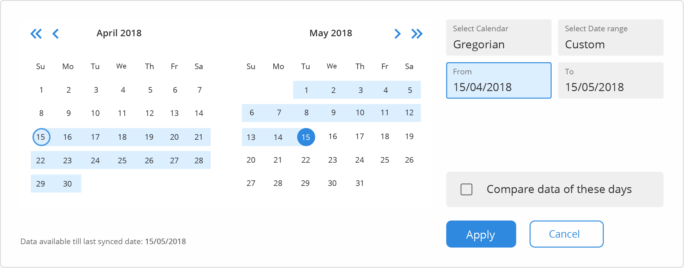
Notice how the UI got simpler with each iteration. And the final UI of the Date range filter looks like:
Testing
Several testing methods are used to measure the usability of design solutions to find out how the final output could be improved further. Fullstory is an example of this, which I used.
The design is tested and improved. It is a recurring process.
You can begin learning Testing from here.
Wrapping up
Design processes are evolving, moving from more-wrong to less-wrong. In the process discussed, many subjective choices can be made depending on your scenario & understanding. The process is purely customisable. If you have any suggestions, do share them!
It’s the first article I have written after learning & executing design as a student, as a mentee, as a freelancer; as a hobby, as a passion; waiting for the right time, learning enough things to deliver something to the readers.
Do clap!!! clap!!! if you liked it, if it was useful in any way.
Feedback fuels motivation, they are awaited!
Work. Empathise. Explore.
