5 ways to design a user-friendly data table
When designing a data table I have come across various interface designs that simplify table functions.
Align Numaricals to Right of the column
While presenting a table it is important to align numerical at the right side of the column. This makes it easy for a user to distinguish them from others. You can align the number to right in case of showing amounts, scores, and marks, etc.

Show headers
The user must be able to see what the column or a row is about. You can use the two in following of the way shown below:

Stop Using modal every time
Don’t always use modals/popups when editing fields inside the table. If the information is small and there are a few details to play around with, you can use drop-down extensions instead.


How to put navigation in case of multiple columns?
Adding navigation to a table consisting of multiple columns is quite a hassle. But there is one way we can make it work. It is by showing them when the user is hovering over a row. Though this only works on PC setups.

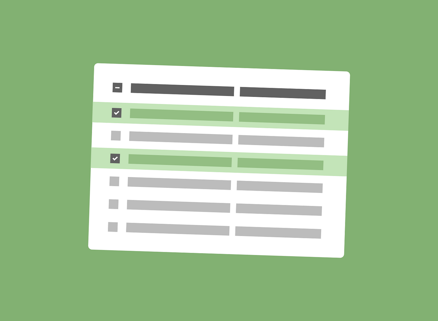
How to show the checkbox?
Now let’s take a scenario where a user has a long list and they have to export a few related ones. Just putting a check button won’t be prominent enough. Making the highlight visible through the whole row itself reduces the chance of errors.


