Designing Accessible Navigations
Overlooked features with powerful results

Defining Navigation
Although we almost always think of a site’s header when referring to navigation, it’s important to remember that navigating a site is not only moving from page to page but also from section to section within individual pages. When designing a navigational experience, designers should make sure that all users, impaired or not, are able to maneuver through your site’s content at their own pace with little to no frustration.
For the general public, this usually means designing a clear header with descriptive titles and ensuring the content on each of your pages has a cohesive narrative. Impaired or disabled individuals, however, may be accessing your site with only a keyboard and you should account for these unique challenges when designing.

By designing with accessibility at top of mind, you should be able to integrate a few powerful features to improve your site’s accessibility for everyone.
Allow Users to Skip Content
You should give users the option to skip irrelevant or redundant content when possible. The most common way to do this is by adding a hidden ‘Skip to Content’ link in your header. A user activates this link by tabbing on a site and once accessed, it can give users the ability to skip to main content areas like the main section or the footer. This feature is important because, without it, users are forced to navigate through the same block of links whenever a page loads, thus increasing the amount of time it will take them to get to a page’s content.

Airbnb, Target, and Wikipedia are a few examples of sites that surface hidden links to skip content when a user begins tabbing. Airbnb lets users jump directly to the main content of the page, while Target gives users the opportunity to skip to the main content area or the footer. Wikipedia designed their hidden link to be within the main article and gives the option to jump to either the full navigation or search bar.

Regardless of how you decide to integrate these hidden links into your site, they provide impaired or disabled individuals the opportunity to navigate without having to traverse redundant links on every page.
Add an Accessibility Menu
Other sites go to extra lengths to create comprehensive accessibility menus accessed via the keyboard. These menus provide alternative navigations altogether to simplify an impaired or disabled individual’s experience.

Facebook offers a simple alternative to the main navigation as it’s comprised of only three dropdowns:

- The first dropdown provides quick access points to different sections of the current page.

- The second dropdown surfaces quick links to different pages.

- The third dropdown features ‘Accessibility Help’ that provides further information to all the accessibility features that Facebook offers.
This menu is easy to use and simple to understand, especially for screen readers.
One of the best parts of this menu is that it’s easily activated through the use of the shortcut opt + / no matter where the user is on the site. This gives them the opportunity to go back to the top of the navigation without having to hard refresh the page or tab backward a significant amount of times.
By surfacing quick links to pages, content, and relevant accessibility information in an alternative menu, you will be reducing the amount of effort it will take for an impaired or disabled individual to find and access content on your site.
Consider Keyboard Shortcuts
Keyboard shortcuts offer an opportunity to let users navigate and perform many actions on your site with only a button. This significantly reduces the frustration for individuals with limited mobility or vision.
Twitter describes their approach to keyboard shortcuts by saying, “our shortcuts function as highways, and the Tab as a local street.” In other words, the j and k keys function as tools to cycle between different tweets in your timeline while tabbing brings you into one of those tweets. This is a smart and simple way to give users the opportunity to skip content if they find it irrelevant while also allowing them to get more granular if they would like.

Another notable keyboard shortcut Twitter has is the . key. By clicking this button, it loads all the new tweets on the timeline and brings the user to the top of the page. Sites with live feeds could benefit to having a one button action to refresh and load all new content on the page.
Facebook also offers a suite of different keyboard shortcuts that allows users to access content easily. The j and k buttons allow the user to skip through different posts on the timeline while tabbing pushes the user to interact with a post’s content.
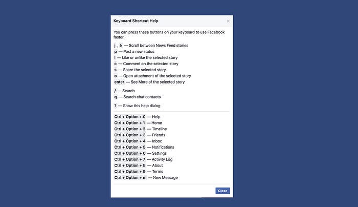
Key pages like notifications are also only a hotkey away by clicking ctrl + opt + 5. If your site has a few key pages, assigning them hotkeys could be a great way to give users instant access to content without having to look around for a specific link or pathway.
Both Twitter and Facebook focus their accessibility efforts around their main goals of promoting, sharing, and consuming content. When adding keyboard shortcuts to your site or digital product, it’s important to have a focused goal and not just add keyboard shortcuts randomly.
Properly Structure and Label Elements
The latest Apple devices all come installed with VoiceOver, an assistive screen reader that allows impaired or disabled users to easily navigate their devices. Turning on VoiceOver creates a series of keyboard and gestural shortcuts to quickly access content. It also verbally dictates focused elements to the user as they navigate their device.
As disabled or impaired users navigate your site, they will be relying on VoiceOver (or other screen readers like it) to successfully make purchases, fill out forms, and understand where content lives.
One of the most useful features VoiceOver provides is the Rotor function. Rotor gives users quick access to Headings, Articles, Links, Form Controls, Landmarks, and more. If a user enables Rotor (ctrl + opt + u while VoiceOver is enabled) a modal will appear that dictates each of these different elements to a user. They could then use the arrow keys to choose an element to go to with only one button.

Ensuring that all sections of your page are descriptively labeled as landmarks and your type hierarchy is correct will allow users to confidently skip entire irrelevant sections of your site to find the specific content that they are looking for.
If you’re unfamiliar with how screen readers work, I recommend enabling VoiceOver on your Mac (press ⌘ + F5) so you can try to navigate your favorite websites. This small exercise will provide valuable insight into how frustrating doing simple tasks like ordering a product online without a mouse or trackpad could be. It can also reveal companies with sites that pay careful consideration to all users, not just the general public.
Conclusion
In all, designers should focus on creating a clear site architecture for both the general public and for impaired individuals. By mindfully adding accessibility features to your sites like an accessibility menu, keyboard shortcuts, and robust rotor compatibility, you can ensure that you are providing the best experience to all users.
Nicholas Kramer is a designer currently working at Barrel in New York City. He solves design problems for businesses by helping them simplify ideas and communicate their value to customers.