Designing Color Systems — Transparent vs. Solid Shades
From communicating visual hierarchy to expressing brand identity, colors play a key role in the design of products and design systems.
While some systems rely on the use of transparency for color shades, others prefer solid color palettes. In this post I will compare the two approaches and share my thoughts on the pros and cons of each.
Usage of color shades
Shades are used mostly for two purposes: indicating states such as hover, active or disabled and indicating hierarchy, such as primary or secondary text.

Benchmarking design systems
Analyzing four popular and well established design systems shows that there is no unanimity regarding which is the best. While Google’s Material and Adobe’s Spectrum prefer to use transparency, IBM’s Carbon and GitHub’s Primer stick with solid colors instead.

Comparing the two approaches
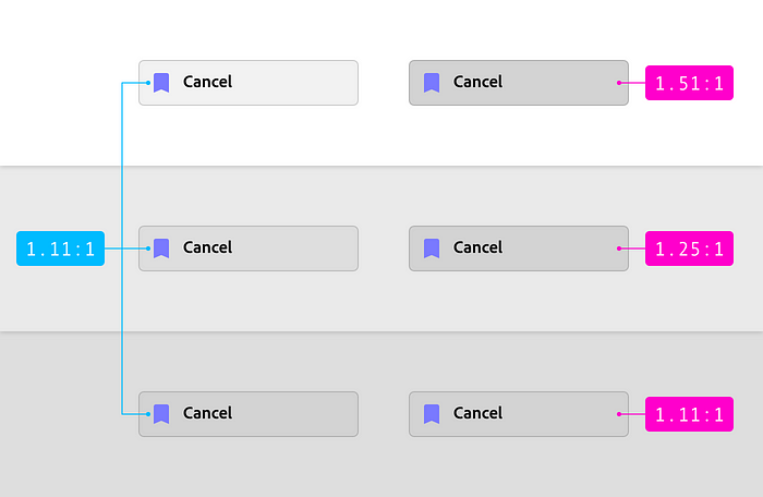
a) Amount of colors
The use of solid shades increase significantly the amount of variables required in a system, and can therefore make it harder to maintain and consume in comparison to using transparency.
In the example below, defining the four states of a menu item would require 2 color variables using transparency (blue tags below) while it would take 8 unique colors using solid values (pink tags below).

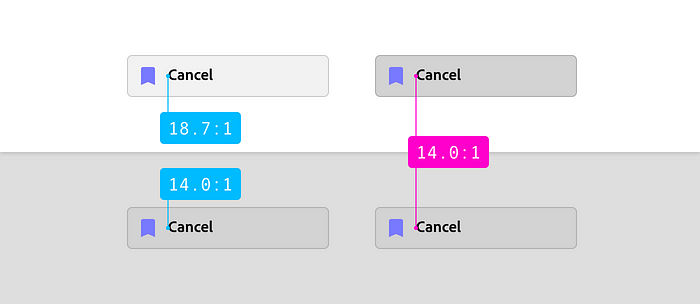
b) Theme-ability
Directly related to the amount of color variables, the use of transparency makes it easier to create and apply themes.
When using solid colors, switching from light to dark theme would require the creation of several new color values, while it would only require switching one variable when using transparency, as shown below. This is due to the blending of foreground and background which is done automatically by the use of the alpha channel.

c) Layering
Like Material Design, many design systems are based on a layered approach. This usually means that ‘deeper’ layers usually appear darker while the ones closer to the surface are lighter.
Transparent shades adapt easier (blue tags below) to different backgrounds, since they keep the contrast between the element and its background mostly consistent.
Solid colors (pink tags below) on the other hand appear darker or lighter depending on which layer they are above.
d) Accessibility
The contrast between text and background is also affected by which approach you choose, and that can have an impact on the accessibility of the UI.
Solid shades give higher control by keeping the background stable and is therefore more suitable for that purpose, although good contrast ratios can still be ensured with transparency, for example by limiting the variability of the background layers.
Conclusion
While both approaches have their pros and cons, color systems based on transparencies are easier to use, maintain and scale.
Mature color systems usually offer a mix of both, such as applying solid swatches to containers and transparency to component states and content.
As mentioned on points c) and d), it is important to keep in mind the contrast ratio between container background, component background and content (especially text), so usability and accessibility are not compromised for the sake of easing maintenance.

