Designing eCommerce for colourblind users.
Colour-blindness affects 7% of the world’s population. When it comes to surfing the web, this condition can make it impossible to understand the infinite influx of videos, images, and charts.
What is Colour Blindness?
Colour blindness does not imply that one cannot see any colour at all, or that people see everything in greyscale. It’s actually a decreased ability to see colour, or a decreased ability to tell colours apart from one another.
The science of colourblindness
Cones are a type of photoreceptor cell in the human eye that are responsible for perceiving colour. There are three types of cones — each responsible for detecting red, blue, and green wavelengths in the spectrum. Problems with colour vision occur when these cells are defective or absent entirely. Usually, these conditions are inherited from the parents from birth, but they can also be acquired through trauma, prolonged exposure to ultraviolet light, natural degeneration with age, an effect of diabetes, or other factors.
Common type of colour blindness —
The two most common types of colour blindness, deuteranopia and protanopia, are sex-linked traits and are much more common in men than in women. Deuteranopia, the most common, occurs in 7% of males, but only 0.5% of females. Well, confused? 8% of the entire population is colour blind and that is huge in order to ignore.
As designers, it is our moral duty to ensure that our designs are colour-accessible and user-friendly for a wider audience.
1. Use commonly used colour names
One of the most annoying experiences for people with colour vision deficiencies is to not relate to the product’s colour. Under such circumstances, the colour name mentioned in the description often helps. But just imagine if the colours mentioned are — “Damson”, “Blush”, “Olivaceous”, “Woodrush” — how much would someone understand from these names? And, I am not making up these names, these are actually names of colours I found on few e-Commerce apps.

By clearly stating the colour name in the description of the product, we make it a notch easier for the colourblind users to make decisions.
Having said that, good websites and apps keep the colour description as common as possible. “A pale pink” or “a dark blue” shirt is a much better way of describing the colour of the product.

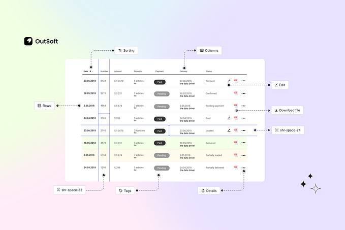
2. Use combination of colour swatches and labels
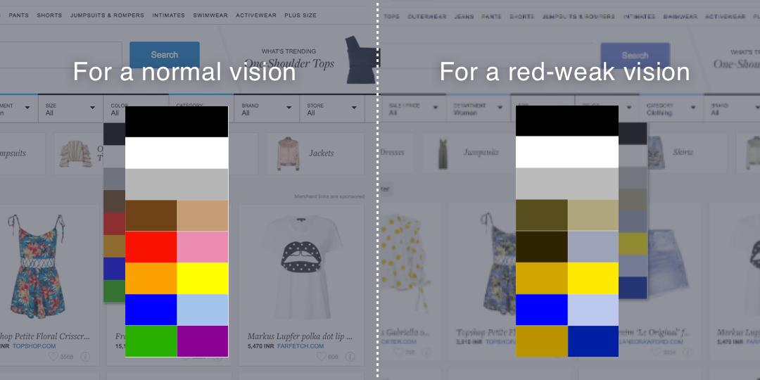
Another common problem is when there is a colour filter but its unlabelled! Here’s an example of a well known eCommerce sites that has colour filters but are unlabelled. I have also shown on the other side how a user with red weak issue experiences the website.
Another approach to this problem is just listing out the names of the colours in the filter.

While this might seem like a good idea, but it’s important to remember that not all people visiting the website/app are under the same category. For users with normal vision, it is a good experience when they see colours in the filter. Removal of colour swatches can slow down the interaction of choosing a colour when customers simply want to see search results as quickly and smoothly as possible.
The best solution involves a combination of both colour swatch and commonly used colour labels. A fantastic example of this is WarbyParker website for glasses

3. Avoid communicating a message on the basis of colour
A common practise while designing forms is to mark a mandatory input field in a different colour. Or maybe if the user tries to submit without filling in the mandatory field, the border of the input field changes to red, indicating error. But, we have to understand that not all our users experience the colours in the same way.

Hence it is important to show a error symbol as in this case or have a label supporting the error call.

Here are few ways of denoting mandatory fields in a form —
- Mark required fields with an asterisk.
- Even better, mark required fields with the label “required.”
- Where possible, remove optional fields altogether.
Not just forms, but also alert messages. We often tend to show success and failure messages as green and red respectively. However, using prefix text such as “Success” or, an icon makes it quick and easy to read as shown below —

4. Low contrast design is haunting the web
Low-contrast text may be trendy, but it is also illegible, undiscoverable, and inaccessible to not just colour deficient users but also for normal vision users. Instead, we should consider more usable alternatives.

“WCAG 2.0 level AA requires a contrast ratio of 4.5:1 for normal text and 3:1 for large text (14 point and bold or larger, or 18 point or larger).”
— WebAim color contrast checker
Make use of bold text for added readability on low-contrast items and avoid very thin fonts. Also, don’t use any JavaScript or CSS techniques that would prevent users from highlighting elements of the page with their mouse or change the default highlight behaviour. Many visually impaired users make use of highlighting as a quick trick to increase contrast and to aid visual focus.
5. Experience your designs as a colourblind user
It’s true that if you are not suffering from a colour vision deficiency it is very hard to imagine how it looks like to be colourblind. That’s the reason we build an internal tool for ourselves — CanvasFlip colourblind simulator. Few weeks back we released it for designers across the globe. The idea is to bridge this gap between designers and the experiences of a colourblind user.
It’s worth checking your design to catch any potential problems up front, as well as running a final check before designs go under development.

Conclusion
It’s actually easy to make our sites accessible for colourblind users. We just have to put forth a conscious effort in thinking towards it and abiding to the guidelines. It can often be helpful to use a colorblindness simulator to help decide how the colours on the page affect the overall experience.
Leave a comment below and let us know other tips and guidelines for designing eCommerce websites and apps for colourblind users. :)